App launcher and menu
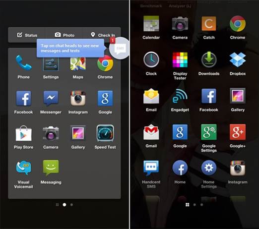
App launcher is a series of panels, each of
which consists of a 4x4 grid of application icons in a small Holo-themed box.
Facebook informs there is no restriction on the number of panels we can use,
beside our own application count; we created 12 before giving up our attempts,
and there was still room to add more. Unfortunately, there is no option to add
utilities or folders. Those who often visit the Facebook for Android application
will realize some similar elements: on each panel is the same set of three
features - status, photo and check in. It appears that Home will gradually get
rid of the reasons to visit the standard application, although its initial
launch does not make us agree with that view. (Facebook intends to add new
functionality, fixing bugs and device compatibility in the form of regular
monthly updates, so it is possible that the native application will ultimately
turn out to be irrelevant). If you take a close look at the wallpaper, you will
find that it is your latest viewed Facebook photo.

App
launcher is a series of panels, each of which consists of a 4x4 grid of
application icons in a small Holo-themed box.
From here, swipe to the right and you're in
a familiar area: a vertically scrolling app menu has your full list of
applications with a Google Search bar at the top. As on most Android devices, a
long-press any icon will take it to the app launcher, offering you the option
to drop it somewhere or - in the case of that the applications are installed
from the Play Store - drag them to the top of the panel to uninstall them.
Messaging and Chat heads
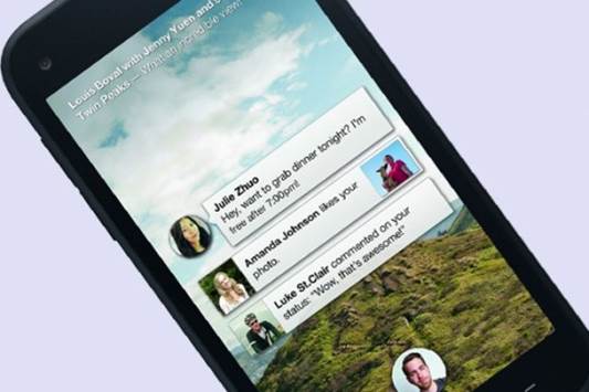
One of Home’s greatest strengths is its
messaging ability, which makes use of SMS and Facebook chat and combines them
into one application. Whenever receiving a new message, you will see a bubble
appear with that person’s profile picture inside, with the number of unread
messages in red and the first few words of the text are proudly presented in a
small box to one side. These bubbles, which will show up regardless of whether
which application you're now in, are called "chat heads" You are able
to move the chat head to different places on either side of the screen (never
in the middle, probably because it would interfere too much about your other
activities), or drag it down to the bottom so that it does not interfere. If
you are tracking multiple conversations, you will find that the chat head
becomes a stack. Also, in the case of group chats, numerous profile pictures will
show up inside.

One
of Home’s greatest strengths is its messaging ability, which makes use of SMS
and Facebook chat and combines them into one application. Whenever receiving a
new message, you will see a bubble appear with that person’s profile picture
inside, with the number of unread messages in red and the first few words of
the text are proudly presented in a small box to one side.
When you click on a chat head, a new pop-up
screen will appear which presents the main body of the conversation, and two or
more circles on top. With the exception of the farthest-left circles, all of
the circles (you can have up to 5 circles that are spread across the width of
the screen) are ongoing conversations; the bubble on the far left is a shortcut
that leads you to the messaging application. If you have four conversations
going on and a new conversation has just come in, it gets rid of the oldest
thread to make room for it. Do not worry, you do not lose that information -
you will simply need to return the messaging application to access it again.
Android 4.1
Returning the application menu, we were
curious about the "More ..." icon at the bottom of the screen. While
pressing it, we found that it took us to the standard Jelly Bean app launcher,
coming with the utilities, wallpaper and dock tray which we are accustomed to.
Yes, the rumors are totally true: the First has vanilla Android 4.1.2, instead
of the Sense’s version. While the First is pre-loaded with Home, the launcher
can be turned off in the settings; giving you a full version of the Jelly Bean
that does not need modifying.
Because Home is nothing more than a
launcher, this is not a great discovery, but it is a selling point to help
expand the First’s expected customers beside the crowds that have a passion for
Facebook. It is not too often when a US carrier-branded phone delivers the
inherent Android experience right from the start, and the fans of Nexus 4 who
expect an LTE option might take notice that this is an acceptable alternative.
However, we should warn that we are confirmed by HTC that the boot-loader is
not open on the First.
Concerns with Home
So far, our biggest concern with Home is
the effect that it could have with the use of data; as it regularly updates
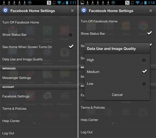
Facebook’s news feeds in the background. Fortunately, Facebook includes a setup
of the image quality and a three-tier data usage (high, medium and low) that
allows you to adjust the amount of information that is transmitting to the
phone. The switch becomes convenient for the smaller data packages or if you
are reaching close to the limit, but it is strange that only the Wi-Fi option
is not available – we would like to see this added in an update soon. Why? In
our test, we used 93MB in four days on the medium setting; at that rate, Home
would consume 698MB in a month. Think of it this way: if you have a 2GB
package, Facebook Home would occupy more than one-quarter of the data, only on
the medium setting. Now let’s imagine how much the high-usage scenario will
destroy the ordinary consumer's data packages. So, all of you should use Home
responsibly.

Facebook
includes a setup of the image quality and a three-tier data usage (high, medium
and low) that allows you to adjust the amount of information that is
transmitting to the phone.
Another minor annoying thing is the fact
that when Facebook friends update a series of images, each image appears as an
individual update. This means that we have to scroll back through several
photos from the same person before updating from others. Also, we wish to see
these utilities and shortcuts that can be customized to launch (for instance, a
quick access button of the camera) to provide faster access to the important
features.