When talking to the executives of the Google
Maps team, we were reminded that Map had never been a product until 2004.
Within less than a decade, one of the most intelligent ideas of Google has
changed the whole navigator industry. Along with the navigator’s development,
the rapidly increase of the smartphone industry has put some navigator
companies into trouble, Magellan company for instance. Not too long ago, the
PNDs (personal navigation devices) were one of the most wanted gifts of many
people for the holiday season. And in fact, many of the Garmin products have
satisfied me in many years.
But nowadays, the PNDs’ companies have a
feeling that they are left behind on the market. Some companies have to renew their software as well as cooperating with
automakers and fleet-management firms in order to keep their businesses
running; whereas Megallan decided to create their own way by introducing a
brand new hardware to the market. Apparently, that hardware must be the
SmartGPS. Instead of a separated PND that usually sit on the control panel or
front window in most of the cars, the Megallan’s device operates at its best
when using along with an iPhone or an Android’s application (we really feel
sorry to the Windows Phone or BlackBerry users). Technically speaking, the
company expected that by making a product that could extend the use of
smartphones; the customer would be more willing to spend $250 for the device.
However, after one week travelling around the South West of the States, it
seems like I personally have another opinion about the device.

The
Magellan SmartGPS
Hardware and user interface
Yet, you can use SmartGPS independently of
any smartphone’s applications, however, it only perform at the maximum when
there is either internet connection around or through Mi-Fi in your car, or
being connected with mobile phone via Bluetooth. The device itself is
ridiculously huge in size. It has a 5inch screen (low resolution 800x480) and
is surrounded by a 3.5x6.4 case. The rest is more alike a mini Nexus 7. When
you attach it onto your windshield, it is big, yes, really big! There's an
inexplicable amount of bezel here, and I seriously do not know which words to choose
to describe how large this thing looks when mounted. You can position it in
such a way that it does not block your direct driving field of view, but if
you're travelling bypass a few national
parks for a week, it is going to obstruct a lot of awesome scenes.

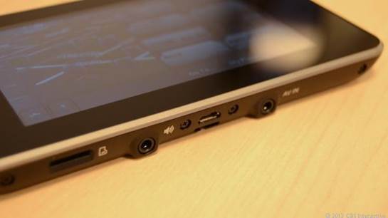
Magellan
Smart GPS’s hardware
The unit goes along with a windshield mount
/ cradle as well as a cigarette adapter for power. Although it worked well
enough in practice, it just feels kludge in today's world of sleek smartphones.
For the first time, I finally feel that we as a navigating society are over the
"mount this massive screen on my windshield" era. There are simply
far better (and cheaper) alternatives, which I'll show you later on.
The screen itself does not have anything to
talk about. The resolution is just a nightmare; it not even reaches the standard in today’s market. If you are
expecting something like Retina display, you are making fun of yourself. Also,
other graphical elements might come from the last century. While other navigating
applications such as Foursquare and Google Maps have yet been following the new
UI innovation, SmartGPS seems to be using a graphical engine from many years
ago. Surely it is not a good thing to look at.
Usability
Predictably, one of the features of SmartGPS
is that it allows the interaction with other services. In theory, the user has
to create a MiCloud account, where they can easily sync their preferences as
well as upcoming trips and routes while working on a laptop or pc. After that,
SmartGPS would find if there is internet connection; if so the device will
transfer all of the information immediately - including your favorites, your
new destinations, etc. Moreover, you will be provided with many localized
information from Yep and Foursquare while travelling from one city to another,
including the cost of fuel and many more up-to-date traffic notifications.

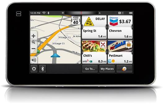
Magellan
Smart GPS’s interface
The problem is how the user can sort out
this messy program. The way to set things up is far complicated, so if you are
thinking of giving this device to your mom or your grandfather then just forget
about it. In another words, the device could be described as the scariest
nightmare for the elder. In order to put everything together, you are required
to install an application on your smartphone, sign up an MiCloud account, fill
up the register form on Megallen’s website, pair your phone with the SmartGPS
over Bluetooth, plug in your home's Wi-Fi information and ideally, install and
log in to Foursquare and Yelp. Even after the whole complicated process above,
my review model took a while before the information from Yelp and Foursquare
started displaying on the screen.
Once you have done all the things above,
you would then be facing with an abnormal complicated home-screen. An
easy-to-miss scroll wheel atop the display allows you move the map out of the
way, where you're blitzed with tiles that continually refresh to show local
recommendations and pricing. Technically speaking, it is grateful to have all
of this kind of information in your hands. But in fact, you would kill yourself
and other people on the street if you try to read this information while
driving. I am an experienced driver – I have travelled to all 50 states of
America on my car, and I've driven U-Haul trailers in places that I'm ashamed
to admit. But still, I cannot be confident of myself to look at all that
information while driving on the highway. Texting and driving are enough
terrible, but panning throughout the whole screen and wiping through Yelp’s
reviews are different stories.
You can argue that this information would
be useful when u already parked your car. But I am telling you that it is way
more convenient to use my iPhone and the better interface than using SmartGPS.