ViewSonic VP2772-LED - Out With The Old
Out with the old, in with… something
very similar
How do you improve on near-perfection?
That’s the challenge facing the new ViewSonic VP2772-LED. Its progenitor, the
VP2770, was a seriously slick screen, and among the very best of the 27-inch
IPS bunch.

Image quality, particularly at maximum
resolution, is impressive
Indeed, the VP2770 hasn’t been around all
that long. Then again, with 4K panels popping up and IPS tech drilling down to
mainstream prices, there’s an awful lot of action in the monitor market, so
perhaps we shouldn’t be surprised.
Anyway, what to make of the new VP2772?
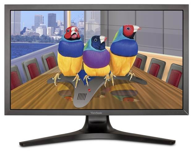
The basics are carried over. We’re talking a premium 27-inch model with an IPS
panel, 2,560 x 1,440 pixel resolution and an LED backlight. The pro-style
chassis and stand are dead ringers for the VP2770, too. That means full
adjustability in every direction, a nice slim bezel and solid build quality.
There are no snazzy gloss finishes or flourishes of brushed metal. It’s a no-
nonsense design we reckon will stand the test of time.

With its advanced 12-bit color engine and
14-bit LUT, the VP2772 smoothly processes,
grades, and renders 68.7 billion colors to create stunning images with rich
depth and detail.
Calibration challenge
The panel itself looks familiar too, with
its nice, smooth anti-glare coating, but the instant you fire up the new VP2772
there’s an ‘Oh God’ moment as you wonder if ViewSonic has seriously cocked
something up. At default settings, the VP2772’s colour balance is awfully warm.
When we say ‘awfully warm’, we mean whites
are noticeably discoloured. It’s bad enough to have you resetting the screen to
defaults just be sure. Then you hop back into the OSD menu and knock the colour
settings a notch cooler and it does look better. However, the coolest option is
a big leap towards blue, so the bottom line is that this screen needs proper
calibration to achieve the correct colour balance. For graphics pros that’s no
problem – they’ll be calibrating anyway. For we gamers and other amateurs, it’s
a pity.
That aside, there’s relatively little to
choose between old and new. You get the same awesome viewing angles and similar
pixel response. However, there are one or two metrics by which the new model
opens up an advantage.
For starters, the static contrast is
simply better. That has a knock-on effect in a few areas. Colours are a little
more vibrant and saturated, and black tones are deeper and more convincing.
Suddenly, the VP2770 looks a little washed out. Who’d have thunk it?
Then again, for some reason ViewSonic has
removed the power supply from the chassis for the VP2772 and supplied an
external brick – something we’re not hugely keen on. Oh, and we should point
out that this, like pretty much all 27-inch IPS panels, is limited to 60Hz. No
100Hz-plus loveliness here.

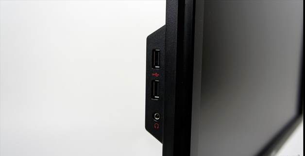
In addition, HDMI and DVI inputs, and
four USB 3.0 ports let users
connect with multimedia and storage devices
All of which means this revised panel is
hardly an unambiguous win over the outgoing model. Deep down it’s a better
screen, but you need to know what you’re doing to get the most out of it.
What’s more, at over $1,000 it’s painfully pricey.
If you’ve got the money and are confident
setting up a premium panel, the VP2772 still highly recommended. It isn’t quite
the no-brainer of a proposition that its predecessor was though, and that’s a
pity.