User interface’s improvements
The chain of startup guides you through the
initial welcome screen and normal settings. You will be prompted to create or
log into your Microsoft Account, choose your preferred language settings and
choose whether you want to back up your photos, text and phone settings. From
there you will find yourself on the Start screen, roaming freely through the
Live Tile and the list of applications that you want. If you've previously used
Windows Phone 7, you will immediately notice the differences - very different.
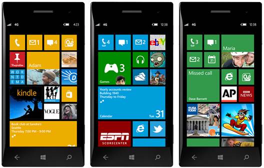
When you're on the Start screen, you will be presented a group like Live Tile
checkerboard as familiar as you've ever seen on a typical Modern UI, but this
time it extends to the right edge of the screen (in WP7, the tile covers only
two thirds of it, while the rest of the space is not in use). This adds more
space for each tile. Microsoft has also included support for three Live Tile
sizes (compared to just two in WP7) and for developers to access all of them.
Whatever used to be smaller in WP7 is now considered average, which means there
is one option available for even smaller size for those you want to access but
do not it to occupy much space. It works well - we want to be a setting tile
associated with the Start, but there is no reason for it to account for a large
portion of the screen. It is similar to other utilities. You also have the
opportunity to change the tile size, a privilege that is not extended to WP7
users. It is necessary for third-party developers to support small and
medium-sized, but it is their will if they want to offer the largest sizes. To
switch between 3 sizes, just press and hold the tile and 1 new arrow appears at
the right bottom corner. Click it and so your tile will shrink or expand,
depending on where the direction of the arrow is facing. The people in Redmond claimed
that this new setting would make your phone more personal than before, and we just
like to add that we can be able to see much more content on the Start screen,
and do so in an efficient and well-organized way.

User
Interface
While the Start screen is the biggest
innovation in WP8, there are some important changes to the lock screen that
will ultimately make it more useful. In WP7, you are allowed to get some
details about the next appointment in your calendar. At this point, you can
exchange it for unread emails, text messages or missed calls. The message at
the bottom of the screen is now more easily customizable, so you can choose
what kind of notifications you receive and the order you want them, from left
to right. There is room for 5 symbols. It is improved compared to WP7, but
unfortunately it still does not beat Android's notification system. The platform’s
lock screen can be dynamically updated to display information of third-party
applications - for example, HTC has done excellent work in the weather app,
allowing you to view the current temperature and the weather during the day
(along with beautiful images of local weather conditions), and applications
such as CNN will provide new information to receive updates in the same way.
You can also make the lock screen show images presented by Bing if you are
looking for something eye-catching. In addition to these two changes, WP8 does
not include major changes to the user interface. As you will see in this
review, that does not mean that Microsoft did not add extra things - it just
means that those who are familiar with the Modern UI will now need to learn how
to use this new phone again.
Synchronizing your phone

Syncing
your phone
Windows Phone 8 provides several ways to
sync your phone and computer, so you do not need to go through to access Zune for
music, video, and photography. The device on this platform uses MTP, meaning
you can access the phone as an external hard drive. Drag and drop the files you
want on the phone and that's all you have to do. Even you can go to Windows
Media Player and sync songs and playlists in the same way that we can do with
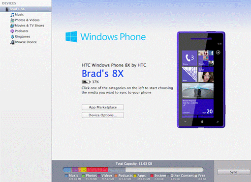
Android phones. You can also sync the device with iTunes, but you will need to
use the desktop application that comes from Microsoft to do this (available for
Windows 7 and Mac, Win 8 has this feature built-in). In fact, this particular
program is the only option that Mac users will have if they want to connect the
phone to the computer. When you are in the program, the program first asks you
to sync iTunes or Windows libraries. If you choose the former, it appears in
the iTunes window and begins to load all your music, photos, video, podcasts
and your ringtone. From there, just select what you want to put into the phone.
It reduces one of the biggest worries that iOS users have to scroll through the
Windows Phone, and it works smoothly.
Fortunately, you also will be able to
upgrade OTA, a feature that is already available on Android and iOS devices for
a long time. You can be notified when the next update is available, downloading
updates automatically or manually checking to find a new software version.

Some
screenshots
Finally, WP8, plus the ability to backup
text messages, the list of applications, bookmarks of IE10, device settings and
image / video on the cloud, with all this data associated with your Microsoft
account. This makes it easy to restore your phone if it is deleted or if you
need to replace it for any reason.
Compatibility with Windows 8
If you've seen Windows 8, you will see
quite clearly that Windows Phone 8 has a relationship with each copy of the
desktop than the previous versions. Microsoft is betting big on Modern UI, and
has tried to combine experiences on desktop, tablet and mobile platforms into
one. Now they do not just use the same style of the user interface, but also
share the same code, that is the Windows 8 developers will be able to use the
same code for the WP8 apps, and vice versa. WP8 also supports C++ and C, as
well as DirectX. Microsoft hopes that this similarity will promote third
parties to both combine and improve the new and untested ecosystem.
Regardless of whether this strategy is
effective or not, we believe it will make the platform more powerful in the
future, but it will take quite some time to develop enough applications to
convince those Android and iOS users typically who have invested heavily in the
ecosystem of their choice. This problem will not happen after a night, but it
can be a message that many PC users upgrade their desktops to a new OS. Whether
the company is placing heavy emphasis on Win 8/WP8 experience, it does not mean
it's completely thrown away Windows Phone 7 or 7.5; all inherited applications run
easily, and we look forward to seeing large-scale improvements in the
applications when they add compatibility in the near future.