Who says iOS gets all the best
looking apps?
It’s a bit of an urban myth that because of
its harsher approval policy, the sleeker, better-looking apps of this world are
more likely to be found on the App Store than on Google Play. This is something
that Zime is happy to try and prove wrong, with a unique 3D interface that
literally gives new dimensions to your calendar and organizational side.

Give
new dimensions to your calendar organizational side
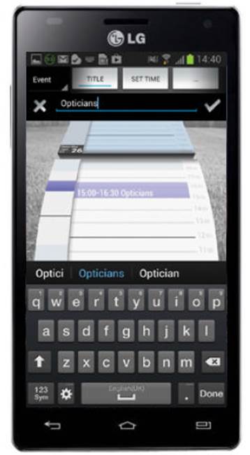
The home screen of the app sees the days
both ahead and just passed curve down the screen as though towards you,
creating a cool 3D effect against the artistic background image. The interface
itself is also very responsive, with accurate taps for users to drop in tasks
at specific times, and pinch-gestures to extend the length of the task or event
you want to drop in. This can all be done via the drop-down menu and data
input, but the gestures method is more than accurate enough.

The
3D-style interface makes for a new perspective of your calendar, but allows you
to see what’s coming up in your schedule
Zime may still be in beta but the app is
already impressively functional and feature - filled, with calendar syncing
from your Gmail account as well as Facebook, and the ability to prioritize the
tasks you drop into your calendar in a separate list. On the subject of tasks,
one piece of functionality that did catch our eye is the way users can set
different types of tasks. For example, if it is time sensitive then there is a ‑
fixed-task option that applies a time and date to the to-do. However, there is
also a ‘floating’ option, which is ideal for those less pressing tasks that can
sit on the back-burner for now, but need to be fresh in the mind.
Although Zime has to-do and calendar in its
extended name, it feels much more like an intuitive, all-round organizer. This
is further highlighted by the inclusion of a timeliness chart, where you can
keep track of how on-the-ball and on-time you are for certain engagements each
month. Each one of your events is logged here, and you can use a scroll bar to
say whether you were early or late in arriving. This data is then used to build
a graph you can monitor.

You
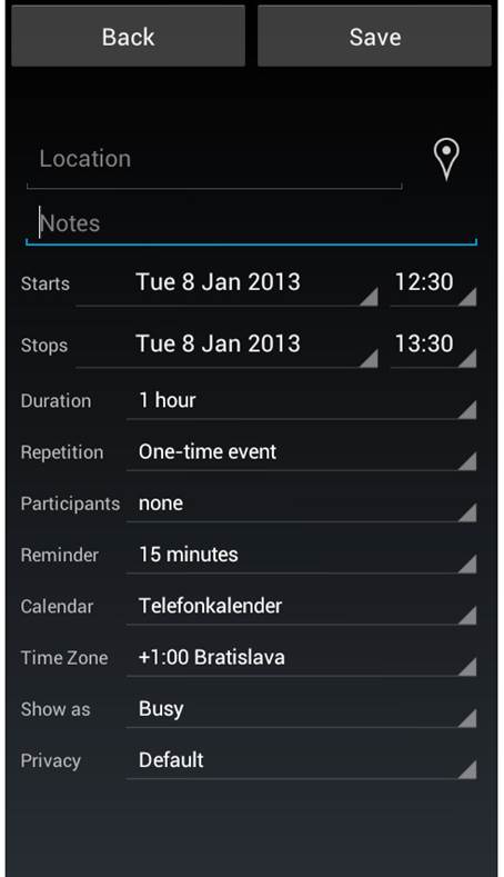
can enter detailed notes and points regarding your events, and set reminders
Everything in Zime then is geared to making
your life a smoother running operation, and it does a great job, while
maintaining some very good looks, too.
A very promising app in beta, and
well worth keeping an eye on
Verdict: 4 stars
Android: OS 4.0/ Free/ v1.0.1.9
Pros/Cons
·
Eye-catching and engaging compared to a lot of
calendar apps
·
Already has plenty of great features and is
still only in beta – amazing!
·
Some bugs here and there
·
No option to add further calendars
Showcase
The five most eye-catching parts of Zime
1.
Home
Zime’s home screen is brilliantly eye catching.
With its cool 3D effect that mimics a physical Rolodex, your calendar has never
looked anything like this.
2.
Gestures
The interface is both responsive and
intuitive, with taps, swipes and pinches galore to help you create and edit
events in your calendar.
3.
Tasks
As well as the usual calendar events, you
can drop in tasks, and these can be fixed to a specific time and date point or
left floating and ongoing.
4.
View
Use the pinch gesture to alter the calendar
view, zooming out to see a breakdown of your events, or zooming in for more
precise event creation.
5.
Timeliness
As well as the app’s main functions, there
is a clever timeliness tool, that is included to help users keep a check on
when they have to make appointments.