With the Nook HD, US bookstore giant Barnes
& Noble entered the wide-open 7-inch tablet market, but with the 9-inch
Nook HD+ it faces a daunting foe.
The full-sized tablet market continues to
be thoroughly dominated by the device that defined it - Apple’s peerless iPad.
When even Google and its technically impressive Nexus 10 can’t make an
impression at retail, what hope for the Nook HD+.

Nook
HD+
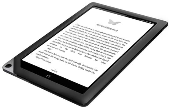
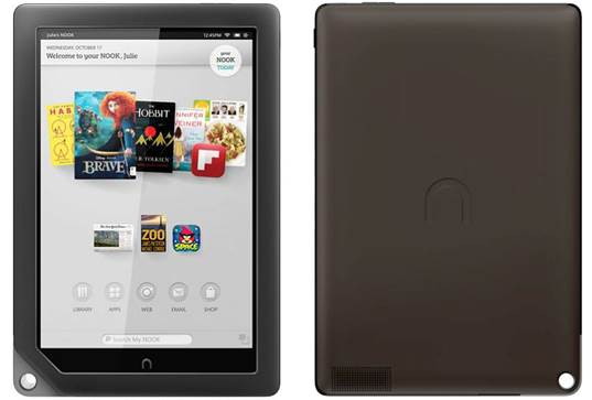
With a super-sharp 9-inch display, a slim
and lightweight body, and a $269 full price tag for the 16GB version -or $299
for the 32GB model - Barnes & Noble certainly has some notable
bullet-points to put on the box. But does the user experience match the raw
specs?
It’s far from the best Android tablet experience
available, but with its recent price cut, fine HD screen and all-new access to
the Google Play Store, the Nook HD+ has somehow suddenly become worthy of
consideration. But how good is the Nook HD+, and can it climb above devices
such as the Amazon Kindle Fire HD 8.9? Read on to find out...
Like the Amazon Kindle Fire HD, the Nook
HD+ is essentially an Android 4.0 Ice Cream Sandwich tablet with a heavily
customized interface layered on the top.
Indeed, Barnes & Nobel has taken a leaf
out of its formidable rival’s (e)book in producing a simplified home screen
that pushes media content to the fore, ahead of even core tablet functions such
as email, internet or widgets.
Don’t Nook now
Curiously, despite this simplified approach
the Nook HD+ interface feels sluggish, with frequent and noticeable stutters
throughout. This can be seen from the first time you wake the device from its
sleep, which seems to take half a second longer than it should.
Speaking of the lock screen, it’s possible
to access multiple accounts straight from here, as you would on a PC. This
enables you to filter out unsuitable content for a child’s profile, for
example, or to remove the ability to access the internet or settings menu.

Speaking
of the lock screen, it’s possible to access multiple accounts straight from
here, as you would on a PC
You can switch between these (or set up a
new profile) at any time by hitting your profile picture at the top-left of the
home screen, though it can take a good few seconds for the Nook HD+ to make the
change.
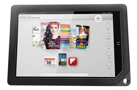
Past the lock screen and into the home
screen you’ll find a content carousel that, like Amazon’s Silk UI, features the
most recently accessed apps and multimedia content.
This too seems afflicted by the general
lethargy found elsewhere in the operating system, with the panning and scaling
of the icons far from buttery smooth.
Nook before you leap
Admittedly the Nook HD+ is hardly powered
by the most cutting edge of processors, but its 1.5GHz dual-core TI OMAP 4470
CPU should really be capable of running such a lightweight UI without a hitch.
Adding app and media shortcuts to one of
the five home screens is a simple matter of pressing and holding on an empty
area of the screen. This brings up a nicely arranged sub-menu that separates
items in categories such as Library and Apps.
There’s even a Bookmarks category that
pulls out your favorite internet shortcuts from your selected browser (which is
now Chrome by default).

Like
the Amazon Kindle Fire series, Barnes & Noble’s tablet is designed to be
the focal point for thousands of books, movies, magazines and newspapers
through the Nook Shop
Dragging these icons around the screen is
far quicker and more fluid than any other tablet OS we’ve used. In fact, it’s
almost too easy to do - you just need to touch and drag, with no holding or
confirmation phase whatsoever.
Below these secondary app icons (or to the
right if held in landscape orientation) is a row of five fixed icons that
provide a handy shortcut to key functions including Library, Apps, Web, Email
and the Nook Shop.
At the very bottom of the home screen is a
search command that enables you to scour your Nook for a apps or media.
Like the Amazon Kindle Fire series, Barnes
& Noble’s tablet is designed to be the focal point for thousands of books,
movies, magazines and newspapers through the Nook Shop. With the recent
addition of the Google Play Store, you can now open that out to music as well.
Watching films on the Nook HD+’s 9-inch
display is a joy. Indeed, with a 1,920 x 1,280 resolution, Full HD 1080p
content feels perfectly at home on the tablet, which makes it good for movies
as well the Nook’s staple of books.
Hello, is it me you’re Nooking for?
We found the 7-inch Nook HD to be
uncompetitive in a crowded field, but the Nook HD+ may well have carved out a
niche for itself as an ultra-affordable full-sized tablet. Its custom UI is
clunky, its own media store is a bit of a write-off, and it won’t win any
awards for its looks. But for HD multimedia kicks on a budget, there aren’t
many better-value alternatives out there.
Nook HD+ specs
Design
·
Device type: Tablet
·
OS: Android (4.0)
·
Dimensions: 9.46 x 6.41 x 0.45 inches (240.3 x
162.8 x 11.4 mm)
·
Weight: 18.17 oz (515 g) the average is 17.9
oz (512 g)
Display
·
Physical size: 9.0 inches
·
Resolution: 1920 x 1280 pixels
·
Pixel density: 256 ppi
·
Technology: IPS LCD
·
Colors: 16 777 216
·
Touchscreen: Capacitive, Multi-touch
Hardware
·
System chip: TI OMAP4470
·
Processor: Dual core, 1500 MHz, ARM Cortex-A9
·
Graphics processor: PowerVR SGX544 @ 384 MHz
·
System memory: 1024 MB RAM
·
Built-in storage: 16 GB
·
Maximum User Storage: 13 GB
·
Storage expansion: microSD, microSDHC up to 32
GB
Multimedia
·
Features: Album art cover, Background
playback, SRS TruMedia
·
Speakers: Stereo speakers
Internet browsing
·
Browser: Yes
·
Built-in online services support: Facebook
Phone features
·
Organizer: Calendar, Document viewer (Office
2007, Office 2003, PDF)
·
E-mail: IMAP, POP3, SMTP
Connectivity
·
Wi-Fi: 802.11 b, g, n
·
USB: USB 2.0
·
Connector: microUSB
·
HDMI: Yes
Other features
·
Sensors: Accelerometer
|