Display
The 4.6-inch TFT LCD screen of the Xperia
SP has the same Reality Display technology as the Xperia Z, though with lower
resolution, 319ppi. However, the screen is not as good as the Z's screen, even
after you take into account the lower resolution. We can’t know whether there
is too much light passes through, or whether the closest to black it can get is
a very, very dark blue, but the blacks are simply off. It goes from noticeable
when the two Xperias are compared, to shockingly apparent when placed next to
the Galaxy S III's AMOLED display. However, whites are accurate, and there's
even one white balance adjustment in the display settings menu if you think you
can do better by aligning it manually. The other colors look vivid without
being cartoony.
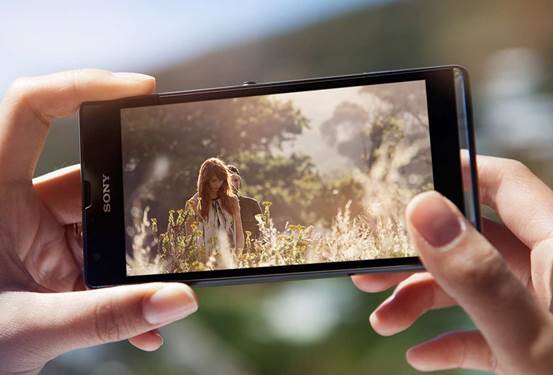
The
4.6-inch TFT LCD screen of the Xperia SP
On the SP, there is an option to activate
Sony's Mobile Bravia Engine 2 for increasing contrast when you watch videos or
view photos. It's great to enjoy your favorite shows on the road - everything
looks almost surreal and 3D. Glove mode is one of the special settings of the
screen. As Super Sensitive Touch version of Sony, it activates when you open
the phone with gloved hands, and work very well when we tested it using
double-thick leather gloves.
Sony's Android Interface utilizes
resolution. You will struggle to find pixelation of any kind, and even the smallest
font is easy to read. Viewing angles are subpar, with the display quickly
washing out after about 30 degrees of tilt. The outdoor vision is not very
good. It is not related to the brightness, and you still can easily check
messages and so on. But it reflects most of the light that is thrown on it, so
glare can get in the way of doing anything more entertaining. On the subject of
brightness, the auto setting is somewhat strange. It seems it uses manual
brightness setting as an excuse, so it really needs to be set manually complete
or nearly complete before the auto box is selected. If not, it will be too dark
for most of the time.
The Gorilla Glass protects the glass screen
is a magnet to attract dirt and oil. If you have a habit of polishing your
phone's face on clothing even when it's not necessary, as the author, then it
does not matter. However, it is confusing to see that after only a few minutes
of hands-on time, the screen looks like it's been attacked by a horde of
sticky-fingered toddlers. While the 720p display offers great detail in movies
and games, it misses more boxes than it ticks.
Software
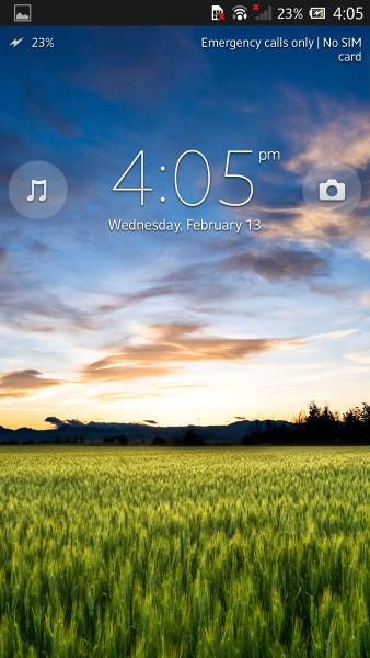
Xperia
SP’s lock screen
The Xperia SP comes with Android 4.1.2
running under Sony's custom interface. Granted it is not the latest version,
but you did not miss much. Compared to the interface of other manufacturers,
such as Samsung's TouchWiz, it's simple and light, prioritize performance
rather than flashy. That is, it does not lack of tricks. From the lock screen,
you can launch straight into the camera or Walkman applications using dragging
gestures, and swiping up or down to unlock the phone creates the same effect as
dragging your hand down window blinds. A similarly trivial animation happens
when you press the power button to create a sleep state. The darkness falls
quickly from top to bottom - an interesting reminder of the era of CRT TV. It
never gets old.
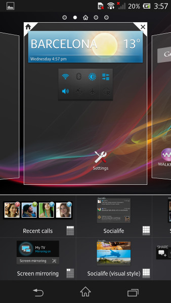
Pressing
and holding an unoccupied space on your home screen brings up the menu from
which you can add or remove panels
Pressing and holding an unoccupied space on
your home screen brings up the menu from which you can add or remove panels,
change theme/wallpaper and add widgets or app shortcuts with ease. Setting up
the perfect home screen is extremely simple and fast. The notification pull-down
only has a few things to switch on and off on the fly, but there's a
quick-setting utility that offers greater choice. The app drawer is a bit too
realistic for our liking, but at least there's one quick way to uninstall
applications, such as pre-installed McAfee Antivirus & Security, which
requires you to register from the moment you boot up for the first time.
That's not the sum of bloatware, either,
and much of it is un-installable. Sure you'll use most, such as the application
of Google, Facebook, YouTube and Sony applications (such as Walkman and Album,
which utilize transparent element mentioned earlier). However, we may not need
Sony's media-sharing, music-streaming, feed-aggregating and store-curating
apps. Sure, leave them on there for us to check out, but don't force us to
stare at unnecessary icon clutter forever.
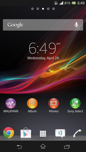
Sony
Xperia SP’s interface
We've already mentioned the Mobile Bravia
Engine 2 mode for video and pictures, and within the various menus are a bunch
of other settings to fiddle with. Stamina Mode adds battery-management options
(although you do not really need to worry about battery life). Clear Phase and
xLOUD technology will augment loudspeaker output, and in the Walkman
application, you can activate ClearAudio + which promises greater sound
clarity. It also makes audio crisper and boosting volume slightly. A completely
new feature debuting on the PlayStation-certified Xperia SP, and will be
introduced to the other Xperia phones later, that support DualShock 3
controller. Using an extra cable to connect the pad charger with micro-USB port
of the SP, it is recognized immediately. If you prefer to use it over wireless,
a single tap will immediately pair devices via Bluetooth. They said it is
compatible with many games, and while it worked perfectly in GTA III,
communication was problematic in others. Touchscreens aren't the favorite input
method for some games, so if you remember to bring the pad with you, it could
make for more comfortable sessions on long journeys. And when you get where
you're going, you can transfer to a larger screen via MHL outputs.
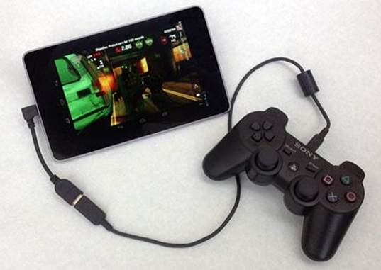
Using
an extra cable to connect the pad charger with micro-USB port of the SP, it is
recognized immediately.
With a lack of physical keys on the front
of the device, a substitute bar with buttons for back, home and recently
accessed programs is (almost) always present at the bottom of the screen. While
watching the video, it disappears to give you more space, but it proved to be
very inconvenient for some applications. For example, it remains on the screen
while playing games, and in portrait orientation, it sits there just begging to
be accidentally tapped. And you will run into it quite often with disappointing
results.