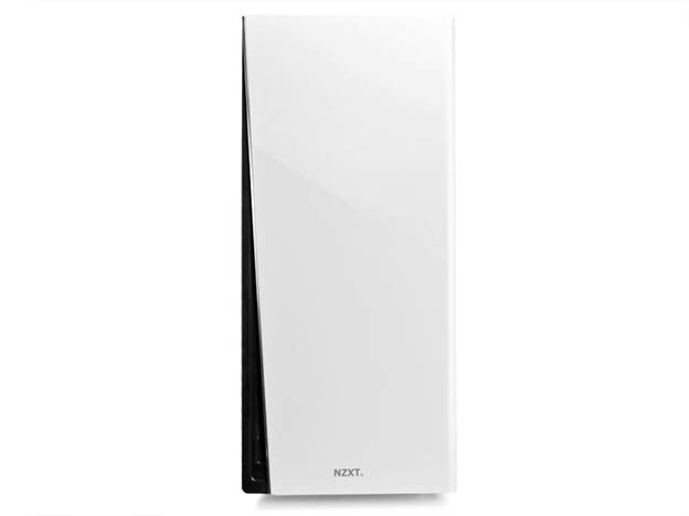
It's spare and sparse, but with a touch of class...
It’s been mentioned elsewhere, but the preponderance of
white hardware this issue is a little odd.
White can look good, but it brings a number of challenges
when it comes to PC hardware, and NZXT’s H230 Classic case tackles them all
with varying degrees of success. The most obvious issue is going to be one of,
effectively, personal hygiene. It won’t take long for the area around the power
buttons to pick up a filmy stain from constant use, and the case’s front door
could, too, build up a similar level of unsightly grunge. It will be up to
users to really stay on top of keeping their case clean, so if that sounds like
too much effort for you... you may want to look elsewhere.

NZXT H230 Classic
The other issue is that white is kind of formless, so it’s
very easy for a white case to look quite blobby. NZXT has solved that with a
bold black insert on the main case door, and black highlights internally.
Though, speaking of internals, you still have an all-white interior to keep in
mind, so if you don’t open your case much the built up dust and grime most
cases gather could look quite, er, striking.
Thankfully, the H230 doesn’t feature a side-panel window, so
any lapse in case-cleanliness will be between you and your hardware.

White is kind of
formless, so it’s very easy for a white case to look quite blobby
Build-wise the H230 is pretty simple, and it makes for an
interesting comparison with Corsair’s similarly priced new Carbide model. The
H230 will cost you, on average, $10 less, but for that saving you get a mix of
different features. On the one hand, you get one less fan, but on the other,
you do get foam-lined side-panels and rubber-grommet mounts for the PSU, and mesh
along all the lower-mesh panels. You don’t have a lot more room for extra
cooling, though, with no top mounts - but there’s a second mount on the front
of the case, and one on the bottom.
The tool-less option in the H230 are plastic, and - very
oddly - the HDD drive bays face backwards, out of the right-hand side of the
case. Each of the two drive cages can take three SSDs or HDDs, and the top cage
can be removed entirely to make room for larger video cards. There’s not a lot
of room for cable management, and while the official specs cite a good 14mm of
clearance behind the motherboard plate for cable management, in practice the
foam-padding makes this a much more congested space. But if you’re not
installing a tonne of drives or other internals, it should do just fine.

There’s not a lot
of room for cable management
It’s plain that NZXT is aiming for a definitely sense of
luxury despite the H230’s price point. The front door panel hinges smoothly,
the power buttons feel nice, and the hi-fi style feet are rubber footed and
classy. Less classy, however, are some very literal rough edges. The edges of
the steel panels are just a little rougher than we’d like, and the very pointy
expansion socket screws are a real danger to anyone blindly trying to plug in cables
or pick up their PC. It would be very easy to hurt yourself, which is not a
good look.
NZXT are very close to getting it right with the H230. It
looks sharp, has some nice features for the price point, and is certainly
sturdy. But a couple of poor build decisions make it hard to recommend above
other brands in a very competitive market.

It looks sharp,
has some nice features for the price point, and is certainly sturdy
|
Specs and price
·
Price: $90
·
195 x 447 x 502mm (W x H x D)
·
7x expansion slots
·
3x 5.25in drive bays, 6x 3.5/2.5in drive bays
·
1x 120mm fan (front), 1x 120mm fan (rear)
·
2x USB3, audio ports
·
Steel and plastic construction
Rating
·
Build quality: 2/6
·
Features and design: 4/6
·
Value for money: 4/6
·
Overall: 3/6
|