Compared with S and U, Xperia P is more
suitable, beautiful and fashionable because of the solid metal cover, 4-inch
screen and dual core processor helping it run smoothly.
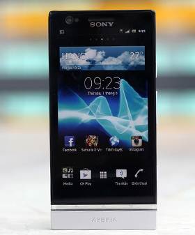
Xperia
P has the similar appearance with Xperia S and Xperia U
Besides that, the highlight of Xperia P is
Magic White – technological screen that is able to display more brightly and
clearly but still save 50% of consumed energy compared with normal screen
technology.
Located in the moderate – high quality
segment, Xperia P is equipped with 4-inch screen with qHD resolution and
integrated Mobile Bravia Engine. It has 1GHz NovaThor U8500 dual core
processor, Mali-400 graphics with 1GB RAM. Sony equips P with 8 Megapixel
camera which can record Full HD video, and secondary VGA camera in the front.
In addition, the product also comes with
NFC and supports Smart Tag of Sony. However, it is a pity that Xperia P still
runs Android 2.3 and has not been upgraded to Android 4.0 yet.
Currently, Xperia P has just appeared in
stores of Sony and the official price is 600USD.
General evaluation
Advantages
Good appearance and block design
Run smoothly with TimeScape interface
Recharge quickly
Integrated NFC, support Smart Tag
Play music well with In-ear headphone
included
8 Megapixel camera for high-quality photos
Disadvantages
Medium battery duration
No expandable memory card slot.
The bottom of the cover may be loose
easily.
Design and screen
Still keeping general design of NXT
smartphone series, Xperia P is the best model among three products of Sony.
With 4-inch screen, its actual dimension is 122 x 59.5 x 10.5 mm, so it fits in
hand better than Xperia S and U. Having monolithic design with aluminum
material, Xperia P seems more lightweight than some people expected when they
held it. It weighs only 120g, lighter 5 grams than ultra-thin One S model of
HTC.
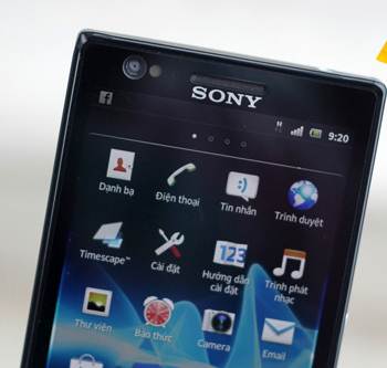
The
top of the 4-inch screen looks so cramped with Sony logo, a speaker, sensors, a
secondary camera and a notification LED.
The front is a 4-inch screen with black
glass protective cover that is able to avoid scratches. The border of the body
is slightly prominent compared with the front and it is easy to see when users
stroke and slide on the touch screen. A transparent plastic strip is right
below the screen with logos of Back, Home and Setting touch buttons.

Three
touch buttons are put in transparent plastic strip now.
The interesting and different point between
X and S – transparent plastic strip of P is also the place of three touch
buttons instead of three small dots at the top and users will not choose
wrongly anymore. However, like Xperia S, plastic strip of P only emits white
light and it can’t change colors as flexibly as U.

Xperia
P with aluminum monolithic cover
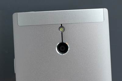
8
Megapixel camera with LED Flash. The rectangular section above is made of
plastic and it has the same color with aluminum cover.
With translucent aluminum cover, the back
of Xperia P is designed as a block and a bit curved prominently towards the
center. 8 Megapixel camera is made carefully and put at the center with the
Flash above and NFC chip below hidden under the back.
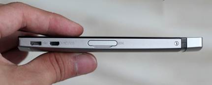
The
left edge with sim card slot, micro HDMI port and microUSB port
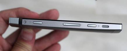
The
speaker with metal net is put in the opposite edge.
There is no expandable memory card slot and
the battery can’t be replaced, so microSIM slot is moved to the left side by
Sony. This slot has a firm cover button. Users should keep in mind that
whenever the sim card is withdrawn and removed, the mobile phone will
immediately restart. There are microHDMI port and micro USB beside microSIM
slot.
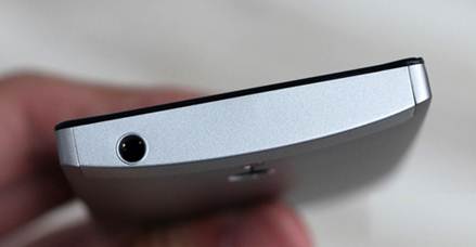
Unlike
two sides of Xperia, the edge on the top and bottom seem quite well-aired with
only and 3.5mm headphone jack and a small hole for speaking micro.
Xperia P is a smartphone made very
carefully for the design which is detailed to very little points such as two
screws in the body. Connective ports are naked but designed quite keenly and
thoroughly. However, putting ports closely may make users plug wrongly if they
don’t pay attention to the logo beside. Meanwhile, left side is the place of
lock button, volume key and professional camera button.
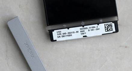
The
body inside the plastic strip is printed information about the mobile phone.
However, removing multiple times may cause this part of the cover to be loose
and infirm.
Another point in design of P that many
people wonder is that the bottom of transparent plastic strip can be removed
like U and not mounted closely like Xperia S. With plastic instead of aluminum
material, this cover doesn’t stick with the body but become loose, which makes
us feel lost when holding a monolithic product.
The distinction of Xperia P is also White
Magic screen. Not only does the screen of P use LCD IPS Reality technology with
Mobile Bravia Engine on S and U, it also uses pixel structure with 4 sub-pixel,
adding a white pixel to 3 basic sub-pixel: red-green-blue (RGB).

Pixel
structure of White Magic screen of Xperia P
As the explanation of Sony for White magic,
the screen of Xperia P offers ultra-high brightness up to 900 nits (even higher
than Nova screen of LG). Thus, the advantages are displaying in the sunlight or
in places with strong light and reflecting images clearly with higher contrast
than other LCD screens. In addition, White Magic is also considered to help
save 50% of consumed energy compared with normal screens.
With 4-inch size and 960 x 540 pixel
resolution, P is able to display sharply. Observing at normal position, it is
hard for viewers to recognize pixels on the screen and they only see very
smooth images. The pixel density of Xperia P is 275 ppi, not as high as S.
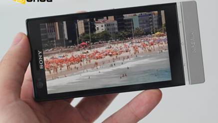
The
screen displays beautifully.
Exclusive image processing technology of
Sony helps colors shown on Xperia P become vivid and realistic, but they are
not too barbarous like AMOLED. However, with White Magic, this model doesn’t
reflect black as well as Xperia S. Nevertheless, Xperia P is still one of
smartphones possessing the top screen currently.