iBooks author was the digital textbook
creator app that was going to change the face of educational publishing. Except
educational publishing wasn’t sure it wanted its face changed, and in any case
the app, though cleverly simple, wasn’t quite up to the job. Now Apple has
released version 2, along with a smaller iPad that looks ideal for schools. So
is world domination back on? And what kinds of books can you make with this
second-generation tool? the original iBooks Author, launched on the Mac App
Store in January 2012, was an imagination-capturing release for both
professionals and enthusiasts, providing a fairly comprehensive yet easily
grasped set of layout tools for creating and publishing interactive titles for
iBooks on the iPad. Offering a more visual, designable and interactive format
than conventional ebooks with a creation process an order of magnitude simpler
than digital magazine publishing solutions, this came at the compelling price
of free, with the proviso that your iBooks Author output could only be sold
through the iBookstore (although it could be given away elsewhere) - hardly a
worrying limitation when the iPad was the only tablet in town.

iBooks
Author, launched on the Mac App Store
iBooks Author’s first incarnation was
strong: stable, fast and capable of professional-looking output, it offered
anyone access to a platform with over 100 million users. But we highlighted a
number of limitations when we tested it, including the inability to embed
typefaces rather than just relying on the few included with iOS. Given that
whatever else we say when we mean ‘book’, we always mean a collection of text,
the inability to set type however you wanted was a pretty serious limitation.
Commercial and amateur users alike quickly
generated wish lists for the next version, and while Apple had its fans’ attention
for the announcement of the iPad mini in September, it let slip iBooks Author
2.
So has illustrated book creation for the
iPad finally come of age?
One of the bigger
changes is to the way iBooks Author deals with portrait orientation.
Publishers who wanted to use totally bespoke layouts had no problem with version
1’s landscape layouts: while templates were offered, you could opt to start
every page completely blank and add your own elements, much as you would with
InDesign or QuarkXPress. But pages for readers who preferred portrait
orientation forced you into a much more straightforward, fixed design. Elements
could be shuffled around a bit, but there was no way to create a completely
bespoke portrait page.
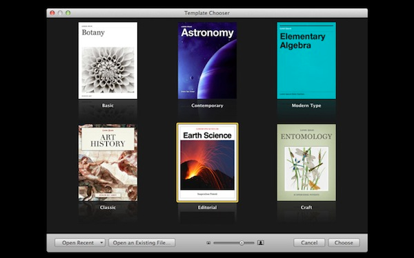
iBooks Author 2 allows more flexibility,
and the template chooser now includes six portrait-only options. Books with a
mix of portrait and landscape orientation remain a little stymied, though. The
landscape version of your book can be put together from completely blank pages,
but you’re still forced into a preset layout in portrait mode - you just have a
better choice of presets. The only way to have a completely bespoke portrait
layout is if you create a portrait-only book.
The debate about whether consumers really
expect every bit of content on their iPad to work in both orientations will continue
to rage, but it would have been useful for Apple to allow a little more
flexibility for ambitious designers.

iBooks
Author 2 on Mini iPad
Interactivity has had a welcome boost, and
one of iBooks Author’s more annoying omissions - the inability to make text
boxes with scroll bars for overflowing copy - has been rectified. You can now
create text boxes which, once full, simply add a scroll bar that the reader can
use to move through the content: useful for chapters that have too much text
for a single page but not enough to justify the creation of another spread.
Designers adapting text- heavy print books will also appreciate this, as it
allows you to place large images on a page as well as a lengthy text box.
iBooks Author 2 also goes someway to
alleviating the pain of not being able to set conditions such as OnClick: now,
if you create an image thumbnail, the interactivity panel of the Inspector allows
you to set a checkbox that sends the image full-screen. It has potential for
the creation of pages with multi-image galleries - on the proviso that you
don’t mind full-screen images having the same masking and aspect ratio as their
thumbnails. As with many of iBooks Author’s undeniably clever features, the
limitations become clear once you start attempting customisations, and the
feeling is all too familiar to users of version 1.
There’s the further addition of a popover widget, which creates a small image
box that when tapped produces a larger text box over the top. The pop-up box
can contain text, images or shapes, and again is a useful way of fitting more
content on a single page.
Again, it’s imperfect. Pop-over boxes are
limited to 740 pixels wide, so you can’t use them as a way to create a
full-screen pop-up of an image thumbnail, say. You’ll also find, if you’re
using a pop-over to house a large image, that if your image comes anywhere near
the sides of the popover box,
iBooks Author adds a scroll bar, even if the image doesn’t run outside the
box’s boundaries.
Finally, there’s no way to highlight a
selection of text and have that produce a pop-over box when tapped - although
you can create a pop-over box thumbnail placeholder, drag it over your text
and change its opacity to 0% to create that effect.

Now,
any OpenType or TrueType font can be used in iBooks Author
Font handling has been
completely overhauled. Previously, although you could open the OS X font picker
and apply any font on your Mac to a text selection, that font wouldn’t appear
in the deployed iBook, as iBooks Author’s documentation warned you. The only
fonts you could use successfully in an iBook were the ones supported by the
iPad natively. Not only is this a rather small selection, but an even smaller
subset of the available faces are well suited to body text setting. Picking
from two or three credible options might be acceptable, though not ideal, for
staid textbooks and novels, but iBooks with an emphasis on design tended to
look rather homogeneous, and designers were again left feeling they were
tweaking ready-mades rather than creating publications their way.
Now, any OpenType or TrueType font can be
used in iBooks Author. The font data will be protected to prevent unlicensed
re-use and embedded in the final product. This new feature has the potential to
open a can of worms all over the non-professional publisher, who may not
previously have braved the learning curve of font licensing: while using a font
in a print publication is simply what fonts are sold for, distributing it in an
electronic product can open the door to whole new worlds of terms and
conditions pain.
Fortunately, this type of protected
embedding has been the norm for years now in PDFs and PDF-based digital publishing,
and many if not most modern type licences explicitly permit it, without the
metrics-based fees imposed on web fonts.
Although the typographic controls available
aren’t as detailed as those in traditional page layout apps, font embedding
finally makes iBooks Author a usable publication design tool, and allows
creative pros and, just as importantly, experimenting learners to create truly
individual books.
There are other changes throughout. For
example, embedded audio files now get not only a play button but also a
timeline scrubber to allow users fine playback control.