Understanding the changes to
navigating your media in iTunes 11.
The latest version of iTunes
(go.macworld.com/itunes11) makes a number of changes to the way you view the
content in your library of digital media files. Most significantly, iTunes 11
adds a new set of views and gets rid of most of the viewing options that were
available in previous versions.
With iTunes 10, you could view your music
(and other media content) in any of four ways – via List view, Album List view,
Grid view, or Cover Flow view. (Some types of iTunes content, such as apps,
didn’t offer all of those options, however.) In iTunes 11, those four views are
more or less gone. Here’s a look at the different views that iTunes 11 offers.
Songs view

The
latest version of iTunes makes a number of changes to the way you view the
content in your library of digital media files
What Apple used to call List view is now
known as Songs view. In functionality, it’s similar to what iTunes 10 offers
though the new, narrower font in iTunes 11 makes this view look more compressed
and harder to read. Songs view shows you one song per line, with no artwork.
You can still use the Column Browser in
Songs view, but there’s no artwork viewer at the bottom left of the iTunes window.
As a result, when you select a track, Songs view doesn’t provide any visual
indication of the album it belongs to.
The main advantage of using Songs view is
that it allows you to display any columns you want with information from your
media files’ tags. Simply press z-J, and check the columns that you want to
display. This View Options window is greatly improved in iTunes 11, with
different types of tags grouped into sections to make them easier to find.
Albums view

Albums
view, which is the new default view in iTunes 11, resembles iTunes 10’s Grid
view in most respects
Albums view, which is the new default view
in iTunes 11, resembles iTunes 10’s Grid view in most respects. With Grid view,
though, you could change the size of the displayed artwork, whereas in Albums
view you can’t. to change the sort order of your files in Albums view, press z-J to display
a small window that lets you specify two sort criteria. For example, you might
choose to sort your content by artist and then by title.
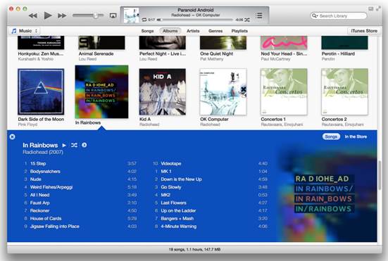
Supplementing Albums view, a new Expanded
Album view lets you see what’s inside an album and then start playing items or
otherwise work with them. This view works with movies and TV shows, as well as
with music. Click an album’ artwork image, and you’ll see the album’s contents
displayed below the artwork, in a color scheme that iTunes bases on the
dominant colors in the artwork. (You can turn this option off if you wish:
Choose iTunes ð Preferences; click the General tab; and then, in the
Views section, uncheck Use custom colors for open albums, movies, etc.)
Artists and Genres Views
iTunes 11 also introduces Artists view and
Genres view. When you choose one of these views, you’ll see a sidebar at the
left of the iTunes window that displays a list of artists or of genres,
respectively. For artists, iTunes uses the album art in your library to
illustrate the entries; for standard genres, it uses built-in icons; but if you
have custom genres, it uses art from one album of that genre.

For
artists, iTunes uses the album art in your library to illustrate the entries
These views let you examine various details
of your music such as album art, album titles, track names, and track
durations. And if you’ve entered the year of the album’s release, you’ll see
that date displayed to the right of the iTunes window.
You have limited sort options in these
views. You can press z-J, and choose to sort by title, genre (in Artists view) or artists
(in Genres view), year, or rating. With each of these views, you can alter the
size of the artwork via a slider; and in Artists view, you can group
complications in a separate section, so that the tracks of compilation albums
won’t be scattered throughout the list.
The Albums and Genres views display a new
sidebar at the left of the iTunes window. In previous versions of iTunes, the
sidebar displayed your media libraries, any connected devices, and your
playlists, among other things. If you miss that old sidebar, you can re-enable
it by choosing View ð Show Sidebar, or by pressing z-<Option>-S.
It will stay at the far left of the iTunes window, regardless of which view you
choose.
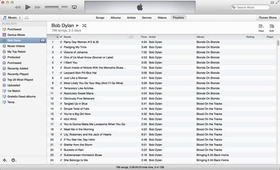
Playlists view

The
new iTunes’ Playlists view shows all of your playlists in a sidebar at the left
of the iTunes window
The new iTunes’ Playlists view shows all of
your playlists in a sidebar at the left of the iTunes window, and is available
only if you don’t display the sidebar mentioned above (which displays your
playlists just as it did in iTunes 10). If you select a playlist, you can see
it contents; and for each playlist, you can choose a number of view options.
You can display the Column Browser (View ð Column Browser), or you can click the View button at the top right of the iTunes
window to choose any of three ways of seeing the playlist: List, which is a
simple list view; Grid, which resembles Albums view; and Artist List, which is
similar to Artists view.
You may also see your view options by
pressing z-J; these options vary depending on which of the three views you
choose. In List view, for example, the View Options window lets you choose
which columns to displays,; in other views, you can select a sort order, choose
whether to group compilations, and adjust artwork size.
New and improved?
iTunes 11 gives you some new ways to view
your media. Even if you’re a longtime iTunes user, take time to try out the
different views and their options so you can figure out which ones work best
for you. But don’t forget that you can switch views at any time, depending on
what you’re doing in iTunes. Though adjusting to the new views can be a bit
frustrating, you may find them to your liking once you’ve had time to get used
to them. And if you still have the new setup and you feel adventurous – you can
always try rolling back to iTunes 10.