Screen
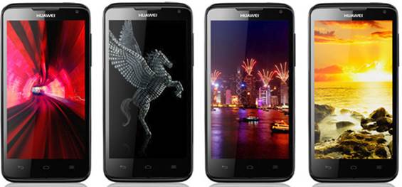
D1 Quad XL uses the 4.5-inch HD Toshiba
IPS+ screen, 1,280x720 with 330ppi pixel density. Thanks to using in-plane
switching tech, it delivers excellent viewing angles and bright screen. High
resolution and non-PenTile BGR matrix stop us from seeing the smallest pixels,
giving us the opportunity to better enjoy what we’re watching; however, on the
other hands, colors on the screen lack saturation, especially when comparing
side-by-side to One X Galaxy S III. The dark isn’t as dark as you will see on
an AMOLED screen, and the white is not as bright as Super LCD 2 and the colors
are not as vibrant. Luckily, the direct sunlight is not a problem (as long as
we increase brightness to its max). Film still proves to be an interesting
experience, and we doubt anyone, except for the screen lover, will have problem
with it.

Ascend
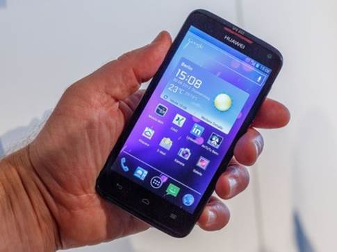
D1 Quad XL’s screen
Software
When talking about Android firmware, Huawei
seems to follow either 2 general rules: either sticking to custom Emotion UI or
coming close to vanilla as you may expect from a prestigious manufacturer.
Purist followers will love the fact that the company has chosen the second path
for its high-end model, but not the perfect available copy of Ice Cream
Sandwich that we know and highly appreciate on the devices such as Samsung
Galaxy Nexus. Launching the app, most core apps and the home page are
identical, but Huawei has made some changes for the lock screen and put some
icon themes into the traditional 3D Home launcher. Let’s discuss about some
changes of Huawei. The normal lock screen (as long as you don’t choose the
security lock option) provides a group of fast-access shortcuts pointing you to
the camera, phone log and message beside the standard swipe-to-open gesture
available on most of the Android devices. This interface will look a little bit
different if you turn from 2D unlock to 3D unlock, but the buttons are the same
– and unfortunately we won’t be able to find the way to change them so as to
fit our hobbies.

Huawei
has made some changes for the lock screen and put some icon themes into the
traditional 3D Home launcher
3D Home has been the main factor of Huawei for
a long time, so there’s nothing to be surprised when it shows up here – in
fact, there’s few differences for this special version compared to what we see
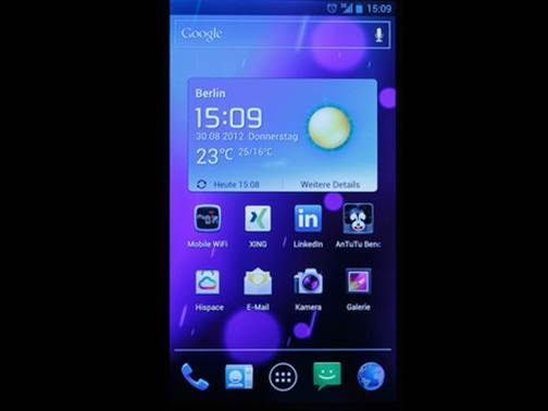
on Honor and Ascend P1. Basically, 3D Home is a separate launcher providing
your Android interface different design and style with the inherent experience.
On the home pages, you will find a group of special Huawei utilities trying to
appear as if they’re jutting out of the screen – if you used to try to draw 3D
cubes on the regular notebook back into the time you’re at school, you will
understand us – but they don’t necessarily carry any new function to the phone.
Entering the app menu, you will instantly see the differences between this one
and the vanilla ICS style: each is arranged into 4x4 grid, instead of 5x4, and
you can’t access the utilities here (you will need to press the home screen for
a while to take a close look at them) at the bottom of each panel, you can find
2 buttons: settings on the right and home on the left (unnecessary feature, as
one capacitive home button always shows up right below the screen) While we
welcome the attempt of Huawei in order to provide choices in UX, we don’t see
any disadvantages in using 3D Home. However, at least it’s easy to swap back
and forth if you want to compare 2 launchers. If sometimes you want to change
the look of the icons and home screen, the ability to choose the themes is
another way to do so. There’re 3 themes available: the existing Android theme used
by default, while the Breeze and Dawn themes are provided to make the home
pages and the app launchers look more Huawei, along with the square icons which
is similar to the cartoon ones. Strangely, the phone doesn’t save your favorite
wallpaper when you change the theme.

D1
Quad XL uses the 4.5-inch HD Toshiba IPS+ screen, 1,280x720 with 330ppi pixel
density.