A brief history of the GUI, David Hayward
takes a look back the evolution of the GUI and wonders just how we ended up
with Metro
Innovative, intuitive, ground-breaking:
these are just a few of the words that some have used to describe Microsoft's
bold new interface, Metro. Frustrating, useless, nasty and bad have also been
bandied around, usually in the same sentence as the former compliments, which
is a little unfair, as we've only had a brief taster of what Metro can do and
how it affects our productivity. But how on earth did we get to this point,
with tiles, apps, icons and graphics?
The graphical user interface (GUI) has
undergone many changes in last 40 years of its existence. From a bleak yet
functional, monochrome look in the early 70s to the modern look of Metro, it's
been something of a rocky road. Originally designed for users to interact with
their operating systems in a more friendly way, the early pioneers of the GUI
served a basic function and that was it. As time moved on and the hardware
along with it, the operating system itself became a more complicated beast and
along with it came the GUI and the users, kicking and screaming about how much
they hate change or having to learn something new.
It soon became apparent to operating system
developers that the GUI had become so much an accepted part of the OS that its
design could make or break the company behind it. So over the next few pages,
we'll have a look at how the GUI evolved from those early days, how it shaped
and paved the way for operating system design and how we've ended up, in 2012,
with the infamous desktop that is Metro.
Xerox PARC
Founded in 1970, the Xerox PARC (Palo Alto
Research Centre) opened up a whole era of computing by developing something
called WIMP, which stood for 'Windows, Icons, Menus and Pointing' device. In
other words, Xerox created the first true GUI. There were minor examples before
that time, using the likes of light-pens or text-based links (Sketchpad, for
example), but the PARC Ul was the first to combine all the features we use even
today, along with radio buttons and checkboxes. The first computer to fully
utilize this new system was none other than the Xerox Alto, a weighty looking
beast, but surely the great-granddaddy of the modern PC.

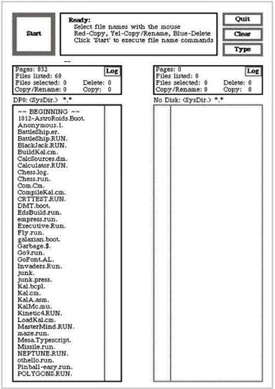
The Xerox PARC, the first guide
As you can see from the screenshot
(courtesy of toastytech.com) there wasn't much to it other than a basic file
manager operation, but it set the line for software developers to cross.
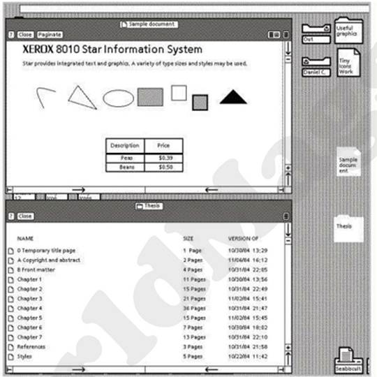
Xerox 8010 star information system
Through the 70s, and into the early 80s,
the operating system evolved and started to become more complex in its
operations. After all, it now had a larger hardware base to cater for and an
increasingly growing popularity in electronics and computing from the general
population.

As the GUI evolved, icon and windows appeared
Following from the Xerox PARC was the Xerox
Star, also known as Viewpoint. This was the first GUI to be regarded as a true
integrated desktop, as it featured a bitmapped display, support for a
two-buttoned mouse, folders, Ethernet networking and access to print servers.
It was pretty awesome and well ahead of its time.
Looking at the screenshot, we can see that
it's not all that dissimilar from the likes of GEM for the Atari ST, or even
the early versions of X window System, so even as far back as 1981 we were
beginning to see the use of multiple open windows, desktop shortcuts and icons
for links to the computer's hardware.
VisiCorp Visi On
Interestingly this operating system, in
spite of being a very brief flash in the pan, was the first OS developed for
the new-fangled IBM Personal Computers. Built to be installed and run on top of
DOS, this OS was scheduled for release during the fourth quarter of 1983.
However, various problems cropped up, as they inevitably do, and the shelves
didn't see a single copy of Visi On until at least the beginning of 1984.

The Visi On could make astounding graphics, like pie charts!
The response to Visi On wasn't quite what
the developer, Personal Software, had hoped for. For starters, the OS cost
something like $500, and on top of that it required the use of a specialist
mouse, which would set you back $300. Should you require something in the line
of office applications, these would go for $400 for the spreadsheet software,
$250 for Visi on Graph (a graphing program, funnily enough) and $375 for the
word processor, making a complete package totaling $1,765 enough to make even
the most affluent business user's eye's water. Coupled with the extortionate
price of the software, Visi On only worked and installed on the highest-spec PC
at that time, needing a whopping 2.5MB of hard drive space to even install on.
The funny thing was, it wasn't even that
effective as a GUI. There were no icons or folder shortcuts, and it ran like a
pig in treacle. In fact, as far as the development of the GUI was concerned,
Visi On was more of a step backwards than the step toward the future. But one
particular user saw the vision that was Visi On - so much so, that according to
history he immediately set forth a project that would, in a year or so, become
the most used GUI in the known universe. However, before Mr. Gates’ famous GUI,
there was another noteworthy release during 1984...