A mere year before, 1983, saw the release
of Apple Lisa system 1. Unfortunately it didn't survive very long, but it paved
the way for the first GUI developed for the Macintosh: System 1.0.

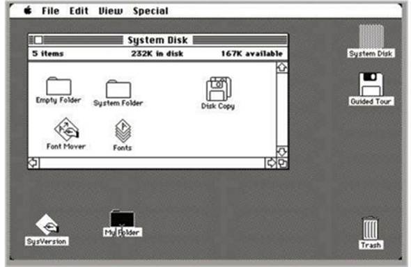
A Mac's first outing (although this screenshot is actually 1.1)
It was a massive leap in evolutionary
terms, although the writing had been on the wall for some time. Mac OS System
1.0 featured icons, menus, and multiple windows. You could move the icons on
the desktop and copy and paste folders by dragging and dropping. Although the
system could only run one application at a time, it came with 'Finder', an
application that could manage files and launch programs, and when a disk was
inserted it appeared on the desktop.
It's all stuff we take for granted
nowadays, but in its small way Mac OS System 1.0 set the bar for what an OS and
a GUI should look like and, more importantly, what it should be able to do for
the user.
The screenshots are apparently from System
1.1, but there was little change to the look of the GUI during the first few
updates.
Amiga Workbench 1.0
In the timeline of evolution, if 1984 was
the year that the GUI started to walk on two legs, instead of all fours, then
1985 would be the year it invented fire, tools, and farming, shaved off all its
bodily hair and went to a disco. Yes, the Amiga Workbench had landed, and it
was incredible.
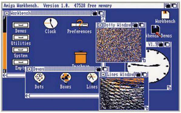
Admit it; the Amiga workbench was
fantastic; it even looks cool by today's standards. As far as the evolution of
the GUI goes, AW1.0 was well and truly ahead of its time, with things such as a
recycle bin, proper animated menus, multi-state icons, stereo sound, left-click
and right-click menus, the ability to launch more than one application at a
time and the real star of the show: color! Indeed, Workbench was fit to perform
all of its duties in glorious black, white, blue and orange out of a palette of
4,096 and at a resolution of 640 x 512.

The Amiga Workbench 1.0, with eye-catching (eye-watering) color schemes
However, one of the greatest features that
the Amiga Workbench offered was the underlying customizable interface. With
this the Amiga user could alter the colors, change the appearance of the icons
and even manipulate the state of the pop-up menus. This level of customization
was unique in such a way that the Amiga Workbench earned the respect of the
first wave of tinkerers and, although often regarded as chaotic, the Amiga
Workbench showed the world of personal computing that the GUI was the future.
Looking at the screenshot (thanks to
www.guidebookgallery.org), you can see how, by using the snapshot, a user could
open an application, or a window, and keep its settings, dimensions and content
every time they booted into the GUI. In many ways, it's thanks to Amiga Workbench
that we now have a customizable desktop that remains unique to the user and
makes the GUI not only a friendly interface but also a very personal one.
Windows 1.0
1985 also saw the release of Microsoft's
new 16-bit entry into the GUI market, Interface Manager, or as it was later
called: Windows 1.0. Although Microsoft had entered the race a little late, it
had spent its time wisely and created a GUI that was not only colorful, but
could also make use of the existing DOS programs as well as the new executable
that were designed purely for Windows.
Often regarded as the front-end to DOS,
Windows 1.0 featured many great advances over the traditional OS and GUI. For
one, it had dedicated drivers for graphics cards, mice, keyboards and printers,
whereas many operating systems of the day communicated with these devices from
the hardware level. Multi-tasking had been improved and opened windows tiled on
the desktop, making a neater viewing area, and Windows 1.0 featured a number of
pre-installed or supplied applications: Fileman, calculator, calendar, card
file, clipboard viewer, and clock, Notepad, Paint, Reversi, Terminal and Write.
Windows 1.0 fast became the operating
system of choice for many business users, as well as the home user. It was much
cheaper in comparison to the competition, costing in the region of $99, and it
didn't require the equivalent of a Cray supercomputer to run, needing only a
bare minimum of 256KB of memory in order to get up and running, plus it didn't
require the user to gain a PhD in computing science prior to moving the mouse.
Windows 1.0 was designed to represent information in a way that closely
resembled the way people worked at that time; it worked off the shelf and, due
to its pricing, it allowed the education sector to get their hands on PCs for
classrooms, thus bringing the next generation in line with the Microsoft GUI
and ethos.

A Windows 1.0, the start of something big
Windows looked good. It could run
everything the PC users had at the time, it was simple to use and it was
intuitive. The use of drop-down menus, scroll bars, better-looking icons,
dialogue boxes and application switching made many millions for Bill and his
band of merry men and became the stepping stone to making the GUI an
independent operating system, as opposed to being installed on top of DOS.