As an Apple user, you will know how well
your devices work with each other. Your music is available on iTunes whether
you use an iPod touch or a desktop. Your Photo Stream updates from MacBook to
iPad and you can stream movies from your iPhone to Apple TV.
Since the introduction of iCloud, the
integration between Apple devices has also been closer, with data stored on
this machine automatically available on another machine.
It’s a nice thing to look at. However, when
you step out of the walled garden, you will be shocked. It’s for sure you can
download iCloud for Windows. It will allow you to share contacts and upload
images to your Photo Stream, but the application support will be limited. In
reality, it’s mainly limited to Apple applications.

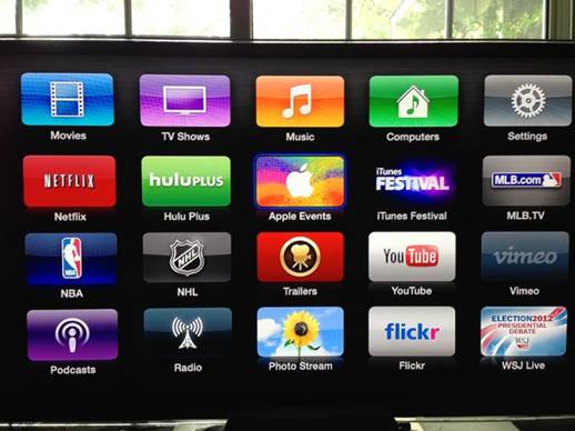
Apple
has announced they’re going to be streaming the iPad mini event live on
Apple.com, and the Apple TV.
We can say the same about Microsoft’s
operating system. For instance, it will integrate perfectly with Windows Phone and
your Windows 8 tablet. Even it will stream music and videos to Xbox. But just try
connecting your iPod or iPad to it. Unless you have installed iTunes, it’ll
come to nowhere.
In this case, Mac still wins in spite of
the focus on Apple. Why? Be realistic! How many people bring their music
collection on a Zune with them? We bet that even Bill Gates has an iPod.
Mac: 6/10
Windows: 5/10
Gestures
Experienced iOS users will see that
Mountain Lion’s gestural interface seems to be a bit inflexible. However, Apple’s
operating system is a transitional one when talking about gestural control. And
with a trackpad, using full-screen applications and Mission Control is very
easy and natural. The operating system also feels comfortable with a keyboard
and a mouse.
And that’s the reason why Windows 8 is
really different. The Microsoft design interface – as Metro is currently called
– is totally optimized for touch screens. It’s surprising that it tries to
redefine gestures. Swiping to close an application or dragging to open the Charm
bar on a touch screen is very natural without copying iOS. However, many of
these gestures perform clumsily in environments without touchscreens.
Mac: 7/10
Windows: 6/10
Messaging
With increasing updates for iOS and OS X,
Apple has done a great job of integrating messaging between different Apple’s
devices. FaceTime works smoothly on iOS 6 as well as on Mountain Lion. Messages
sent to iPhone or to email addresses are smartly routed, wearing away the
frontier between moving and staying at the desktop.
So, what does Microsoft’s operating system
offer? Its messaging has been overhauled in the style of Windows 8. Tidy and
simple, the application automatically adds other accounts that you have
connected by using People (although in the Preview version we tested it had
some problems). However, there’s no SMS integration and, generally, the
functions are not as complex as those of the desktop application that it
replaces, Windows Live Messenger.
Mac: 9/10
Windows: 5/10
Web Browsers
Let’s get straightforward here: Safari is
better than Internet Explorer. It puts the usability and web standards first,
and is built around an engine that renders HTML5 faster and with greater fidelity.
Windows 8 version of Internet Explorer
tries to find a way to reduce much float and bulk associated with previous
versions, and it looks great in full-screen mode. But Microsoft doesn’t include
one version of Internet Explorer, but two instead. One is optimized for the
default Windows 8 full-screen view, while the other is used on desktop in
windowed mode. And they are different, with support for different plug-ins.
Both use the same rendering engine, but which of them is loaded at runtime
depends on which mode you’re in. This strengthens the feeling that Windows 8 is,
in fact, two operating systems disguised to be one.
Mac: 8/10
Windows: 5/10
The Cloud
Both Windows 8 and Mountain Lion have the
built-in cloud integration, but the focus is different. In Apple’s operating
system, it’s iCloud, a service that enables you to sync files across all the
devices, even with Windows PCs.
In Windows 8, this service is SkyDrive, a cloud
storage and document editing solution available for 6 years. However, until
now, with Windows integration, it has really felt “of the age”. Overhauled with
a Windows 8 style minimal layout, SkyDrive is currently easy to navigate and
comfortable to use. With online versions of Word, Excel, OneNote and
PowerPoint, it is a useful supplement for the operating system.

Overhauled
with a Windows 8 style minimal layout, SkyDrive is currently easy to navigate
and comfortable to use.
Mountain Lion doesn’t have the same
built-in document editing features. To open iWork files, you have to install
local Pages, Numbers or Keynote.
Other features associated with iCloud in
Mountain Lion are smoothly integrated in Windows 8. Connect your Google or
Facebook accounts and you’ll see those contacts and calendar of yours
automatically updated!
Mac: 6/10
Windows: 7/10
Application switching
Windows 8 has changed the way users switch
between applications, but retained the same keyboard shortcuts. It’s a rare
moment of user experience awareness in an upgrade that mostly lacks it.
However, app switching doesn’t work the way
it does in Windows 7 (or Vista). Alt (Option) and Tab enable you to cycle
through all the open applications. Once activated, you can move from this
application to that one by using arrow keys. Holding Windows or Start key and Tab
now shows a sidebar displaying all the applications that are running in Windows
8 mode – and only these kinds of applications. Unfortunately, arrow keys don’t
work here, and losing Windows 7’s Flip 3D application selection feels like a
withdrawal. Once again, the lack of the interface cohesion between desktop and Windows
8 mode is disappointing.
Within three upgrades, OS X first matched
and then outdid Windows’s application switching. With Mission Control (which
combines all the best from Expose and Spaces) and OS X’s context sensitive Dock,
it is invincible. Mountain wins this battle.
Mac: 9/10
Windows: 4/10
Full-screen applications
Frankly speaking, Windows had won the
full-screen battle until Lion jumped in. Cross-platform apps like Chrome and
Firefox, which gladly run in full-screen mode on Vista, can’t overcome OS X’s
windowing restrictions. That changed with the built-in full-screen application
support in Lion and Mountain Lion.
Now, it’s certain that you have realized Windows
8 is an operating system with two halves. It’s a Windows 8 style overlay and
under it lies the old background screen. From the Start screen, there are some
applications that work well in full-screen mode. The tidy minimal design rules
are suitable for the new Mail application, for instance.
There are still some conflicts between the Windows
8 layer, where things look similar and work in the same way, and the old
background layer. For example, using Chrome in full-screen mode disables any
access to the Charm bar.
Mac: 6/10
Windows: 6/10
Photos
Windows 8 comes with some applications,
which feel like the simplified versions of the tools that Microsoft used to
provide with its OS. It’s the same with Photos. On the positive side, it
integrates with Flickr, Facebook and other online accounts so that you can
quickly view all your images in one place. But it’s all you can do. You can
view them but can’t edit, crop or resize them. That makes it less perfect than Preview,
built into the OS.

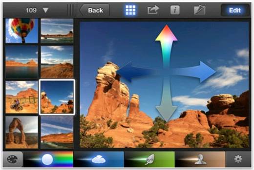
iPhoto
does all that Photos does, integrating Facebook and Flickr.
iPhoto does all that Photos does, integrating
Facebook and Flickr, enabling you to share images via email or across Apple
devices, but it still has the built-in image editing features.
Mac: 8/10
Windows: 5/10