Notification facelift
Jelly Bean introduces an overhaul to
notifications, with new APIs so developers can make better use of this vital
area of the user interface. Gone are the neon blue highlights, now replaced
with a much cleaner white.
The first thing you’ll notice with Jelly
Bean notifications is that they have increased in size. Not only does that make
them infinitely more readable, but in the case of built-in apps such as Gmail,
you can now get a quick preview of incoming emails as they arrive.

Notification
facelift
You’ll also see that the current time is
now displayed prominently on the left, with the day of the week stacked atop
the date. And there are still handy buttons to jump straight into Settings or
to clear notifications, and on the Nexus 7, a software-based rotation lock
button has also been added.
Speaking of the tablet-centric version,
while notifications take up the entire display on a smartphone, the window
appears smaller on the Nexus 7, displaying the name of your currently connected
wireless network or carrier at the bottom.
Jelly Bean also introduces a method for
completely hiding apps from sending notifications, but Google has tucked it
away in an unlikely spot. Pulling up an App Info window now includes a ‘Show
notifications’ box underneath the ‘Force stop’ and ‘Uninstall’ options.
Clever updates
Where supported, dragging up on a
notification with two fingers collapses it to a single row, while doing the
reverse expands it. In the case of Calendar events, users can even act upon
information, such as snoozing an alarm or emailing invited guests.
Likewise, incoming missed phone calls can
be returned quickly thanks to a handy callback button, while your photographs
can be shared with ease right after being taken. Oddly, the stock Gmail and
Email apps don’t currently allow you to act upon their incoming missives,
although a tap quickly opens the respective app.
For now, these two-finger drag actions are
exclusive to Android’s built-in native Google apps, but that’s likely to change
in the days, weeks and months ahead as developers tap into the new API to
create their own third-party apps.
Widget resizing
While Apple’s iOS operating system remains
widget-less, Google continues to refine the feature, with users now able to
drag widgets on to their homescreen, which then automatically shifts app icons
around it, enabling you to change the size of the widget, depending on how much
screen space you are willing to give up for it.
Whereas previous versions of Android made
it quite tricky for widgets to be placed anywhere on your homescreens, Jelly
Bean now very kindly moves icons or even other widgets out of the way for you
so you can get exactly the customized layout that you want.
And even more importantly, supported
widgets are now completely resizable - tap and hold, and up pops a blue dot on
each of the four sides. Grab one, move it to your liking and then tap outside
of the widget to commit the change to your phone.

widget
resizing
Multimedia market
The biggest improvements to Google’s
content store are the addition of magazines, television shows and movies, which
you can now rent and buy. Well, buy at least in the UK, due to copyright
matters. And we can also finally access the Music section of Google Play over
here.
The extra content now available on these
shores is good news for us UK dwellers - ever since Google Play emerged from
the ashes of the Android Market, we have been very impressed with the slick
user interface, ease of use and the really neat integration with other apps.
Hey, good looking
Although many of our complaints with the
stock Android graphical interface were wiped away with the introduction of Ice
Cream Sandwich, the majority of Android users are still living with a heavily
skinned version of Google’s mobile OS.
This latest major release of Android finds
Google at the top of its game, showing restraint when it comes to feature bloat
while streamlining what worked so well with Ice Cream Sandwich - and making it
even better.
During the boot-up, Jelly Bean briefly
follows the familiar white Google logo with a pulsing blue, red, green and
yellow X, before being presented with the fine-tuned U I.
The custom Roboto font is still very much
present and accounted for (with a few subtle tweaks depending upon where you’re
viewing it), and Google has reduced Android’s dependence on neon blue accents,
while retaining the same dark background.
In short, it’s the arts of Honeycomb and
Ice Cream Sandwich you know and love, with the odd nip and tuck resulting in
welcome improvements.
Camera action
The decision not to include a rear-facing
camera on the Nexus 7 was remedied by the excellent Nexus 4 and 10, which both
feature excellent front-facing snappers for video chatting. However, no matter
what Nexus you have, the photo experience is excellent.
Nexus users, however, will benefit from
being able to review photos straight from the camera application, and swipe away
photos you don’t want to keep, similar to the way you can dismiss applications
using the Recent App feature.
When it comes to looking through your
pictures, you can now pinch into a filmstrip mode, making it easier than ever
to find that embarrassing picture you simply must delete, with a simple swipe
down resulting in the offending image being vaporized. You can, of course, get
it back with a tap.

Camera
action
One size fits all
Google has tailored its new operating
system so it adapts itself to present information in different ways, depending
on the screen size of the gadget it is running on.
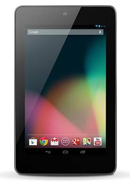
For example, on the Nexus 7 tablet and
other forthcoming 7-inch slates, the user interface will differ from the
experience on 10-inch Jelly Bean tablets. The Nexus 7 boasts a vertically-
themed Ul, while 10-inch slates will proceed with the landscape navigation and
notifications interface that we’re used to, thanks to the likes of the Samsung
Galaxy Tab 10.1.
Keyboard strokes
While we found the Ice Cream Sandwich soft
keyboard to be one of the best available on any mobile platform, Jelly Bean
kicks things up a notch or two by making the keyboard smarter and more accurate
than before. Text-to-speech has also been improved with Android 4.1, while
voice typing now works even when you don’t have a data connection.

Keyboard
strokes
The keyboard’s ‘brain’ grows over time,
with its bigram prediction engine evolving, depending on your text and typing
habits. It’s also much simpler to switch languages, handy if you're the
multilingual type.