It isn't often that you start using a new
piece of software and chortle in delight, but that's exactly what happened when
we first launched Excel 2013. The reason: lists.
Let's say you run a query on a database
that returns the usual mishmash of poorly formatted data. Imagine hundreds of
rows, consisting of three columns filled with obscurely worded job functions,
email addresses and phone numbers. To make sense of the data in Excel 2013, you
type in the first row's values and then start to repeat the job for the second
row. Excel then instantly applies the lessons learnt to the rest of the data,
with all the columns below filling with the correctly formatted data. It's the
sort of problem 100-line macros have been written to solve in the past.
Chart clever
Chart handling is the real star of Excel
2013. Excel 2010 and 2007 both made it much easier to create
professional-looking charts than previous versions of Excel (and any of its
rivals), but you had to wade through a wizard-style interface to find the style
you wanted. It's easy to see how many people would plump for the familiar ones,
without giving much thought to what presentation best suited their data.
Excel 2013 is far cleverer. Its main weapon
is the Recommended Charts feature (see Inserting and amending charts, right).
If you have a simple set of figures - say, two rows of six columns - then it
will suggest basic charts such as a line bar or a clustered column.
Now imagine you're dealing with more
complicated information. Eight rows of data, the bottom of which is
automatically summed from the seven above it. This time, Excel will suggest a
chart that presents the total figure as a line and plots the figures that make
up that total as bar charts beneath it. If you don't like that choice, there
are others to pick from.

Recommended
Charts makes it harder to pick the wrong chart for your data.
Let’s make amends
Forgive us our obsession with charts, but
we're also big fans of how easy it is to make amends once a chart is in place.
In our example of the six columns of data, the final one was the sum of all the
previous, and this was skewing the relative sizes. Click anywhere on the chart
and you'll see three new icons appear to its right; for now, it's the bottom
one we're interested in.
Called Chart Filters, it allows you to
deselect (or reselect) any data you want to remove from the chart. In our
example, getting rid of the Total figures is a matter of a single click. The
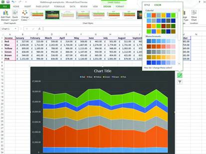
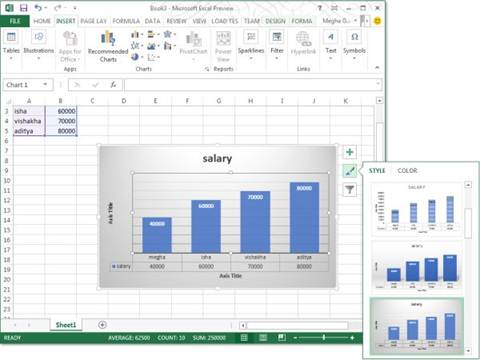
middle icon (Chart Styles) is all about appearance, allowing you to pick from a
selection of predefined styles - 3D graphs rather than 2D, perhaps, or using a
black background rather than white.

We're disappointed to have only eight
styles to choose from, however, and that it isn't possible to replace a default
style with our own preference. While you can make dozens of tweaks if you head
to the Chart | Design ribbon, we'd like to set a few house styles to apply in
an instant. The topmost icon refers to Chart Elements: think axis labels,
gridlines and trend lines. So you can switch them off and on, and adjust their
position.
If you're trying to make a point in a
meeting, you may also find yourself using Excel 2013's animation skills. Want
to show the effect of 500 sales versus 200? Change the value in the table and
the chart animates, redrawing the axis scales as it goes. It hammers home the
point far more than a changing figure ever will.
Quick analysis
One of Excel 2007's best innovations was
conditional formatting. Taking a table of data and applying formatting based on
the values of the cells, with one obvious example being sales figures: the
highest figures would be shaded vibrant green; the worst vibrant red; the rest
would gain a shade somewhere in between.
Excel 2010 added extra niceties, such as
Sparklines. These analyzed the figures from a row of cells and placed a graphic
in the cell to their right to give a visual representation of the data. You
could choose a line graph, bar charts or a simple win/loss image. While Excel
2013 doesn't add many conditional formatting features, it makes them easier to
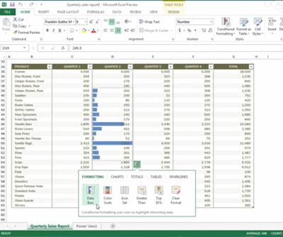
apply. Select your table of data and a Quick Analysis icon appears at the
bottom right; click it and you're greeted with a mini options menu that lets
you select the most common conditional formatting options (such as the color
scale mentioned above, or selecting the top 10% of results).
You can also use this menu to add charts,
tables and Sparklines, but we like the Totals feature. Choose this to instantly
sum figures (either at the bottom of columns or to the right of rows), count
values and calculate averages.

Conditional
formatting can help to make sense of tables of data: Sparklines can show
trends.
Making sense of data
PivotTables come to the fore when handling
interconnected data: the sales figures for a toy shop chain, for example, where
the figures apply across product type, month, unit sales, sales value, sales
person, district, promotions running - the list goes on.
They provide a way to view data through
whichever lens you choose: you can see at a glance how effective each sales
person was compared to others; track the success of your promotions; drill down
to one month's figures.
Previously, no-one could call themselves a
master of Excel unless they could tap into the power of PivotTables, but Excel
2013 allows even casual users to take advantage. It's similar to Suggested
Charts, but you select the data and click on the Suggested PivotTables icon.
The feature that's generated much
excitement among those working in business intelligence is Power View. Only available
in the Office Professional Plus version, it has the ability to turn a mass of
data into meaningful graphics - ideal if you need to present complex
information such as sales by location, especially as you can integrate Bing
Haps. Coupled with the PowerPivot add-in, it turns Excel into a genuine
business intelligence tool, giving even small businesses the means to
intelligently analyze their data - and act on it.

Want
to see how many products you’re selling by location? Power View gives you this
kind of business intelligence at your fingertips.
The small things
Anyone who works with multiple worksheets
at one time will appreciate that Excel 2013 opens files in different windows,
making it easier to have one sheet open on the left-hand screen and another on
the right.
But there are irritations, too. We'd love
to switch off the swooshing animations Microsoft seems so keen on; they can be
a distraction. It's also astounding that two people can't work simultaneously
on the same Excel file, given that "collaboration" is as big a
buzzword as "cloud". But you can't: the same old "File is
locked" warning appears as always.
Despite these rumblings of discontent, we
can’t hide our admiration for Excel 2013. Of all the Office components, its
changes are likely to have the biggest effect on people's working lives.
Inserting and amending charts

1. Excel 2007 introduced excellent charting tools, but Excel 2013 makes
it easier to use them thanks to Recommended Charts. Select your data, in this
case the amount of profit from each color of toy sold, then head to Insert I
Recommended Charts.
2.
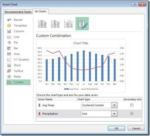
Since our data includes totals based on the
results, Excel has worked out that we’d benefit from a mixed chart: clustered
columns to show how each color of toy sold, and then a line above them to
indicate how the total sales vary over time.
3. Our table includes an extra column at the end for the total sales
per color, and this is skewing the results. Click anywhere on the chart and
three icons appear: click on Chart Filters at the bottom, deselect Total from
the categories, and then hit Apply. It’s gone.