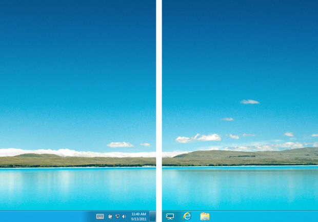
For those lucky enough to enjoy the desktop
real-estate of dual monitors, Windows 8 offers improved functionality over
previous versions of the operating system, but at the same time, it also does
something rather odd.

Dual
Monitors in windown 8
I have a dual-monitor setup and have done
for some time; it greatly aids with productivity and helps me write from one
medium to another while researching. When I first installed Windows 8, it
automatically found monitors, and positioned them accordingly, displaying an
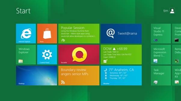
extended desktop across both. However, when I entered the new UI, it only
appeared on the primary screen, with the desktop being shown on the second.
Apparently, this is a feature that
Microsoft has decided on, and despite the much improved usage of the extra
desktop space offered by a dual-monitor setup, there’s no way to extend the new
UI so that it fills both monitors. You can quite happily duplicate or have the
new UI on one screen or the other but not extended across both.
The problems this causes come to light when
you have a lot of apps, tiles and groups. Despite being as near as possible,
there are instances when an individual will require a lot of quick-launch
applications to inhabit their UI. This user will then have to, on the one
monitor, use the slider or mouse wheel to move horizontally along their UI
setup to locate the tile(s) they want. Personally, although I like UI, this use
of the single monitor is just crazy, and it gets worse.
No doubt you’ve all heard of Windows 8’s
ability to snap two apps to the left and right of the screen? In essence, this
works perfectly fine, but only on the one monitor! Even having a perfectly
respectable resolution of 1920 x 1080, when two apps that are developed to be
viewed in full screen are running side by side you inevitably encounter some
rather tedious viewing problems – in other words, it quickly becomes nigh on
impossible to view the content of the side by side apps.
You can choose which display the new UI
will be present on, as it will always default to the primary monitor, so even
in a situation of three or four monitors you’ll have to nominate the primary.
This would work if the primary monitor (i.e. the one that the new UI will run
on) is a touch-screen, but under normal circumstances this isn’t an option
that’s likely to happen.
There is an ongoing (and rather heated)
discussion regarding the UI and multiple monitors currently raging on the TechNet
forums. Many users are amazed that Microsoft has not included the option to
extend the UI across both multiple displays, thus in reality only showing half
a display.
The Microsoft representatives who have
commented on the forum questions have done so to the best of their abilities,
but comments such as “We’re all still learning of the different ways to do
things, so I apologise for not having all the answers” are hardly inspiring,
especially as they comes from the horse’s mouth, so to speak.
As to whether this is something that will
be fixed before the release to the general public or if it’s more complex than
that and would require a future service pack download remains to be seen. To
our knowledge, Microsoft isn’t planning on fixing something that it doesn’t
regard as broken. Perhaps, though, the pressure from the multi-monitor
community will force the hand of the development team to include a UI expansion
across multiple monitors.
However, it has to be said that the desktop
side of things looks perfectly fine, with some online themes from Microsoft
that now fully support a dual setup, expanding the ever changing images across
both monitors while retaining the high-definition look and feel. To be honest
though, I miss the Aero depth and the slight visual improvement that came with
it. The wallpapers look great on the Windows 8 desktop, but they seem a little
flat when compared to Windows 7 on the same PC. It’s a nit-picking point, I
know, and eye-candy isn’t everything, nut Windows 8 has the resources available
to pull off something astounding, but it doesn’t.
Performance
I won’t go into intricate performance
benchmarks, or Windows 7 versus Windows 8, as that appears to have been done to
death over the last week or so. What I will mention is the face that, yes,
Windows 8 starts considerably faster than any previous Windows, by a factor of
several seconds, even more when using a moderately powered PC and an SSD, and
there is no noticeable lag with nay of the programs I have since installed.

Windows
8 starts considerably faster than any previous Windows
The issue of performance is one that’s
often bewailed when an operating system is released or a major upgrade for an OS
is installed. Most of the time the average user is quite content that the
system boots up, regardless of the speed in which it does it. Windows 8 takes
its performance seriously, and in doing so it has included a radically updated
Task Manager.
The new Task Manager launches with by
default with an extremely minimalistic approach by showing only those
applications that are currently running and nothing lese – no percentages,
amount of resources being used or anything. However, clicking on the ‘More Details’
button at the bottom of the window reveals quite the opposite
From viewing virtually nothing, to suddenly
viewing something that would be at home on the floor of the Stock Exchange can
be quite a shock. In the first tab alone, the Processes tab, you’re offered a
breakdown of each program – CPU percentage, Memory, Disk and Network – with the
amount of resources each is using, in either MB or Mbps. Each program is
grouped into Apps, which are currently running; Background Processes, which
aren’t and Windows Processes, which consist of both. Each individual program
can be further expanded (by clicking on the right-facing arrow next to its
name) to reveal to active process that’s being used by the program in question.
For example, a browser would show the active tab, Microsoft Word would show the
active document and so on.
The Performance tab displays levels of
information we’ve never seen before in a default Windows program: CPU speeds
are displayed, along with the Up time, the number of cores, and each cache’s
available memory. The available RAM slots are numbered, hard drive average
access times are displayed and the Ethernet section shows DNS information as
well as IP4 and IP6 addresses.
The other tabs are no exception: App
History, Start-up, Users, Details and Services all provide the minutiae of
Windows 8’s resources, and what it’s currently up to. Unfortunately, the
Resource Monitor has stayed very much the same from its previous outing in
Windows 7, but then with the levels of detail the new Task Manager goes into,
there seems very little point in ever entering the Resource Monitor, as was
once the norm. perhaps Windows 8 is the last we’ll see of the Resource Monitor,
as there’s no doubt Task Manager will be improved as time goes on.

Microsoft’s
web browser has seen a lot of ground lost in the battle of the browsers, with
many users now opting for the likes of Chrome and Firefox, so can IE10 pull a
rabbit out of its hat for Windows 8?
Next up, staying on the topic of
performance, is the much maligned Internet Explorer. Microsoft’s web browser
has seen a lot of ground lost in the battle of the browsers, with many users
now opting for the likes of Chrome and Firefox, so can IE10 pull a rabbit out
of its hat for Windows 8?
IE10, in Windows 8, has caused some
confusion thus far, as it appeared to be two different versions in the same
operating system: one being a full-screen app accessed via the new UI and the
other being the familiar ‘e’ icon, accessed from the taskbar.
You can control the desktop version of
IE10, the one that’s launched from the taskbar, in the normal fashion. In other
words, you can set the home page and access all the various options. The IE10
that’s an app, launched via the UI, will use the settings from the desktop
version (e.g. home page setup) but operates separately from the desktop
version.
It may sound confusing, but it’s not and
its certainly nothing to get all wound up about. For those who use the UI more
than the desktop, the IE10 app will cover you. It’s exactly the same as if, or
rather when, Chrome or Firefox release a Windows 8 UI app for their browsers.
Regardless of the different versions, the
performance of IE10 is quite easily the best yet, from any of the previous versions
of Internet Explorer, but it’s still behind the rest of the browser pack. A
standard web page – such as the Micro Mart forum, for example – will load up
adequately and show no sign of lag, but when compared to the like of Chrome of
Firefox, it can be a good couple of second behind them.
Then there’s the future of the web
technology WebGL. Microsoft has, at present, no plans to officially support
WebGL in Internet Explorer, due to the potential security risk it represents,
as per the requirements of the Security Development Lifecycle. Depending on how
you look at this, it could be a killer factor of Windows 8. On one hand, you
have a browser within an operating system that’s adhering to a strict security
policy. On the other hand, you have a browser and a company that are refusing
to implement the latest web-based technology, despite the fact that the other
major browsers include it. Either way, it’s little wonder that the number of IE
users is dropping at an alarming rate.