We work our way through Microsoft’s latest
operating system
A few months ago, I downloaded the Consumer
preview of Windows 8 and, hand on heart, I was not impressed. Metro (as it was
known as back then) didn’t make any sense, there was no Start button, Internet
Explorer didn’t have any toolbars, the apps were bleak and pitiful, and it took
a good 15 minutes to work out how to switch the thing off.

Windows
8 Special?
Then came along the Release Preview. It was
much of the same, in most respects, but the one thing that had changed and made
a world of difference, was me. I stopped looking at Windows 8 as the train
wreck everyone was claiming it to be and started to be more positive, more
interested and more enthused with the UI. The result was that I came to
actually like Windows 8, along with its radical UI.
Now I’ve had the pleasure of receiving a
copy of Windows 8 Pro RTM. This version is the code that will ultimately be
shipped out to the punters in a matter of weeks, aside from a few updates that
Microsoft will dish out before then. It is exactly the same desktop, UI, IE,
apps and everything else that will be packaged into the shiny new box.
It’s quite a slog going through the entire
operating system with a fine-toothed comb, so we’ve broken it down into
easy-to-swallow chunks. After all, this is a brand new operating system, and
while we may not cover absolutely everything, we’ll try our level best to
incorporate what we think is important to you, the end user. And the verdict…
well, you’ll just have to wait until the end.
Installation
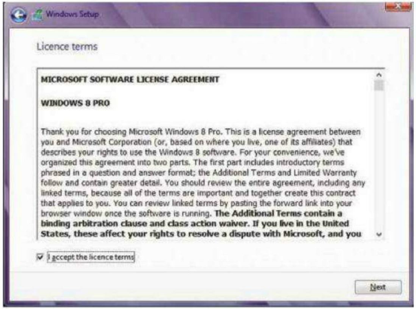
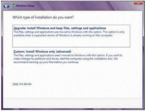
The modern Windows installation is a
familiar place to many of us, and you’ll be glad to know that not a huge amount
has changed since the Windows 7 install GUI. As per the standard now, you
choose your language and keyboard layout, you enter the product key, and you
agree with the licence terms. You’re then given the choice of upgrading an
existing operating system or the custom method of a fresh install. I went for
the custom method, a fresh install that wouldn’t be tainted by any
customisations, applications or drivers from a previous Microsoft outing. After
that you get to customize your hard drive, with the default system-reserved
space, although it’s now considerably bigger, being 350MB on a 120GB hard
drive, whereas Windows 7 was just over 100MB.

The
setup is familiar by now and it features Aero Glass effects
After the restart, you see the 3D Windows
icon on an otherwise black screen, which isn’t too inspiring, but after a short
while you get to personalize Windows 8 by first choosing a color you like. At
this point, it’s worth mentioning some of the wording that’s been included in
Windows 8, especially the installation. It feels as though Microsoft has
realized that it’s offering a product that has quickly become the most
trendy-to-hate technological innovation in modern times, and in light of that,
it’s included some wording that makes the user feel a little more relaxed with
what they’re about to embark on. Take, for example, the personalize screen:
note the UK spelling of ‘personalise’ without the Amercanised ‘z’. moreover,
consider the ‘Pick a color you like and give your PC a name – any name you
want’: again a UL spelling and a feeling of being dealt with as individual,
rather than one of millions of customers. It might seem a little odd, and
nothing too amazing, but the little things do count.
After choosing your color and the name of
your PC, you get to the part that Microsoft has probably dreaded: settings. By
settings, we mean the first round of installing important updates and setting
their update frequency, and by turning on the HomeGroup Sharing functions and
the option to check online for any problems. We also have the more nefarious
settings, the ones that allow an application to locate your whereabouts, or to
provide Microsoft with updated information on the apps you use and how you use them.
And finally, the login: not just a straight forward local login as the default,
but instead an all-out Microsoft online account, which holds such wonders as
offering apps to download, getting hold of online content, or synchronising
settings, accounts and everything else.

We
would recommend you back up and do a custom, clean installation of Windows 8
This type of setup was inevitable in a
modern operating system. Of course, many of us have several devices, all linked
to one another. We share data, email, pictures, music and updates, not just
with each other, but across the computers on our own home networks. So yes, an
all-encompassing account makes perfect sense.
Alternatively, you can opt for a local
account, but simply clicking on the smaller ‘Sign in without a Microsoft
account’ link at the bottom of the page, but where’s the fun in that?
After going through the many options
associated with the setting up of Windows 8, you receive another blank, black
screen. Just when you think all is lost, Microsoft steps in with another nice
touch of word-marketing magic. ‘Hi’ appears on the screen, for several seconds
– enough time for you to digest that the operating system has just said ‘Hi’ to
you. Not hello or welcome or anything as clinical as that, but again, something
personal. The cynical among you could compare this to a doctor who is about to
break some bad news, but it continues, ‘While we’re getting things ready’,
‘Check out the new way to use Windows’, ‘After your new PC is ready’, ‘Move
your mouse into any corner.’ And then a short animated display of the mouse
pointer being moved into the top- and bottom-right corners appears. More
gentility from Micosoft, giving a feeling of handholding and that everything is
going to be all right. Nice, because in a couple of seconds, you’ll enter the
new UI.