Once the setup has completed, you’re taken
to a bright, satisfyingly pleasing desktop, displaying a couple of daisies, the
Recycle Bin, and the Starts button-free taskbar along the bottom, but lacking
in Aero Glass and its associated visual effects – although the open windows and
program borders are dynamic, and shadow the coloring of the active theme. This
choice of first boot to desktop I find quite interesting. I’ve installed
Windows 8 Pro onto a number of PCs since I downloaded it, and all have
defaulted to the desktop after the initial setup, but then boot straight to the
new UI after every subsequent restart thereafter. Why would Microsoft do that?
After all, isn’t the new UI the main focus point? It’s almost as if it’s in
some way ashamed of displaying the UI initially. However, by pointing the mouse
into the bottom-left corner of the screen, we get the UI.

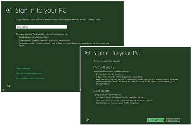
Creating
a Microsoft sign-in account isn’t to everyone’s tastes (above) – Luckily, you
can opt for a local account (bottom)
I’m sure an award will be commissioned in
due course, entitled ‘The Windows 8 new user look of bewilderment award’. It
could be presented to the scores of user who haven’t yet tried the previous
examples of Windows 8. Joking aside, much has already been written regarding
the UI formally known as Metro, most of it damning the interface far into the
seventh circle of hell, but take a moment to have a look around and you may be
pleasantly surprised.
To start with, there’s very little
difference between the final UI and what’s been on offer previously, but those
differences do make a slight impact on the overall experience. For starters, by
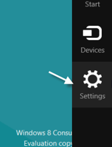
moving the mouse into the bottom right corner of the screen, then clicking on
the ‘Setting’ cog icon, followed by the link, ‘Change PC Settings’, you’re
offered more graphical liveliness in the form of a new lock screen and start
screen. The lock screens will appear when, obviously, you either lock your
account, while away from the PC or when you first boot up and Windows awaits a
user login. You can choose from six default images or select your own.
Similarly, the start screen is the artistry of the new UI; from here you can
alter the coloring, as you did in the setup, but you now also have the choice
of a number of UI graphics, or ‘Tattoos’, to add. These UI Tattoos consist of
various wavy lines, monochromatic images, or full-color cartoon-esque scenes,
but nothing as of yet to include your own images – perhaps this will be
something Microsoft will include in the coming weeks?

For
starters, by moving the mouse into the bottom right corner of the screen, then
clicking on the ‘Setting’ cog icon, followed by the link, ‘Change PC Settings’,
you’re offered more graphical liveliness in the form of a new lock screen and
start screen.
Another noticeable addition to the UI is a
Bing tile, which, when clicked, launches one of the many full-screen images
from the Bing catalogue, with a single search bat in the upper-left quarter of
the screen. The search is dynamic and starts the moment you start typing, with
suggestions appearing in big, clear boxes below Pressing Enter will load up the
results, again in the boxes, and scroll off to the right of the screen. By
swiping, scrolling the mouse wheel, or moving the directional arrow to the
right, you’ll load up the remaining results from a choice of either ‘Web’ or
‘Images’.
Almost instantly, the tiles that reside on
the UI spring into life downloading updated feeds, news casts, the latest
weather, travel advice and financial information. If you take a moment to just
look at the UI, you begin to realize just how busy it soon becomes, and just
how much of it isn’t all that necessary to the average user.
There’s very little doubt in anyone’s mind
who Microsoft has aimed the UI at, and rather than approaching a freshly built
UI with the minimalistic Android way of doing things, it’s decided to include a
wealth of apps that the average tablet user would prefer a healthy choice to
begin with and then whittle that choice down to their particular tastes, which
is entirely possible by right-clicking on a tile/apps, and selecting either
‘Unpin from Start’ or ‘Uninstall’ from the UI taskbar Overall, this leads us
back to the personalizing and levels of choice, along with Microsoft coming
over all friendly, and personable: ‘We are Microsoft, we’ll give you everything
and let you decided what you want.’ Does it work? In short, yes. You can have
the new UI as cluttered or as bleak as you wish. You don’t even need to have
Windows 8 approved apps and tiles on it, because right-clicking any of the
installed program icons on your PC and selecting ‘pin to Start’ will add the
icon to the UI.
The UI is quick, fluid, easy on the eyes
and may well represent the future of the desktop. Yes, using it on a touchpad
may very well be more conducive and natural, but using it via mouse and
keyboard doesn’t stop you from achieving your goal or make you any less
productive. In fact, it makes you think about what to place and where, creating
a neat and more organized working area. After you’ve selected the tiles, apps
and created new shortcuts, then moved them into named groups, you have
essentially made a quick-launch desktop, which works extremely well at being
just that.
One of the best aspects of the new UI is
the type and launch feature, and it’s one that you’ll very quickly come to appreciate.
By simply having the new UI as the active screen, and starting to type the name
of a program, the process will automatically throw Windows 8 into a heavily
modified version of search, whereby it will display the results on the left,
with extra search categories on the right (Apps, Setting and Files). All you
need to do then is click what you want to include, or search within, then click
the correct file, app or whatever to launch. It’s a fast and surprisingly
intuitive method of launching programs and files, which will more than likely
get people’s goat up at first, but after a few tries it soon becomes second
nature.
The Windows 8 new UI isn’t quite the beast
the popular press claim it to be. It’s remarkably configurable in many ways,
and although you can’t totally personalize it as you would the Windows 7
desktop, for example, the UI isn’t a bad place to start.