It would be unfair to suggest that Apple’s
Calendar app divides opinion. In fact, nobody likes it. But convincing
alternatives remain scarce. Menu bar tools such as Fantastical (flexibits.com)
are a help, but BusyCal is arguably the only fully featured standalone
competitor.
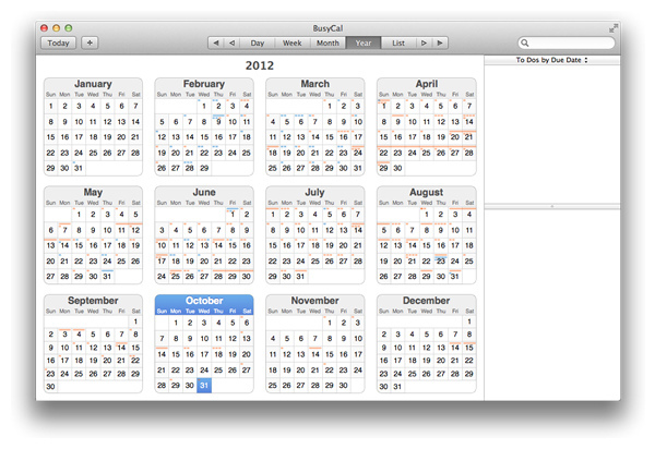
Even if BusyCal 2 looks similar to Calendar,
it comes with a few notable differences. To those tired of Calendar’s
skeuomorphic livery, BusyCal’s simpler interface alone will be a relief. But it
isn’t afraid of adding a bit of colour of its own: the Daily, Weekly and
Monthly calendar views incorporate a live weather forecast and moon phases, for
example. We’d be tempted to dismiss this as almost as gimmicky as Calendar’s
faux leather, if it didn’t turn out to be so functional: when you’re planning a
weekend away, a glance at the upcoming weather conditions proves genuinely
useful.

BusyCal
2
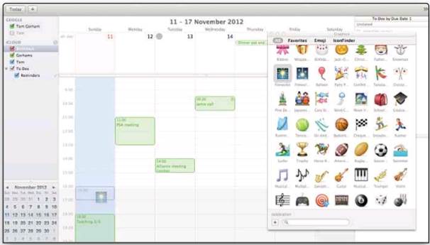
The Graphics palette, on the other hand,
which lets you drag little graphical icons onto calendar events, certainly
belongs more in the ‘quirky’ category.
There are other differences from Apple’s
approach. BusyCal sacrifices some screen space to include an integrated Edit
pane in most calendar views. It’s a price worth paying, as it makes editing
appointments much quicker.
Like Calendar, BusyCal lists calendars in a
pane on the left, but for those with particularly packed agendas, it offers
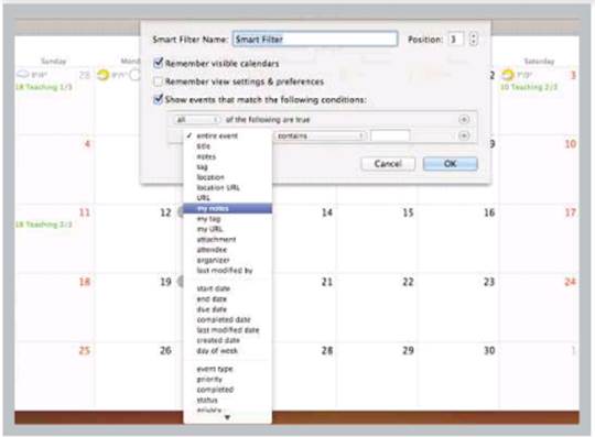
event filtering. BusyCal’s Smart Filter stores calendar views that match
specified criteria, so in a couple of seconds you can create a filter to list
those events across your calendars that, say, take place on a particular day of
the week or include certain keywords. The filters can be stored as toolbar
buttons above the calendar view, so it’s easy to switch between them.
BusyCal is more customisable in other ways,
too, even enabling you to change the number of days in Week view or weeks in
Month view. List view is also sortable according to multiple criteria,
including duration. Used in tandem with a Smart Filter, that feature could be
useful for small businesses when calculating billable hours.

Like
Calendar, BusyCal lists calendars in a pane on the left, but for those with
particularly packed agendas, it offers event filtering
BusyCal also offers anewmenubar listing upcoming
events and offering a field to add new ones using natural language text input.
The menu is neither as good-looking nor as functional as Fantastical - it lacks
a built-in mini-calendar view and a Search field - but text entry works well,
despite being poorly documented. It allows you to create a task by prefixing an
entry with a hyphen, and this is automatically synced with the Reminders app in
Mountain Lion or iOS.
Existing BusyCal users may be irritated by some changes. As part of its adoption of Mountain
Lion technologies - it requires OS X 10.8 - version 2 has simplified how it
syncs calendars, dropping support for Apple’s Sync Services framework. So while
it will work with hosted iCloud and Google calendars, syncing with apps that
use Sync Services - whether Microsoft’s Outlook or via iTunes to iOS devices -
isn’t possible. Local syncing has gone as well: you can’t publish locally
created calendars to Google.
BusyCal is better than Calendar overall,
but it’s only worth the price if you need its customisable features or menu
input. If you’re already using BusyCal, the removal of Sync Services isn’t the
only thing that may deter you from upgrading. Now on sale only through the Mac
App Store, the new version offers no upgrade pricing and will appeal to fewer
users than it should.
Life in pictures

BusyCal’s interface is more restrained,
until you get busy with icons from the Graphics palette
It’s a date

The app’s Smart Filters make it possible to
manage multiple calendars without losing the plot
|
Details
·
Price: $32 inc VAT
·
From: Mac App Store
·
Info: busycal.com
·
Needs: OS X 10.8
·
Pro: More customisable
than Calendar * Menu bar menu
·
Con: Loss of
syncing options * No upgrade pricing * Won’t work on OS X10.7 or earlier
|