Expert looks at Windows 8. What went
wrong and can it be fixed?
It's fair to say that after the
disappointment and criticism heaped on Windows Vista, its successor, Windows 7,
managed to be one of the most widely loved operating Microsoft operating
systems ever. It fixed the problems of Vista, added some flashy new ideas of
its own, and generally performed in as rock-solid and speedy a manner as any
version of Windows has ever managed to.
So it was perhaps a surprise when, faced
with unusual levels of goodwill and consumer satisfaction around Windows 7,
Microsoft decided to do a radical overhaul of the interface and release Windows
8 so soon after.
The reason for this unexpectedly rapid
cycle quickly became apparent when people finally got a look at the new Windows
8 operating system. The overhauled interface, code-named 'Metro', was vastly
different from any other Windows release thus far, designed to exercise greater
synergy with the interfaces of other devices such as Windows Phone and the Xbox
360, all of which have moved to a similar tile-based Metro interface.

Windows
8
However, this approach seems to have
backfired. For a variety of reasons, Windows 8 hasn't managed to build on the
success of Windows 7. Instead, it's managed to squander it. Windows 8's
lifespan has been characterized by poor critical response and slow user uptake.
In response to this, Microsoft recently confirmed the existence of something
code-named 'Windows Blue', a service-pack-style update, which will make a
number of changes to Windows 8, and may even renumber it to Windows 8.1 in a
move
the Financial Times described as "one
of the most prominent admissions of failure for a new mass-market consumer
product since Coca-Cola's New Coke fiasco nearly 30 years ago." Hardly a
cause for celebration.
The feeling that Windows 8 is a failure is
backed up by statistics. Microsoft recently reported that it had reached 100
million licenses in the two quarters since its launch last year, but the
numbers hide the more pertinent truth: almost 200 million new PCs were sold in
the same period, and with Microsoft's 90% market share, that should mean a lot
more than 100 million licenses. It shows that there are people actively
declining a copy of the latest version of Windows, even though they essentially
get it included in the price of the system.
A large chunk of those saying 'thanks, but
no thanks' are in the enterprise sector. Enterprise (i.e. business) use
represents half of the PC industry, but a recent TechRepublic poll reported
that only 15% of IT professionals (of 4,000 asked) had deployed Windows 8, or
even planned to deploy it. Such low numbers give the impression that Windows 8
isn't what companies want for their business, and that automatically alienates
half of the potential customer-base.
But what's actually going on here? Is there
something fundamentally wrong with Windows 8? Was it created in such a way that
it was incapable of success? Or is it simply a matter of wrong place, wrong
time? Perhaps more pertinently, does the Windows Blue update have the chance to
make a difference?
In this article, we'll answer those
questions and more as we consider whether Windows 8 is simply off to a slow
start or whether it's destined to be remembered as the operating system no one
wanted.

In
this article, we'll answer those questions and more as we consider whether Windows
8 is simply off to a slow start or whether it's destined to be remembered as
the operating system no one wanted
Interface
Of all the changes made to Windows 8, the
most prominent and radical is in the removal of the Start menu. This piece of
interface design had been entrenched in the operating system's very fabric
since Windows 95 was released the better part of 20 years ago and had become as
closely associated with Windows as the very windows themselves.
Despite occasionally becoming the butt of
jokes ('The new Windows is very intuitive. To shut down your computer, first
click 'Start'...'), the Start menu nonetheless managed to endure through
multiple redesigns, each of which seemed intended to de-emphasize it and reduce
the amount of time users spent there. By the time Windows 7 was released, it no
longer had the word 'start' attached and served mainly as a launchpad for a
dynamically updated list of frequently accessed applications. But the old menu
was still there if you looked for it, and despite some flashy adornments and a
greater amount of screen real-estate to play with, it more or less resembled
the original: a small pop-up list of programs, features and documents.
But Windows 8 took the plunge and did away
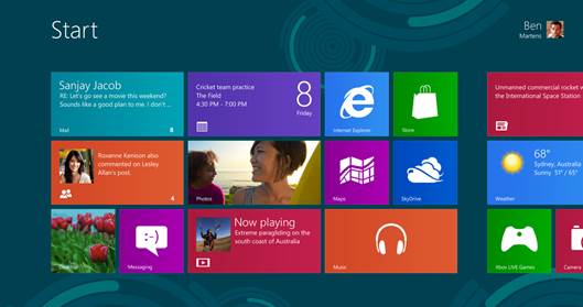
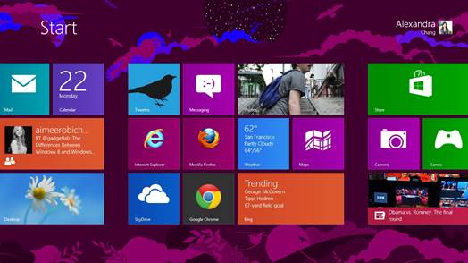
with it completely. Instead of the Start menu, Windows 8 has a 'Start screen' -
an entity that grants access to programs and content of all kinds, but which
uses large blocky 'tiles' instead of a much more simple list, and which fills
the screen, obscuring all else, rather than appearing in one corner. In fact,
the Start screen goes even further than filling one screen, instead stretching
the information on the top level over several. Existing Windows users were, to
put it charitably, flummoxed.
Further complicating the relationship
between the new interface and old users is that the Start screen has become,
quite literally, your first point of contact. It's the first thing you see when
you boot into Windows, and it has to be manually bypassed to even see the
desktop. Windows 8 wasn't even out of beta before people were releasing
programs that could prevent it from appearing first. If that didn't set off
warning bells for Microsoft, what could?
The problem with the new interface isn't
just a lack of familiarity, although that undoubtedly plays a part. Instead,
the problem is that the flow and focus of Windows has changed.
Your desktop is no longer the centerpiece
around which the Windows experience is built; instead it has become secondary
to the Start screen - something people don't know how to use and have no
existing context for.

The
problem with the new interface isn't just a lack of familiarity, although that
undoubtedly plays a part. Instead, the problem is that the flow and focus of
Windows has changed
Even the very design of the Start screen
causes it to actively repel users, swapping precise and small movements with
broader, larger ones unsuited to mouse input and more suited to another type of
user (more on that later). Between an unfamiliar appearance (one emphasized in
all the marketing), a less than ideal design and a poorly established role,
it's no surprise that many users looked at Windows 8 and decided to stick with
what they had. Meanwhile, in the all-important enterprise sector, IT chiefs
felt that the cost of retraining employees to use a new, unfamiliar Windows
interface was too high, the inconvenience too great, to make it worth doing.
If any proof were needed that the Metro
Start screen has been a significant contributing factor to Windows 8's
problems, rumors abound that the Windows Blue update will reinstate the
traditional Start menu and allow users to boot straight into the desktop,
effectively reversing Windows 8's biggest visual design changes. A climb-down,
yes, but one which has the potential to instantly eliminate the biggest barrier
to entry for users, whether home or corporate. Metro isn't going away, but it
may yet be made easier to ignore.