Should you buy an iPhone 5? We look at
Apple’s latest offering
Many Apple products are launched to
something of a fanfare, and the iPhone 5 was no exception. But rather than get
carried away with the high-fiving Apple store staff, let’s start with the
facts: the iPhone 5 starts at US$793.5 for a 16GB model, with 32GB (US$898.5)
and 64GB (US$1048.5) options.

Many
Apple products are launched to something of a fanfare, and the iPhone 5 was no
exception.
This is the sixth generation iPhone that
Apple has made, and replaces the iPhone 4S, which was previously sold for
US$748.5, but is now sold for US$673.5. The iPhone 4 in turn replaces the
iPhone 3GS as Apple’s entry-level model at US$478.5.
Note that these prices are all for an
unlocked model and you will need to purchase a nano-SIM card with call, text
and internet allowance separately. Most carriers will be selling the iPhone 5
on contract with different up-front payment, and monthly rates.
Inside the iPhone 5
Notable new technology includes a 4m
display, a new AG processor (designed entirely by Apple and making the iPhone 5
the fastest smartphone ever), 4G LTE connectivity, a better camera, and a HD
FaceTime camera.
The new iPhone features a black or white
anodised aluminium rear, instead of (smashable) glass, and it’s lighter and
thinner than before (although the increased screen size means it’s taller).
Apple claimed that battery life is better,
although our tests suggest it isn’t, although it does come close. The iPhone 5
battery lasted 8 hours and 21 minutes - 6 percent less than the iPhone 4S and
about 4 percent less than the iPhone 4.
4m Retina Display
The iPhone 5 has a new, taller 4m display
in a 16:9 widescreen ratio (compared to a 3:2 aspect on previous models). This
is the same ratio that most HD TVs offer, and it means that when you turn your
iPhone on its side to watch TV or movies you will no longer see black bars.

The
iPhone 5 has a new, taller 4m display in a 16:9 widescreen ratio (compared to a
3:2 aspect on previous models).
Apple’s not the first to offer a larger
screen, but while Apple has made the display taller, the phone is only 9mm
taller and no wider, so it still feels comfortable in the hand. Apple’s biggest
competitor Samsung’s Galaxy S3 phone looks like an ugly giant in comparison.
Apps can be redesigned for the larger
screen (it’s 176 pixels taller and gains 113,000 pixels), or stay at their
current size with black borders at the top or bottom, which doesn’t look as bad
as you’d imagine. There aren’t many games that have been resized yet, but the
ones that do fit the full screen look special.
Our only grumble would be that when you’re
holding the iPhone vertically (which you do most of the time) it’s hard to see
any real gain with the slightly taller screen. You get an extra row of apps on
the Home screen, and many list-based apps can pack in an extra story or two,
but you won’t benefit from the wider keyboard layout you now get in landscape
mode.
The widescreen is better, but it’s not in
the same league as the jump to Retina Display introduced on the iPhone 4.
Size and design
We can’t emphasise enough how gorgeous the
iPhone 5 is. The amazing thing about the iPhone 5 is that the device manages to
feel smaller, while the screen is bigger. Partly this is a combination of the
lighter weight, slimmer design. and a smaller bezel. The depth is just 7.6mm
and it weighs 112g (the 4S was 9.3mm and 140g).

The
amazing thing about the iPhone 5 is that the device manages to feel smaller,
while the screen is bigger.
The design is similar to the iPhone 4S,
with the same circular volume buttons and mute switch, although upon close
examination they’re all slightly smaller, and the sleep wake button on the top
is slightly thinner.
The only real design change is the 3.5mm
mini jack for the earphones, which has been moved to the bottom of the phone.
We prefer it at the top because the volume controls are more accessible, when
it’s in your pocket.
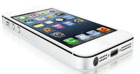
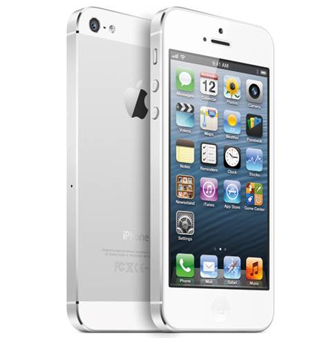
The White & Silver iPhone looks similar
to the white iPhone 4S model, but with a anodised aluminium backing; the Black
& Slate model couldn’t be more black if it tried: black screen, bezel,
slate-like backing, black antenna on the sides; and shiny black logo and
lettering.
Black or white is always a preference
thing, but we prefer the black model. It looks slightly more different to the
iPhone 4S that we’re upgrading from, and looks thinner (black is more slimming,
apparently). Also we think that the black borders that appear on older apps
look better when set against the black surface.