Gorgeous templates are a given; the
real deal here are the tools for the person behind the PRESENTATION
Start Screen
When you’re up the new PowerPoint, you get
a much more useful welcome screen that shows a collection of templates and
themes from which to create your presentation. You can also easily track your
recently opened documents from a list. If you open a previously worked on
document, PowerPoint will let you jump straight to the slide you left off.
Scouring the many new themes, we found that many of them are optimized for
widescreen presentations; this is certainly welcomed as most computer displays
today now come with a 16:9 aspect ratio.
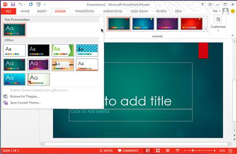
When
you’re up the new PowerPoint, you get a much more useful welcome screen that
shows a collection of templates and themes from which to create your
presentation.
Presenter View
For us, the new Presenter View easily ranks
as the top new addition in PowerPoint. The idea is simple: When you’re doing a
presentation, the display that the audiences have their eyes on (say, a
projector screen) shows the slide you want them to see; on the other hand, your
own screen shows the same slide, as well as an enhanced set of tools that you
can use, and which the audiences don’t see. In this presenter’s view, you can
see the notes that you’ve jotted down for each slide, and you can adjust the
text size larger or smaller so that they’re easier on the eyes.
To draw the audience’s attention to certain
parts of the slide, you can use the on-screen ‘laser’ pointer. Alternatively,
especially when there are elements that you wish to zoom into, use the Slide
Zoom function to magnify an area of the slide. That’s right - there’s now no
need to crop an image and create another slide manually, or resort to that
crude draw-a-box-around the element trick. There’s a timer too for you to pace
yourself. Also, you can quickly check what are the upcoming slides and if
you’re running short on time, you can skip over certain slides, and your
audience would be none the wiser.
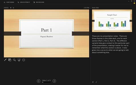
To
draw the audience’s attention to certain parts of the slide, you can use the
on-screen ‘laser’ pointer.
Eyedropper
A slide can look hideous for many reasons.
And one of them is when colors of various elements ‘clash’ with one another.
While PowerPoint comes with theme colors that you can use, there are times you
may want to pick an exact hue for one element (say, the title) to match the color
of another element (maybe the background image) in the slide. The new
Eyedropper tool makes matching colors a walk in the park. It’s found in any
dropdown menu that lets you pick a color, for things like fill, outline, glow,
and text color. And here’s a power user tip: You can even match colors outside
of PowerPoint. By left-clicking within the slide and dragging your mouse, you
can move the Eyedropper cursor outside the PowerPoint window. Let go of the
mouse button when you’ve found the desired color.
Improved Smart Guides
Smart Guides are dashed lines that help you
to align text and graphics as you move them around the slide. While they aren’t
new to PowerPoint, they’ve gained considerable improvements in the new version.
Our favorite is the ability to do equidistant alignment. For example, when
aligning three or more shapes, small arrows will appear to tell you if the
spacings are identical. In addition, you can assign a color to guides, as well
as add guides to a Slide Master. For perfectionists, nudging a shape with the
arrow keys is now more precise.
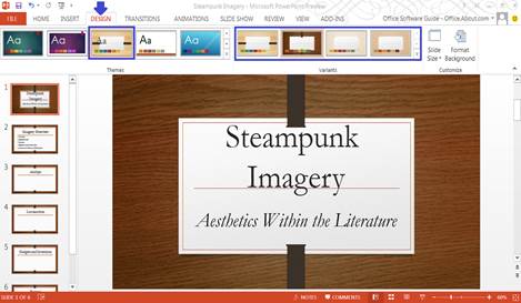
Smart
Guides are dashed lines that help you to align text and graphics as you move
them around the slide.
Outlook
More social, more intelligent, and
more efficient than ever.
Inline Replies
The traditional way of replying to an email
is to hit the Reply button and compose your message in the new window that
opens. With Inline Replies, you can now reply to (or forward) a message from
within the Reading Pane itself; no new window will pop up. If you’ve Lync, you
can start a Lync IM conversation too. When you click somewhere else before
sending out your inline reply (for example, to read another email), the reply
gets saved as a draft automatically. What’s neat is that instead of you diving
into the draft folder to look for it later, just take a glance at the message
list - messages with unsent drafts are marked with a ‘[Draft]’ tag. Speaking of
the message list, you can use commands to quickly flag, delete or mark messages
as read or unread.
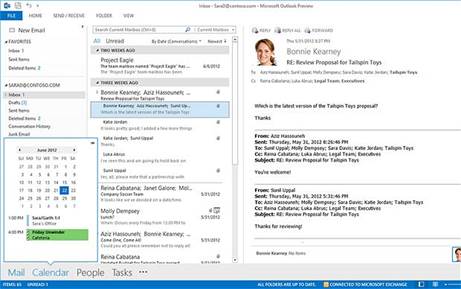
The
traditional way of replying to an email is to hit the Reply button and compose
your message in the new window that opens.
Social Connectors
Outlook embraces social further by
integrating the Outlook Social Connector deeper into the app, offering built-in
support for Facebook and LinkedIn. So unlike Outlook 2007 and 2010, no add-on
or plug-in is needed. Social network details also sync with the People Card,
which basically consolidates all the details about a contact in one place, from
telephone numbers and work address to social media updates and availability.
From the card, you can do things like give the person a call, send an instant
message, or schedule a meeting. The People Card is found at the People section
(formerly called Contacts) just above the status bar at the bottom of the
screen, alongside other main Outlook elements like Mail, Calendar, and Tasks.
Peeks
While the prominent placement of the
above-mentioned Mail, Calendar, People, and Task modes makes switching between
them easier, a lot of times, we didn’t see the need to, thanks to a feature
called Peeks. As the name implies, Peeks lets you peek at something without
opening up a new screen. You can take a peek at your schedule, a specific
appointment, or details about someone you’re emailing. All you need to do is to
hover your mouse cursor over a mode, and a little window that contains the
information will pop up. Yes, it’s hardly earth shattering, but believe us, a
couple of seconds saved here and there tend to work out to be fairly
substantial at the end of the day.
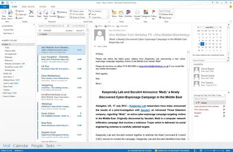
As
the name implies, Peeks lets you peek at something without opening up a new
screen.
MailTips & Policy Tips
We love MailTips as it offers us real-time
information about the message we’re composing as well as the recipients. For
example, it informs us if a recipient is out of the office, if a message is too
large for the recipient’s inbox, and if an address is invalid. MailTips in the
new Outlook now also monitors if your email makes any mention of an attachment.
If it does and you don’t include the attachment, a reminder will pop up before
you can send the email. On a similar note, companies will appreciate the new
Policy Tips (requires Exchange). Outlook will notify you if it detects that
your email contains information that violates the company’s
information-handling policy.