It’s not just Windows 8 that’s been
criticized for expecting users to swallow an unpopular and ill-suited new
interface. When Canonical, the company behind Ubuntu Linux, moved its default
desktop OS interface to Unity in April 2012, it also alienated many loyal
followers.
The issue, like the clumsy Metro tiles that
can’t be avoided in Windows 8, is uncannily similar an interface designed for
mobile devices is blown up to huge proportions, even on large desk monitors
better suited to the mouse and keyboard paradigm.

Ubuntu
12.10 Quantal Quetzal
Ubuntu’s Unity UI grew out of Ubuntu
Netbook Remix, a workaround to make the low-res displays of mini-laptops more
usable. But Unity has gently evolved since it became the default shell in
11.04, to the Unity 6.8 found in this year’s 12.10 ‘Quantal Quetzal’ release.
Thanks to some steady honing, the once maligned
Unity layout is now starting to gain traction with users. Shame, then, that
Canonical has just shot itself in the other foot with the new 12.10 version.

Ubuntu
Unity’s interface has had some tweaks
The flak comes from Canonical’s newfound
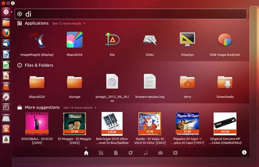
commercial collaboration with . Whenever you use Unity’s search bar (part
of the Dash overlay that emerges from the top left corner of the screen) to
find documents on your PC, your query is sent to the retail giant. It then
offers vague matches with items in its online shop.
For the user, productivity is slowed by
wasted online data traffic, privacy is violated by Unity transmitting the
subject of local searches, and attention is distracted by a panel of thumbnails
comprising retailed rubbish.
If you’re still reading following this
news, either you don’t value your online dignity, or you’ve read the book
before and know about the sort of happy ending.
While 12.10 was still in pre-release beta,
the backlash from users forced Canonical to partly reverse its decision to make
a quick buck, offering a discreetly hidden ‘off’ switch that will keep your
computing life free of nosey shopkeepers. Leave it switched on, and your Dash
queries will be sent not just to , but to Facebook, Twitter and others,
too.
For technical users there have been several
changes under the bonnet. A new Linux 3.5 kernel results in low-level changes in
file systems and the handling of metadata, but little that’s evident to most
casual users. You can also try the new UEFI Secure Boot for improved security.

A
new Linux 3.5 kernel results in low-level changes in file systems and the
handling of metadata, but little that’s evident to most casual users.
More noticeable are smoother interface
graphics, perhaps aided by the move to Mesa 9.0, a software library for OpenGL
3D graphics. We noticed a snappier UI with faster rendering of actions such as
window minimizing, and more convincing transparency overlays when the Dash was
superimposed over the desktop. Even without hardware graphics acceleration, the
Unity 2D interface now feels zippier.
Little treats include the facility to
right-click on Dash results to get a large preview. Certain rich web pages can
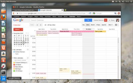
be set as ‘webapps’. When we logged into our work Google calendar, a small
window prompted us to install Google Calendar for extra features and quicker
access. A shortcut then appeared in the Launcher side dock, from which we could
more quickly set calendar events, for example.

In
Ubuntu 12.10 webapps can now be added to the dock Launcher for ready access and
shortcuts in the case of Google Calendar, to create a new event
Other changes include the renaming of
Update Manager to Software Updater, now available only from the Details section
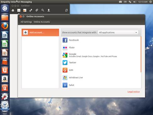
of System Settings. Social networkers can also log in through Online Accounts
in the System Settings.
If you’d rather not broadcast your every
search term to a host of third parties, you can opt out of Ubuntu’s misguided
new commercial initiative. You’re then left with a free operating system that
is fast, stable and a more viable alternative to Windows than ever before.