Plus Or Bust
Since we’ve mentioned it, let’s talk that
elephant in the room: Google Plus. A social network (again) apparently intended
to rival the likes of Facebook and Twitter, but which appears to be looking a
lot like the next Myspace, filled with mournful, abandoned profiles and the
occasional lone voice wondering where everyone is.
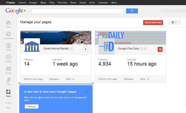
Google
Plus - A social network (again) apparently intended to rival the likes of
Facebook and Twitter
Clearly, Google has staked a lot on the
success of Plus. The failure of Wave and Buzz hurt the company’s image as an
innovative organization that delivered the services people wanted. In fact,
they didn’t just fail to fill user’s needs; they failed to make people
understand what they were actually for. Plus, on its launch, had similar trouble;
presented as unapparent alternative to Facebook, but with the distinct
disadvantage that none of your friends were using it, and very few people saw
the need for a new social network, anyway.
However, it’s clear at this point that
Google is in this one for this long haul. Like Microsoft’s aggressive marketing
of Bing as a rival to its Search product, despite consumer disinterest Google
is ploughing a hefty chunk of its resources into making plus viable in the long
term. It’s integrating profiles with search, it’s putting “+1” buttons on
everything it can get its hands on, shutting down services that might compete
with it – like Reader – and sharing Plus resources with others, like Google
Talk, YouTube and Blogger. At this rate, Google Plus will be the center of
every (and any) Google product.
It’s
integrating profiles with search, it’s putting “+1” buttons on everything it
can get its hands on, shutting down services that might compete with it – like
Reader – and sharing Plus resources with others, like Google Talk, YouTube and
Blogger.
In statistical terms, it’s working. There
are over 500 million profiles on Google Plus at the moment and it’s become the
second most populous social network after Facebook. A major problem, though, is
that a good slice of those accounts are inactive and ignored. Slowly but
surely, however, Google is making it harder not to have a Plus account. Sooner
or later you’ll be required to get one just to use a new feature or service.
It’s already happening to YouTube, which is restricting feature access for up
loaders who don’t have a Plus account. It’ll probably happen elsewhere soon.
This isn’t a product launch; it’s an ideological imperative for Google.
You might not like Google Plus, and we
might not like Google plus, but Google does. In fact, it’s showing an almost
impressively single-minded determination to make the product work. A climb-down
along the lines of Wave or Buzz is unlikely bordering on unthinkable. It’s
betting years of accumulated goodwill against the success of Google Plus, and
at some point we’ll probably be forced to choose whether to activate a Google
Plus account to continue using any Google services we may rely on, or move away
from its ecosystem entirely.
Perhaps the company has guessed correctly,
and people would rather have Google Plus and use Google products than forfeit
access to its other services. If it’s right, Plus might just replace Facebook,
but if Google’s wrong, Plus could end up being a dead weight that drags
everything else down with it. In the meantime, many people are having their
patience chipped away as Google does everything it can to convince us that Plus
is a good idea. If any product represents what’s going wrong at Google in a
nutshell, its Plus- something Google wants, but its users don’t.
The Gmail Redesign
If a product people don’t use can cause so
much bad will towards Google, imagine what happens when it changes something
people do use. In late 2011, Google redesigned the entire look of Gmail’s
interface, replacing the soft rounded corners on various screen elements with
harsher, square ones, swapping text for icons, doing away with the interface’s
graded colors and relying instead on a cleaner, virtually monochrome
appearance. With no ability to restore the old look, people weren’t very
pleased.
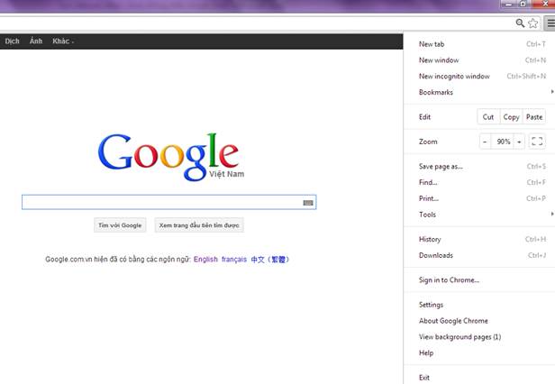
A
change for the better? Chrome’s new menus are oversized, and no-one seems to be
sure why.
Slowly, they grew to accept (rather than
love) the changes, though. To this day it’s still easy to hit reply-all instead
of reply, and the lack of borders means that screen elements can look
unfinished and poorly aligned, but for the most part it hasn’t done any massive
damage to the service. It was, after all, little more than a change in the
interface’s design rather than a change in the interface itself. Most of the
layout itself hadn’t altered.
In the last month, though, Google has made
a more fundamental alteration to Gmail. This time, its changed the way you
write new emails, and again, people are annoyed with this shift in interface
and behavior.
The new Compose window is an in-tab pop-up,
similar to Google Talk’s conversation windows. Immediately, there’s a problem
with that: the Compose box is at the side of the screen, instead of in the
center where people are likely to find it most comfortable to look. The pop-up
itself is flimsy and unceremonious, too, which makes it a poor fit for the job
it’s doing. When you’re writing an email, it’s often your primary focus and
might take some time to write. The new compose window appears to go a long way
towards reducing email replies to the importance of a casual IM chat- it
doesn’t even contain a ‘save draft’ button. There are auto-saves, but that’s
hardly the point. Are emails important enough to save or not? The interface
doesn’t seem to think so.
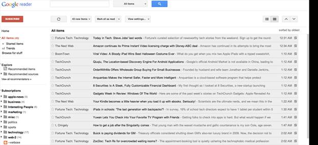
Few
products in Google’s arsenal were as beloved as Reader. So, naturally, it’s
shutting it down.
What’s more, replies aren’t even consistent
anymore. Replies to existing threads have been changed, but not to a pop-up. In
existing mail threads, your reply still appears as an in-line response, rather
than a pop-up, but it too uses a new interface. Gone is the easy-access
formatting options. Gone is the quote button. Gone even, is the text of the
mail you’re replying to, which is now hidden behind an ellipsis button marked
“show trimmed content”. If you’re the sort of person who likes to refer to the
text you’re replying to, or trim it for space, the process now involves a
mandatory button push. Hardly a convenience.
“The dearth of positive reaction suggests
that the change wasn’t to do with improving things for the user”
As with any change, there has to be some
logic behind these alterations. The problem is that it’s tough to see what it
is. Presumably, an organization the size of Google would test and iterate any
design changes this major, so why wasn’t the backlash accounted for? Which
brings us to another of Google’s behavioral problems.
Here’s a thought: maybe the backlash was
accounted for, and deemed acceptable by Google. Maybe, the company calculated
(correctly) that the irritation such changes would cause wouldn’t result in any
significant number of users leaving the service, and decided it was worth it.
The chances are that these revisions aren’t intended to improve the experience
for users, but rather to improve the experience for Google. Maybe it uses less
bandwidth. Maybe it allows them to gather more data. Maybe they’re moving
towards a unification of Chat, Mail and Plus and this is a step on that
journey. We don’t’ know, but the change must have been introduced for a reason,
and the dearth of positive reactions online suggests that it wasn’t necessarily
to do with improving things for the user.