Chrome and Away
In the same vein, Google recently made
changes to Chrome’s interface without offering a concrete reason why, causing
similar irritations to its users. Appearing more or less at the same time as
the latest change to Google Mail, Chrome’s latest automatic update, to Version
26, brought with it a slight alteration to the menus within Chrome. However, as
we know, even the slightest change can prove problematic

Google
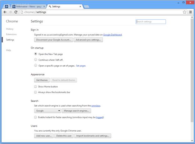
Chrome Version 26
The updated menus have changed color,
moving from a standard Windows light grey to a more Google-inspired white. Fair
enough, that’s just brand aesthetics. At the same time, the menu options have
become more spaced out, with entries now so far apart that the longer menus tower
up and down the screen (good luck to anyone running in low resolutions).
Furthermore, the changes mean that options aren’t in the same place
anymore.

The
menu options have become more spaced out, with entries now so far apart that
the longer menus tower up and down the screen
This is an annoyance. It’s easy to forget,
when designing an interface, that muscle memory plays a part in how people use
it. We don’t necessarily read the menu every time we click it, especially for
more frequently-performed tasks. Change where the hotspots for those tasks lie
by more than a few pixels, and people will miss them. They’ll work slower, make
mistakes more frequently and slowly become annoyed with the product. This is
what’s happening to Chrome users, with Google’s own forums filling with
complaints, and discussions about how to turn this new menu style off.
Again, the reasons for the change are hard
to fathom. The consideration, but the larger activation area for each option
makes this look very much like a feature aimed at devices with a touch
interface. Which is fine, if you’re using a touch interface, which many of
Chrome’s desktop users most certainly are not. There must be, one would hope, a
larger ‘idea’ behind this change, but it doesn’t seem to align with the needs
of the average Chrome user. Instead, Google is pressing on with changes that
are irritating its user base without adequately justifying them. In a way, it’s
disrespectful, but it’s also a path that they can’t continue down indefinitely.
It’s only going to take a few more changes like this before people realize that
Google’s silent – steamroller approach to interface design and user choice
isn’t going to change, and for them to start looking elsewhere.
Closing Google Reader
The previous failures we’ve talked about in
his article could be put down to a mixture of accidental mismanagement and a
dash of corporate arrogance in a rapidly growing company. The first that really
feels like an ideological shift, however. Now-one’s benefitting from this,
surely?
As a company, Google has had a history of
launching products which up-end its competitors, forcing everyone else into
catch-up mode. Gmail was one. Maps were another. Google Reader? That didn’t
just up-end competing RSS readers; it virtually annihilated them with its
simplicity, convenience and ease of use. Naturally, with Google having so
comprehensively dominated the RSS space for years, there was more than a small
sense of outrage when the company announced that it would be retiring Google
Reader on July 1st. outrage is perhaps too genteel a word. People
were livid. Angry. Having created a product so good that no-one else could
compete with it, Google was now shutting down something that thousands rely on
to curate their information. Why? It’s not really clear.

Having
created a product so good that no-one else could compete with it, Google was
now shutting down something that thousands rely on to curate their information.
Why? It’s not really clear.
“Having created a product so good that
no-one could compete with it, Google is now shutting down something that
thousands rely on”
Google explanation notes that in recent
years usage in Google Reader has declined, leading to the decision to close it.
A decline in usage is hardly a surprise, given that the service hasn’t received
any major attention since the turn of the decade, and the removal of the
Adwords for Feeds product killed any chance it had of making money out of RSS.
By its own admission, Reader still has a loyal following – and a sizeable one, it
would seem, given the strength and breadth of reaction to the news of its
impending closure. So, if there are still people using Google Reader, what’s
the real reason it’s disappearing? Those are eyeballs that Google should be
able to use. Why can’t they?
In part, it’s probably due to the
decreasing interest in RSS, which is no longer the not new technology it was in
2005 when Reader launched. In part, it’s because they were never able to
monetize the service as effectively as its advert-ridden siblings. However, one
suspects the real reason is that Reader, despite being a popular and well-used
product, just doesn’t fit into Google current plans. Plans which seem to
involve turning Google Plus into the place to go for syndicated content.
After all, if a content-creator can have
its blog post read through Google Reader, and content-consumers can get access
to it through the same service, why would either of them turn to Google Plus?
Remove Reader, and there’s a small chance that the content will go through Plus
instead.
Again, there’s no reason to shut a
perfectly good service down unless that closure can benefit Google – and since
minimal resources are being expended on actually maintaining Reader as it is,
the motives must run deeper than that. This is a symptom of Google’s
fundamentally changing culture, and it’s not a happy sign for its users.
And The Rest…
There are yet more service closures we
could mention. We haven’t talked about Google Health, the admittedly obscure
product which fell prey to a ‘spring clean’ in June 2011 and was permanently
shuttered in January of this year, with all data systematically destroyed.
We’ve glossed over the end of iGoogle, the personalized and modular portal
version of the Google homepage which is being retired later this year, gadgets,
widgets and all.

Google
Health
Such closures tell us something about
Google’s current mindset: for every Google service that stays open, there are
others being launched and pulled due to unpopularity. With each closure, a
little piece of goodwill towards the company is lost as well, though. With the
exception of Google Plus, Google’s current operation seems to rely on a big
initial push transforming into self-sustaining momentum. If that doesn’t
happen, their features and products will disappear sooner rather than later.
An interesting consequence of this came
mere days after Reader’s closure was announced: Google’s willingness to wrap up
old products is starting to hurt the launch of new ones. The launches of Google
Keep, a note-taking service and web-app, was greeted with the downtrodden
complaints of Reader users. People weren’t talking about the possibilities of
the new service. They were asking why they should bother signing up, only for
Google to close it, and calculating the average time it takes for Google to
launch and retire a product (just under four years, if you’re wondering). This
is a process Google likes to call ‘sunsetting’, a term which makes the process
it sound poetic, natural and – most importantly – inevitable

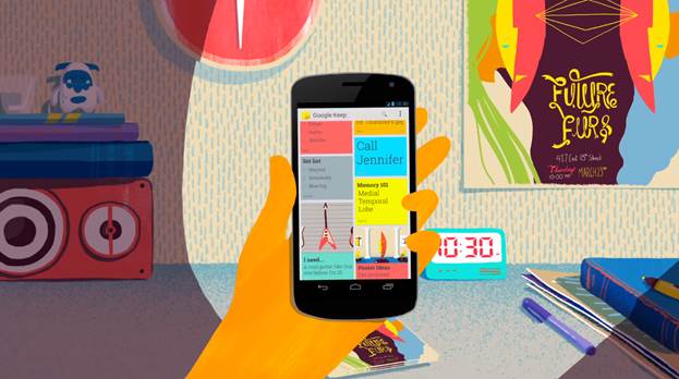
The
launches of Google Keep, a note-taking service and web-app, was greeted with
the downtrodden complaints of Reader users.
This inevitability is something that has
typified Google’s approach to its portfolio of products over the years.
Notably, whenever a new feature is introduced to a major service, they’ve
learnt not to simply slap it on and force people to get used to it. The give
users the ability to ‘temporarily revert’ – a stop-gap consolation measure not
intended to return your beloved features and appearance to you, but to give you
time to get used to the idea that they’re going away. To spread the outrage and
anger over a longer period.
At the moment, it’s possible to temporarily
revert to the old-style Gmail replies, Google’s language makes it clear: one
day, they’ll change to the new ones, get used to it. Likewise, the amounts of
weight it’s putting behind Google Plus makes it clear that, in the long run,
you’ve wither got to get on board or get lost. The difference is clear: Google
doesn’t want to help you do what you want anymore; it’s now doing its best to
make sure you do what it wants.
It’s not unique in this, of course, and
perhaps it’s unfair to hold Google to a higher standard than some other
companies. After all, many organizations will yank a product or feature without
so much as an explanation, let alone allowing you to get used to the idea that
it’s disappearing.
Here’s the thing, though: Google based its
success on being smart, free, and friendly. It wants you to use its services,
because if you’re not, it’s not making money. The problem, of late, is that it
seems to have forgotten that it can’t simply dictate terms. Make enough people
angry, and eventually they’ll leave, and they won’t come back. Just ask Yahoo!
Or MySpace. If Google doesn’t see the problem with the way it’s operating, in a
couple of years we you may not be reading articles about what’s going wrong at
Google –you could well be perusing post mortems on how a once-great company
managed to fall so completely from grace.