Launched in 2001, Webs was one of the first
new breed of online website building tools that offered the kind of
functionality that we’ve grown accustomed to. As with Wix and Weebly, it’s a
point and click site builder that requires very little technical skills other
than a basic creative flair. The UI is intuitive and offers the user a wealth
of options depending on where they currently are on the page, but there are a
few issues which may put people off.

A
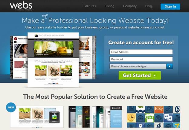
bold and colorful interface greets you at Webs
To start your Webs website creation
process, simply enter your email, a password and choose, via a drop-down menu,
what type of website you want to create from the following choices: Business,
Group/Organization and Personal. After this initial step, there comes a
six-step process where you get to drill down to the site categories, with
sub-categories for each type: name your page; choose which pages to start with
(home, blog, photos, links etc.), depending on the selection you originally
made; theme; site address (paid at $19.95 per year or free using Webs
subdomains); and again an option to choose the paid for route or the free site
builder tools; then finally onto the editor itself.
If you whizz through the process, then it
shouldn’t take too long, but if you want to make more of an impact and focus on
a particular sub-category, then the setup will take considerably longer. Once
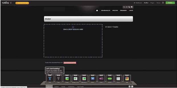
you’re in the editor, you can opt to take the tour of building your first
website or you can follow the animated ‘Let’s start building’ help bubbles that
appear to get you up and running.

Start
free and go premium when you’re ready
Webs' interface is bold, colorful and
offers the basic building blocks necessary to getting your site looking good
and getting you online as quickly and as easily as possible. However, this is
where the first of our problems occurred. While it may look nice and offer the
user a wealth of options, should you click out or exit the builder, then you
have to wait an age for it reload, and there were times when our saved content
wasn’t actually saved at all, meaning we lost a considerable amount of work
when we clicked out of Builder mode into the Dashboard. The speed issues didn’t
stop there either. Inserting an image or one of the many Webs apps available
took far too long for our liking, especially when compared to Wix, Weebly and
even Google Sites.

Webs'
interface is bold, colorful and offers the basic building blocks necessary to
getting your site looking good and getting you online as quickly and as easily
as possible
Another gripe we had was with the changing
of themes on an already designed site. In Weebly, for instance, if you change
the theme, the content will remain in position; just the fonts, colors, backgrounds
and other elements of the themes are changed, not the layout. In Webs, though,
if you change the theme, then the layout is also altered accordingly, which can
make a terrible mess of your site?
However, the problems aside, the number of
elements you can add to your site is quite astounding, and through these Webs
is broader than the traditional website builder. Although Webs is incredibly
easy to use and it can create a very polished, professional looking site next
to no time, it’s probably a tool best used to display your slideshow of images
or as a portfolio for a photographer or an artist. The templates and tools on
offer best reflect that kind of layout, and design and themes can be changed
without the image placeholders being too messed up.

Despite
a slow UI and annoying layout issues, Webs is an okay site builder
Webs is an okay website builder, but it's
nowhere near as good as Wix or Weebly.
|
Details:
·
Price: Free
·
Manufacturer: Vistapprint
·
Website: www.webs.com
Scores:
·
Quality: 6/10
·
Value: 6/10
·
Overall: 6/10
|