Core fonts
Until these various problems with web font
delivery were sorted out, it was important to do what you could with those few
fonts you could assume the end user would have installed – always remembering
to provide fallback positions in case they didn’t – and here Microsoft again
led the way with its “Core fonts for the Web” project. This was a package of
TrueType fonts – Andale Mono, Arial, Arial Black, Comic Sans MS, Courier New,
Georgia, Impact, Times New Roman, Trebuchet MS, Verdana and Webdings – that was
freely available for both Windows and Mac. Unfortunately, these fonts didn’t
become universal (which immediately meant you shouldn’t use Wingdings, because
it couldn’t degrade gracefully to another front) and, in any case, could hardly
claim to be extending the boundaries of web typography. Arguably, it set
standards back, with Comic Sans being notoriously prone to misuse – for
example, in CERN’s presentation regarding the discovery of the Higgs boson.

Microsoft
deserves great credit for commissioning font designer Matthew Carter to produce
these new screen-optimized faces
There were two honorable exceptions,
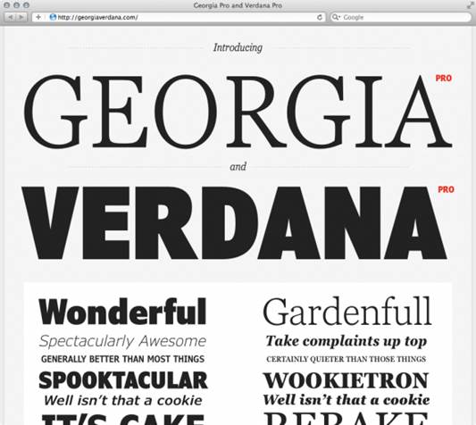
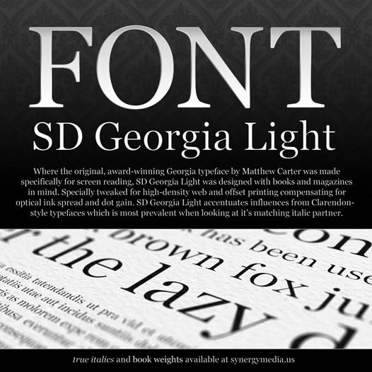
however, in Georgia and Verdana. Microsoft deserves great credit for
commissioning font designer Matthew Carter to produce these new
screen-optimized faces, and Carter deserves the same credit for realizing that
he needed to start from hand-crafted bitmaps and then apply advanced hinting to
match font outlines to the available pixels, rather than from simple outlines
that would rasterize well.
As a result, these fonts change shape
considerably to render optimally even at the smallest sizes – where strokes are
a single pixel wide – but still manage to maintain an overall identity. Their
large x-heights, their clear distinguishing between similar characters such as
1, l and I, and their expansive spacing that boosts legibility and long-form
readability are all reasons why these two web-font workhorses became almost
universal across the PC, Macs and billions of web pages.
Progress… and problems
Georgia and Verdana do a superb job of
making the most of the least number of pixels, but a clear need remained for
improved type rendering. Screen delivery differs from paper in this regard,
because you can vary the grey scale of each pixel through anti-aliasing to simulate
the partial presence of a letterform, fooling the eye into an impression of
greater resolution. The launch of Windows XP in 2001 with its anti-aliased
rendering was a huge step forward, although web designers were still
constrained by the knowledge that Windows 98 lacked such advances.

Georgia
and Verdana do a superb job of making the most of the least number of pixels,
but a clear need remained for improved type rendering
The next trick was to vary the separate
red, green and blue elements that make up each pixel to produce “subpixel”
anti-aliasing. The 2007 Windows Vista made this ClearType rendering the new
default, another red-letter day for web typography.

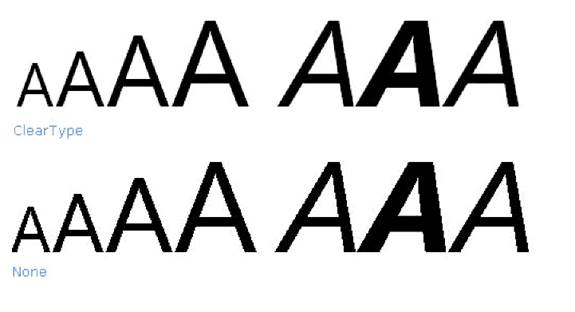
ClearType
is a form of sub-pixel font rendering that draws text using a pixel's red-green-blue
(RGB) components separately instead of using the entire pixel.
The font-smoothing effect of subpixel
anti-aliasing isn’t perfect, since it works only along the horizontal axis and
can produce undesirable color fringes, but it does dramatically improve the
capability of a screen for high-quality type over and above the ever-increasing
pixel density.

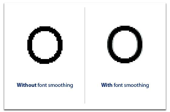
Font
smoothing – An anti-aliasing algorithm used to minimize
distortion of fonts on monitors
However, there was a new showstopper in
sight. Back in my 2002 book I assumed that support for font embedding would
soon become universal, since it only required Microsoft to open up EOT, and
Netscape and Opera to support it. That proved naïve, and the success of Firefox
and Safari meant the proportion of end users who could see web fonts began to
fall. With the dream of universal delivery fading, fewer designers bothered to
embed EOTs, and in 2003 Microsoft stopped developing WEFT altogether (although
it’s still available). With the launch of CSS 2.1, support for @font-face
embedding was dropped entirely, and it looked as though the web had made its
choice – the typographic possibilities for the most important communication
medium since paper would shrivel to a choice between Georgia and Verdana.