Web fonts have been through the mill
over the years, but they’re finally living up to their early potential.
A good web designer recognizes the
importance of typography and will have explored the type-based controls that
CSS provides line spacing, type size, paragraph alignment and so on. But how
many have thought seriously about the most important typographic element of
all, the typeface? More specifically, have you ever considered breaking out of
the box and moving beyond the basic web choice of serif or sans?

A
good web designer recognizes the importance of typography
For designers from a print background, the
web’s restricted choice of typefaces seems quite bizarre. While web designers
treat text as a neutral carrier of information, print designers understand that
text is made up of words, made from letters, made from graphical glyphs that
are neither neutral nor interchangeable. Those glyphs are the product of a
complex creative process whereby a font designer thought long and hard about
just what effect they were trying to produce, not only for that particular
letter but for the whole typeface. In other words, you shouldn’t treat the text
on your pages as the opposite of graphics, but as a sequence of further
design-intensive graphical elements that you can exploit for best effect.
When a print designer starts a job, almost
the first thing they think about is which typefaces will best suit the style of
the project. They’ll have acquired an armory of easy-to-read body faces – such
as Garamond, Frutiger, Optima, Souvenir and Palatino – they know and like:
perhaps the x-height is particularly large, which makes the text open and
friendly; maybe its ascenders and descenders are deliberately exaggerated for a
slightly old-fashioned and austere look; perhaps its unusually geometrical
bowls and counters lend a modernist feel. Each body typeface has its own unique
identity and produces its own subliminal effect.
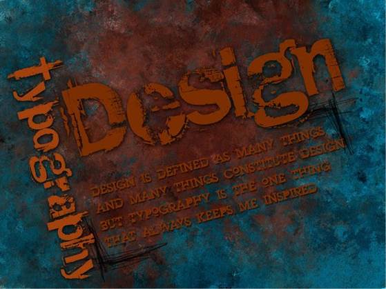
Designers will also know a far wider range
of display fonts they can use for short sections of high-priority text such as
headings, callouts and logos, where impact rather than readability is the prime
issue. There’s a bit more creative license here for fonts that look
handwritten, or hark back to the days of copperplate and black letter, or
Soviet propaganda posters or American Western “Wanted” posters, for example.
Perhaps what’s needed is a subtler effect such as heavier, lighter, more
condensed or expanded headlines that work well with the body text (generally
speaking, body fonts don’t scale well). Then again, you might need a very
localized effect where a single-out glyph – say a lower-case g, upper-case Q or
ampersand & - might catch the readers’ attention and give the project a
unique identity.
If
typography is so central to good design, why aren’t we using great typefaces on
the web?
If typography is so central to good design,
why aren’t we using great typefaces on the web? Ten years ago I was asked to
write a book that explained “all you need to create fantastic web type”, but I
quickly discovered there were very good reasons not to bother. The problem
isn’t in specifying a font, which is nowadays simplicity itself thanks to CSS’s
long-standing font-family property – reference any typeface installed on your
system, then switch to design view or preview in your browser to see it. The
problem, of course, is that there’s no guarantee your site’s visitors will have
that font installed, in which case the text will just display in their
browsers’ default fonts. That’s why you should always specify fallback fonts,
say:
Body {font-family:”PalatinoLinotype”,
“Book Antiqua”, Palatino, serif;}
That way, you can at least control whether
they are seeing serif or sans.
Clearly, what’s really needed is a way to
enable site visitors to view your pages in whatever font you originally used.
Ten years ago, the magical key to achieving this was Microsoft’s Web Embedding
fonts Tool (WEFT). In practice, this involved specifying which fonts you wanted
via styles, or the now-deprecated <font> tag, and then opening the WEFT
wizard and pointing it at a list of pages to process. WEFT would analyze your
pages and produce a compressed Embedded OpenType (EOT) font object, then add
the necessary @font-face CSS rule to link each page to a server-based font,
something like:
@font-face {
font-family: ‘CalligraffitiRegular’ ; src: url(‘Calligraffiti-webfont.eot’); }
Once everything was uploaded to your
website, visitors would see your pages just as you had designed them, even if
they didn’t have those fonts.
The potential was exciting, but there were
significant downsides. Not all font foundries permitted embedding, so, in an
attempt to avoid font stealing and maximize performance, Microsoft not only
tied EOTs to particular domains, but also employed font subsets, in which only
those characters used in your text were included in the file. Therefore, if you
added a page containing a single new glyph, you needed to go through the while
upload process again. Worse still, while WEFT did indeed enable both Mac- and
Pc-based site visitors to see your fonts, this was only true if they used
Internet Explorer, because EOT was a proprietary Microsoft format.

EOT
was a proprietary Microsoft format
But the real showstopper was more
fundamental still: ultimately, scalable font outlines need to be rendered to
the screen as bitmaps, since screens are very low resolution compared to print
on paper (the default at that time was 72dpi). Mapping a glyph outline onto a
low resolution grid led to problems such as different stroke widths on either
side of a glyph, missing serifs and even gaps. Font hinting, which
intelligently changes the outline to match the available grid resolution,
helped, but it depends on how much effort the font’s designer has put in and can
go only so far. When you have only a few pixels to play with, you can’t
recreate fluid strokes or intricate serifs; whatever you try looks awful.
So, font embedding faced serious practical
problems: the setup time it imposed on the designer; the performance hit on
downloading the files; the restriction to Internet Explorer; licensing problems
that limited the range of faces; and low-resolution screens leading to body
copy that was less readable than browser defaults. My how-to book on fantastic
web typography turned out to be a practical guide to why you couldn’t do it.
The only universal solution was to bypass HTML entirely and employ GIF, SWF or
PDF graphical text, clearly undesirable because it wasn’t truly integrated,
search-friendly, accessible to screen-readers or automatically machine
translatable.