When choosing a product to build a website
with, most users will no doubt opt for something with an element of familiarity
to it. Webnode makes this possible by adopting a very Microsoft Office Ribbon
look and feel for its user interface, which, by the by, works very well despite
the animosity over the recent batch of Microsoft interfaces.

Webnode
is pretty quick to get and running
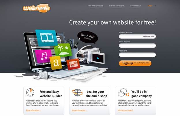
Getting a Webnode site up and running is an
easy and quite nice procedure to undertake. You start by signing up, entering a
name for the website, email details and a password. Then you're taken to a
three-step wizard, which allows you to further fine tune the result into a
personal website, business website or an e-shop. You then move onto selecting
your website template, from a choice of 180 on offer that cover a number of
designs, colors and layouts. Finally, you get to choose which pages you want
start with from a selection of ten, which can be removed or added through the
editor at a later point in time.

Webnode
offers you a decent number of elements to add to your pages, such as Google
Maps, PayPal, YouTube, Photo Galleries, Facebook and Twitter and a basic Forum
function.
Once the site is up, which won’t take too
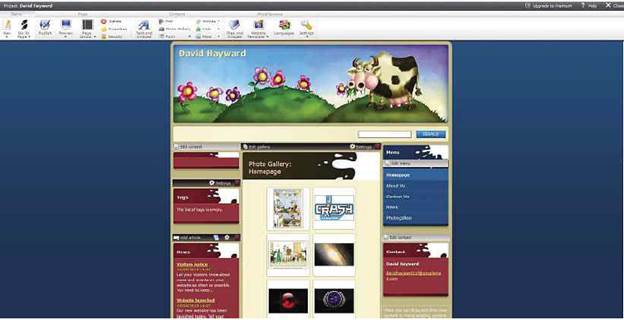
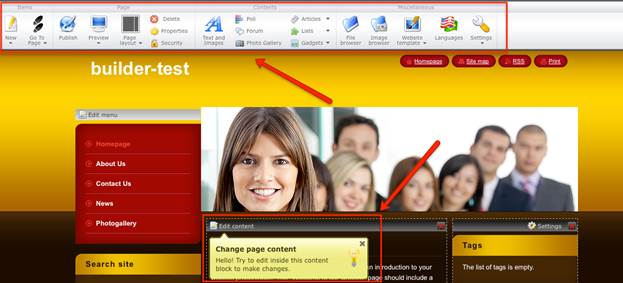
long, you start in the editor mode with the aforementioned ribbon-esque
interface. The actual editing of the website feels pretty slick, responsive and
naturally easy. You can drag and drop the various elements across the page or
subpages, but there’s no way to drag from the desktop or folder onto the page
place holders. The ribbon bar works extremely well and offers easy navigation
and access to all the elements within a few clicks of the mouse.
Webnode offers you a decent number of
elements to add to your pages, such as Google Maps, PayPal, YouTube, Photo
Galleries, Facebook and Twitter and a basic Forum function. Each of the
elements have extra settings that can be drilled down to and modified beyond
the default. Take, for instance, the Photo Gallery, a rather nice element that
can rapidly upload your images, then display them as either a classic slideshow
or a more modern Lightbox with filmstrip thumbnails. The overall feeling of
control you have over the page as a whole and each of the elements is really
very good. There’s also the ability to edit the HTML or CSS behind the scenes,
but you’ll have to drill down through the Website Template sub menu to locate
it and display the relevant ribbon selections.

Dated
templates mar an otherwise great website builder
The main weaknesses for Webnode lie in the
selection of the templates. Although they are many in number and they perform a
basic task, they do look somewhat dated. Admittedly not as much as Google
Sites, but you are still limited to the selection of ten or so fonts available.
Also, there’s no way to change the default colors of a template other than
through the editing of the CSS. Thankfully, though, when applying a new
template to an already functioning design, the elements on the page are reorganized
accordingly and there is little to no distortion or messing up of the layout
when the new template is set. Interestingly, though, if you pick a template to
review, using the current page layout, you only get to see the first three
quarters of the page. So any elements you may have working lower down won’t get
displayed until you actually apply the template.

Webnode
review
Webnode works really well. It provides a
straightforward and fast way of getting a functional web page up onto the
internet without too much difficulty. There are a few gripes, but these can be overlooked
if you’re simply after a half-decent looking website.
|
Details:
·
Price: Free
·
Manufacturer: Webnode
·
Website:www.webnode.com
Scores:
·
Quality: 7/10
·
Value: 8/10
·
Overall: 7/10
|