The new operating system improves
substantially on Windows 7, but Microsoft’s efforts to woo mobile-device users
may leave traditional desktop PC owners feeling abandoned.
Reviewing an operating system is an odd endeavor,
because people don’t really use operating systems; they use applications. The
OS should be as transparent as possible, acting as a platform for applications.
In today’s cloud-driven world, however, the notion that your application will
run in a single OS is tenuous at best. Toss in the increasing use of smart
devices, whether phones or tablets, and the idea of a single-platform operating
system is less relevant now than it was just a few years ago. These days we
have “ecosystems” – Microsoft, Apple, or Google, take your pick.

All
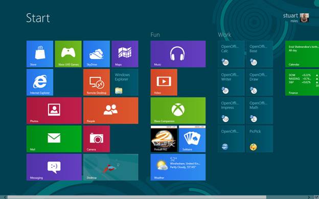
applications show up as tiles on the Windows 8 Start screen
That said, PC users still expect their
Windows applications to run as before, and they want to have the same control
over their laptop and desktop computers as they’ve always had. New software
features should enable users to do more. And as the reaction to the late,
unlamented Windows Vista illustrated, all the shiny new bells and whistles
should not harm performance or require new hardware.
Can Windows 8 meet its goal of being one
aspect of a new Microsoft ecosystem while maintaining its roots in the PC? Can
existing computers run Windows 8 without the need for expensive new touch
displays? Will the revamped Windows 8 user interface turn off existing Windows
users, or pull them into the ecosystem? I’ll try to answer those questions and
others as I dive deeply into Windows 8.
This review is based on the Windows 8 final
release – what Microsoft calls the “release to manufacturing,” or RTM, version.
The final release is available to Microsoft TechNet and MSDN subscribers.
Desktop PCs, laptops, and tablets will ship with Windows 8 preinstalled on the
official launch day, October 26.
We ran Windows 8 on a moderately high-end
desktop system along with a standard (nontouch) monitor, mouse, and key-board.
We also used Samsung Series 9 laptop with an Elan touchpad supporting full
multitouch gestures.
The Windows 8 user interface
Windows 8 tries to get you to tie your
Windows login to your Microsoft account; it’s optional, but if you do link the
two, the Windows login and password serve as your Microsoft account login and
password. Enabling this link allows tighter integration with the remote and
cloud-based features of the new OS.
As mentioned previously, Windows 8 is
designed to be part of an ecosystem, alongside Windows Phone and Windows RT.
Microsoft believes in this idea so strongly that it has made the Windows 8 user
interface (formerly called Metro) the primary interface for Windows users. PCs
with the new OS installed will boot into the Windows 8 interface; the OS offers
no built-in way to set it to boot to the traditional Windows desktop.

The
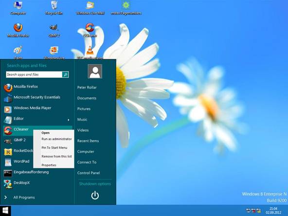
desktop offers familiar shortcuts and pinned icons
The Windows 8 interface acts as the Start
menu now. Instead of appearing as columns of small icons that pop up when you
click the Start button, all your applications show up as tiles on the Windows 8
Start screen. You can also search for an application by typing its name when
you’re in the Start screen; the results list autosorts as you type more
characters.
It’s important to realize that the Start
screen is no more Windows 8 than the Start menu was Windows 7 or Windows XP.
The screen exists as a Launchpad for applications, not as a desktop
replacement. That concept is easy to forget, since the Start screen occupies
the entire display. Even so, Windows 8 apps consume the entire screen, whereas
desktop applications can still run in a window on the desktop.
However, not all desktop applications
appear on the start screen by default. Some accessory apps, such as Paint, live
in the Apps screen. You can force these programs to appear in the Start screen
by right0clicking them to select them and then clicking Pin to Start at
the bottom of the screen. Nevertheless, getting to the Apps screen is simple:
Right-click a blank area in the Start screen and then click the All apps
icon at the lower right.
This is where you’ll run into a fundamental
change in how you interact with Windows. Previously, right-clicking an object
on the desktop always brought up a context menu, giving you a choice of actions
to take. In the Windows 8 interface (but not the desktop), right-clicking now
produces a bar at the bottom of the screen containing assorted
context-sensitive items. It’s a jarring change, but the arrangement makes sense
within the context (no pun intended) of a touch-based display such as on a
tablet. (Context-clicking still works the same way when you’re in the Windows
desktop.)
Live tiles are among the key features of
the Windows 8 Start screen. While normal (non-live) tiles measure 150 by 150
pixels, most live tiles are double-wide (310 by 150 pixels), and display
dynamic information. The People tile, for instance, shows you tweets and
Facebook posts from your feeds, assuming that you’ve set them up. As you
install apps from the Microsoft Store, more dynamic tiles may appear. Live
tiles first appeared in a broad fashion in Windows Phone 7 and Xbox 360
updates, but will exist across all Microsoft platforms going forward.
Navigating the Start screen is easy. If
you’re using a mouse with a wheel, moving the wheel scrolls left and right. If
you’re using a touchpad, swiping left and right (with one finger) scrolls the
tile list. You can drag individual tiles to any location.