Keyboard, track-pad and Switchblade UI
It is difficult to recommend any track-pad
that is suitable for playing games, however, “Switchblade display” is an
exception. That's because of its perfect location. Since it sits in the 10-key's
typical spot, the pad makes itself to comfortable gaming more than most of
other laptops. With a huge amount of wonderful mousing alternatives on the
market, there is no reason for gamers to use the touchpad as their “weapons”,
but for those willing to give it a go (or those who accidentally forgot their mice
at home) will at least find the touchpad relatively well-suited to the task. It
also performs very well as a regular trackpad, and executes multitouch gestures
more reliably than most pointers. Still, the starboard touchpad needs some time
to get used to -- more than once we found ourselves pacnicing when we point the
mouse to the area below the keyboard, the cursor just stopped moving and sat
there quietly on the screen. Ah, right. It's over there.

It
is difficult to recommend any track-pad that is suitable for playing games,
however, “Switchblade display” is an exception.
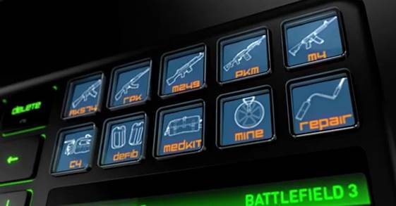
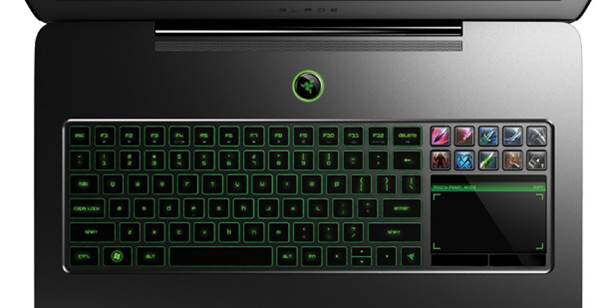
The Razer’s touchpad LCD is not just a
mouse but also the foundation of the Switchblade’s display of the company. This
is not the first time we have seen Switchblade – it appears usually in many
Razer’s keyboards, the original version of Razer Blade and even a prototype
that never introduced before. It is surely a smart idea – 10 push-buttons on
the screen can be modified to create a foundation of a small touchscreen, which
can be useful for custom applications, creating macros and launching
applications – but not much things have changed about the interface over the
last eight months. The Razer’s built in software, Synapse, allows the users to
customize their own short-keys, folders, or icons for some specific tasks. For example,
you can perform a keyboard or mouse function, launch a program, switch profiles
or even change settings on another connected Razer product (like a standalone
gaming mouse). Again, though, all of the above features have appeared in the
original version, so this is nothing but a refresher.
Switchblade UI has learnt some new tricks,
which have also been introduced to other compatible devices in the last few
months. Besides integrating some common applications such as Internet Explorer,
Youtube, Facebook, Twitter, Gmail, the original numpad and a digital clock into
the touchpad’s screen; Razer eventually adds in some special applications for
gamers to the Switchblade. For instance, Star Wars: The Old Republic Combat
Logger keeps track of in-game damage, threats and healing-data on screen.
However, some of the new updates are not function well enough – the UI’s Team
Fortress 2 and Battlefield 3 apps are just the default profiles – and not all
of their toggles correspond to the actions in the game. For example, tapping
the button that displays the TF2 Engineer’s pistol, it brings up a quick-menu
for team voice command. We found out that it is actually a better idea to
create our own profiles, rather than just using most of the new integrated
“apps”.
Razer's interface
is very consistent. Its 10 configurable keys are still a joy to use as an
application launcher, and being able to customize the display of each
individual key is one of the most interesting features ever - but that
consistency means the pad's errors are still there, obviously. The setup's display-laden keys, for instance, appear to ghost and
bleed if they aren't looked upon from just the right angle.
Similarly, the trackpad's screen lacks visual reality and plays back YouTube
videos at a random frame rate. Even though using the Switchblade to open Twitter
or Gmail is a strange idea, our initial opinion stays
unchanged: a lot of this miniature display's functions are better had on a
smartphone. The pad can be a bit finicky, too -- while it does an awesome job
of recognizing standard Windows multitouch gestures, its own three-finger
swipe, used to view the next or previous page of configured buttons, fails to
register unless your fingers are in perfect position. You have to locate your
three fingers stagger, rather than in a straight line? Try again. It becomes
tedious. When everything goes well, though, Switchblade is very joyful - it
provides quick access to any key combination imaginable, stamped with a
colorful custom image. We can see many aspects that could be improved, both on
the hardware and software front. Razer's second-gen laptop would have been great
for introducing a renovated Switchblade.

Stunning
Switchblade UI
Keyboard
preference is a tricky thing, and gamers are among the pickiest - not that
mobile computers offer them much choices. In order to get in line with the
latest trends, the Blade keeps the same Chiclet layout used on the original,
though we have to say that the keyboard's backlight now illuminates the
previously dim Fn functions on the F1-F12 keys. The Blade's alphabet keys live
in the shallows, barely traveling at all with each depression. The keys don't
feel very softly, but they don't have particularly soft landing either. At
first glance the space bar appears to be a bit shorter than usual, but our
thumbs never in motion, resting comfortably on its outer edge. Our biggest
issue with the Blade's keys is also something we admire about it: the delete key.
Positioned conveniently above backspace, it granted us immediate access to
multi-directional text eradication - but its close proximity caused more than a
few problems. As a gaming keyboard, its anti-ghosting features increase the
necessary trust in the users. We were able to record that we can simultaneously
press up to 13 key on the Chiclet clacker, holding at least four keys on each
row of the board's QWERTY alphabet without any conflicts. It is right to say,
gamers counting their APM (actions per minute) wouldn't suffer any hardware
difficulties here.
Display and sound
Similarly to most
laptops in its class, the Blade contains a gorgeous large 17.3-inch 1,920 x
1,080 display. It's the kind of looking glass that makes you feel like your
machine is just technically portable. Huge, true, but this can be ignored because of the sake of the
beautiful viewing angles it provides - surely, it's the next best thing you can
do unless you can bring your personal computer along with you. That said, the
Blade's giant screen isn't the first one we've seen on a gaming device. We want
to recall that the LED-backlit display doesn't have any contrast or color
issues, nor does it have particularly bad viewing angles, color banding or any
other common plagues - it just isn't that spectacular. This is a well-balanced
monitor - its colors are bright where they need to be, and its blacks are
fairly deep. This is a display that will not let you down, but also won't
surprise you for certain. It also won't soak up too much glare, featuring a
matte finish rather than the glossy mess most displays have.

Precious keyboard and touchpad with glowing green
backlit
The unit's
speakers are just at the average rate - though in this case, "par for the
course", it is marked as a good improvement. The first-gen Blade flirted
with tininess and distortion, but we still found few appearances of either in
this upgraded model. The newest hardware still can't shake the table with
significant bass, but it won't distort at maximum volume either. Even so, raising
up the Blade to 11 sounds a bit more like hearing something at level five - its
acoustic chops just cannot spread out too far, and there is no hope it could
fill a large sized room. The speakers' central location don't help much either
- positioned dead center below the laptop's display, they offer very little in
terms of left / right recognition