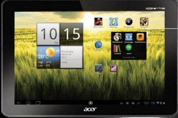
The latest version of Android is packed with
innovative features, and with it rolling out across handsets new and old,
there’s no better time to get acquainted. We guide you through the
improvements.
Apart from the small changes to the
operating system, which take the fight to Apple and the hugely successful iOS,
unification is the biggest change in Android Ice Cream Sandwich.
If you already own an Android device, the
likelihood is that your smartphone runs Android 2.3, codenamed Gingerbread, and
your tablet runs a different version again, called Honeycomb.

The
latest version of Android is packed with innovative features, and with it
rolling out across handsets new and old, there’s no better time to get
acquainted
What Ice Cream Sandwich does is to take the
nuts and bolts of the existing Android OS variant and tie them together with a
dynamic interface and smoother multimedia functionality. This means you get the
same experience across an Android tablet or smartphone, and pull together these
two devices.
Devices have already stared to take
advantage of Android 4.0, and there has been an explosion of great devices
hitting the market, such as the excellent HTC One x, Samsung Galaxy Nexus and
even budget tablets such as the Tablo 7-inch Tablet.
The good news is that devices don’t need to
be made specifically for Ice Cream Sandwich, and manufactures can update your
device using over-the-air roll-outs. Older tablets and smartphone can benefit
from the latest developments, giving your trusty portable pal the latest
features at no extra cost.
With these updates being released all the
time, and a plethora of new phones and tablets installed with Google’s latest
mobile OS coming to market, there’s never been a better time to get started
with Android. Read on to discover the power of Ice Cream Sandwich.
1. New function softkeys
The most noticeable change with Ice Cream
Sandwich is the interface – it might follow the same principles as the Android
of old, but the way it’s used is radically different in a number of ways.

You’re
now offered three softkeys: Back, Home and the Recent Apps list, which is used
to switch between your tasks.
You’re now offered three softkeys: Back,
Home and the Recent Apps list, which is used to switch between your tasks. The
latter is particularly new for phones, and when pressed reveals a vertical list
of thumbnails that show recently-opened apps. You can tap any to switch to that
function.
The Home and Back buttons are the same as
they’ve always been, but no longer have a long press function attached, so you
can’t automatically call up the keyboard, for instannce.
If you move into a movie or image, where
real estate is required, these soft keys shrink down to tiny dots, so you’ve
got more of the screen to look at. You need to remember which dot performs
which function, but it doesn’t take long for that to come naturally.
2. Quick access menu
The other new addition is the dock at the
bottom of the screen – this stays on every homescreen, and like iOS can be
altered to contain the applications that you like to tap away at the most. The
quick access menu sits just above the soft keys, but below your main desktop.
You can get easy access to your phonebook,
calling, messages and browsers by default, but any app can be placed there, if
you need instant and regular access.
3. The People app
One of the big changes in Ice Cream
Sandwich is the way that Android 4.0 deals with your contacts, and information
is now more readily shared between elements of the operating system.
The centre of this experience is the People
app, which offers profile information, pictures and details, all in one place.
It’s a bit limited at present, and can only pull rich information, such as
photographs, from Gmail or Google+. The latter hasn’t exactly become ubiquitous
since its release, and there’s no way of using your Facebook contacts at the
moment.
The People app also has a fair number of
social features as well, that help you stay in touch with your contacts, beyond
just giving them a call. Social networking updates from the likes of Google+,
Facebook and Twitter are available by tapping to open a contact profile, then
swiping to the left.
4. New homescreen folders
Many elements and new features in Ice Cream
Sandwich offer a nod to the pleasing aspects of iOS, and the way that apps are
treated on Android 4.0’s many homescreens is one such example. You can now use
folders to arrange your apps, pulling together a range of different content.

You can now use folders to arrange your
apps, pulling together a range of different content.
Folders are more iOS-like, too, with users
given the ability to drag and drop icons on top of one another from the
homescreen to create bundles of apps that you can simply rename.
5. Resizable widgets
Another big change is that widgets have
been brought to the fore: you can now look at each one on the menu screen
without having to select it – this really helps when a new application you’ve
downloaded has an associated widget, and you’re wondering whether o waste time
popping it on the homescreen.

Widgets
enable you to check your email, calendar appointments, get the latest news
headlines, play music, check your Twitter – all from the homescreen.
Widgets enable you to check your email,
calendar appointments, get the latest news headlines, play music, check your
Twitter – all from the homescreen. That means it’s easy to get an at-a-glance
catch-up with your digital life, without having to load several different
cumbersome apps.
Ice Cream Sandwich borrows a neat trick
from its previous tablet operating system, Honeycomb, here, and enables you to
resize the widgets on your device’s screen. You can expand them to show more
content or shrink them to save space.