Windows
8 - An
In-Depth Expert Review (Part 2)
User interface
Redesigned
Start Screen, and the end of the Start button
It’s sure to say that the Windows
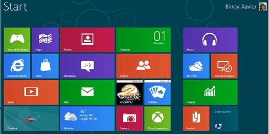
Phone-esque Live Tiles have been the single most polarizing thing about Windows
8. That’s pretty reasonable: the new, mobile-inspired Start Screen looks wholly
different from anything we’ve seen on previous version of Windows. Furthermore,
you cannot interact with these applications the same way: they run at
full-screen, and can’t be minimized or resized like the windows you’re used to.
In short, these tiles are the cornerstone of the Windows 8 experience, and
they’re impossible to avoid, even if you plan on doing much of your work in the
traditional desktop.

Windows
8’s Start screen
As you’ve certainly known by now, the Start
button is no more. Well, actually it’s still there, but you’ll have to hover
with your mouse in the lower-left corner to make it appear. So, it’s exactly
where you’d expect it to be; it’s just hidden until it’s clear that you need
it. And what will happen if you’re using a touchscreen PC, like a dockable
tablet? Your device will almost certainly have a dedicated Start button, the
same way every Windows-compatible keyboard has a Start key. You can also find a
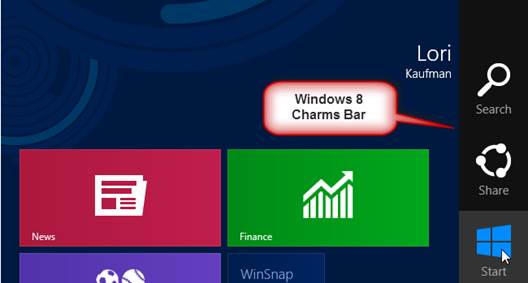
shortcut for the Start menu in the Charms Bar, which you expose by swiping in
from the right side of the screen. To be sure, not being able to click on the
Start button is an adjustment, but we’re also confident you’ll fall into a
rhythm quickly. After all, hovering where the Start button used to be isn’t
that different from clicking it, and hitting the Start key with your pinkie
feels natural as well.

Windows
8 without Start button
When Windows users say that they wish
Microsoft hadn’t axed the Start button, what they’re worry about is the fact
that the Start Menu is presented so differently. When you press the Start key,
you’ll no longer see a stack of fly-out menus; instead, you’ll be whisked away
from the desktop to a full-screen assortment of finger-friendly Live Tiles,
which you scroll from left to right. In other words, that minimal and
unfamiliar screen is the new Start Menu.
When we first tried out the Developer
Preview, we said that it felt jarring to switch back and forth between the
traditional desktop and this more tablet-optimized Start Screen. And it still
is – if you’ve never used Windows 8 before. What we can only say now that we
didn’t appreciate back then is that while the learning curve is steep, you do
get comfortable after a while. No one is a dummy: everyone can and will figure
it out. It just takes a while before using Windows 8 feels truly effortless.
Universal
search

The
Universal search display
We’d like to add that once you master this
layout, there are lots of useful things about the OS that feel like clear
improvements over previous version of Windows. If you perform the same
pinch-to-zoom gesture, you’d use to zoom in and out of web pages, you can
shrink the Start Screen so that you can see all your pages of apps at once. As
you can imagine, it’s very useful if you have a large collection of apps and
don’t want to page horizontally through eight home screens.
In addition, when the Start screen appears,
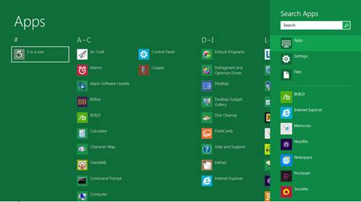
you can start typing to search for something. As any Windows 8 users will tell
you, you can already more or less do this in Win 7, except here you don’t even
need to find a search bar. The results will appear immediately on the right of
the screen. From the search results box, you will see the results are divided
into files, settings and applications. Admittedly, this search method is not
clear to new users, but again, you just need to learn it once. After all, it’s
quite convenient.
Charms
Bar
We already mentioned the Charms Bar, which
appears when you swipe in from the right side of the screen. Here, you will
find shortcuts for the Start Screen, settings menu, a list of connected device,
search and sharing. Referring to the last point, sharing works much the same as
it does on other mobile devices, which is to say if you’ve got some piece of
content – say a Word document or a batch of photos – you can share them in all
sorts of way. This includes email, as well as Facebook, SkyDrive, Twitter and
any appropriate services that you linked to your Microsoft account. We’re used
to doing this on our smartphones and tablets, but it’s a pleasure to be able to
use a Windows PC the same way.
Furthermore, it’s so nice that all these
settings menus and sharing are easy to reach with your thumb, whether you’re
using a large 11-inch tablet or a 13-inch convertible PC. The Charms Bar is an
example for this: you can reach the settings and sharing menus while still putting
the tablet in its natural position. Moving on to the left of the screen, you
can swipe in from the left to toggle through open apps – this feature is called
Switcher. Every time you swipe, a different program slides into place, taking
up the whole screen. Here, it’s easy to control your device, even if you’re
holding a large screen tablet and have your both hands busy.

Windows
8 Charms Bar
You can also expose the Charms Bar by using
a mouse though it’s not a smooth experience. You’ll want to hover on so-called
hot corners at the upper – and lower – right portions of the screen. This can
be frustrating and of course need to be learned. If you’re using a PC without a
touchscreen, there’s likelihood that track pad has fresh drivers that allows
you to replicate key Windows 8 gestures, like swiping in from the right to
bring up the Charms Bar. We also saw accessories like the Logitech Wireless
Rechargeable Trackpack T650, which bring this functionality even to people
whose older PCs don’t support these gestures. The point is: this feature in
Windows 8 is at its best when you have some sort of touch device at your
disposal. Whether that ends up being a touchscreen or a gesture-enabled
trackpad doesn’t matter.
Another embarrassing problem is: the Charms
Bar contains shortcuts for system settings. If you’re inside an app and want to
see some options specific to that program, you’ll need to perform a different
gesture entirely: swipe the top or bottom of the screen to bring up that menu.