Windows
8 - An
In-Depth Expert Review (Part 3)
Multitasking
Talking about switching apps, you can use
that Switcher gesture, but there are other built-in features designed to make
multitasking a bit easier. First of all, Snap allows you to dock a window or
app so that it takes up a third or two-thirds of the screen. That leaves room
for the second app, which you can attach to the remaining space. It’s actually
quite similar to Aero Snap from Windows 7 version of this feature; you can’t
manually resize these windows: once they snap into place, they’re going to take
up a predictable amount of space (e.g., one third of the screen).

Snap
allows you to dock an app so that it takes up a third or two-thirds of the
screen
In Windows 8, you can mix up the
proportions by sliding the border of a window across the screen. Suppose that
you’re working on a Word document on two-thirds of the screen, with IE 10
sitting off to the side. You can spend most of your time typing in Word, but if
you need to conduct a web search, you can put your finger on the border between
the two windows and drag it over so that the web browser takes up more space.
It’s also worth noting that you can mix and match traditional desktop programs
and Modern (formerly known as “Metro”) apps. In some case, this may mean fewer
conflicts between the desktop and more touch-friendly apps.

Mixing
up the proportions by sliding the border
Snap is a trick that you can pull off if
you’re using a touchscreen device or a traditional mouse and keyboard. Whether
you’re using a cursor or your finger, you need to pull down the app from the
top of the screen before it can be docked into place. If you’re using a mouse,
you can also hover at the upper left corner of the screen to expose open apps.
What you’ll see is not a list but a series of preview pictures – miniaturized versions
of whatever’s going on in that windows (your Outlook.com inbox, your SkyDrive
home screen, etc.). From there, you can click on a thumbnail to switch to that
app, or right-click to close one. Like many other features in Windows 8, this
feels less clumsy with practice, though even after months of testing; we find
the swiping Switcher gesture feels smoother and more intuitive.
Personalization
options
To some extent, you can control the look
and feel of Windows 8. No, there’s no bringing back the Start button, but you
can choose different color themes for the Start Screen. At the end of Windows 8
development process, Microsoft added Personalization Tattoos – basically are
the Start Screen background with patterns and borders. So long as you’ve logged
in the PC by using your Microsoft account, this will follow you to other
Windows 8 device you might log into. Open another Windows 8 PC and it will show
your paisley background as soon as you sign in for the first time.
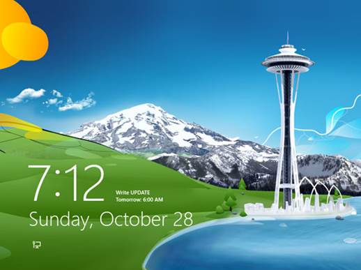
Lock screen

The
lock screen of Windows 8
In addition to the Start Menu, you can
customize the style and feel of the lock screen. It consists of wallpapers as
well as which notifications are displayed. For example, even without entering
the password, you can see the upcoming appointments as well as unread messages
or emails. In PC settings, you can also choose to display detailed information
for the one of two things: your upcoming appointment or the weather forecast.
Desktop
Primarily, the desktop will feel quite
familiar to Windows 7 users, especially compared to that redesigned Start
Screen. Still, there are some differences here. First of all, the Aero UI does
no longer exist, which means windows no longer have a transparent border.
Everything here is flat and two-dimensional, not unlike those new Live Tiles.
In a move that will please even savvy
users, Windows 8 also opens multiple monitor support, with the ability to
display different desktop backgrounds on multiple displays, as well as a single
picture span those various screens. You also have the option of expanding the
Taskbar across those monitors, or setting it up so that a pinned program only
appears on the same screen where that app is running. In short, it’s an
encouraging improvement, although it would be nice if you could be able to run
Modern UI-style Windows 8 apps on more than one monitor at a time. If you have
a multi-monitor setup, you’ll find it’s trickier than usual to pull up the
Charms Bar using a mouse.

Windows
8 Desktop
Other changes are: Windows Explorer is now
called File Explorer, and bears the same Ribbon UI already used in Microsoft
apps like Office and Paint. There’s also a File History feature, which saves
versions of files similar to Time Machine in Apple’s OS X. The Task Manager has
also received a makeover so that when you first launch it, all you can see is a
list of open apps. There are nothing
about processes or memory usage; only a list of programs and an “End task”
button. However, click “More details” and you’ll see half-dozen tabs, showing
you everything from performance graphs to CPU usage to running processes.
Particularly, in the processes tab, there are 4 columns showing CPU, memory,
disk and network usage, with the resource hogs highlighted in a darker color.
There’s one thing that hasn’t changed: the
keyboard shortcuts. The same ones you relied on in Windows 7 will work here,
which should take some of the sting out of getting used to a new user
interface.