Windows
8 - An
In-Depth Expert Review (Part 4)
Built-in apps
Mail
Setting up mail is quite easy: if the first
Microsoft ID you use to initially sign in is tied to Gmail, or some other
service not run by Microsoft, it prompts you for your email password
automatically. In the case of Gmail, we had the option of syncing our Google
contacts and Calendar as well. There are also easy setup options for Hotmail,
Outlook.com, Yahoo and AOL, though you can add accounts from other services
too. Even if you don’t link a Hotmail or Outlook account, the Mail app will
import all your folders and labels everything, but your starred items, in
Gmail. Those directories represent only a small box on the left side of the
screen. The next is a wider window where you can see each individual message,
along with previews and, when applicable, thumbnails of the contact who wrote
to you.

Windows
8 Mail app
The email itself takes up the most space,
spanning the entire one third of the screen. Up top, above the message, you’ll
find the icons to create new messages, reply/forward and delete. (We always did
like the in-time delete button in Outlook.com, so we’re glad to see that design
touch carries over here, too.) If you swipe the top or bottom edge of the
screen for the options menu, you can refresh your inbox or move a message to
another folder. If you have more than one email account connected, you can pin
one particular mailbox in the Start Menu.
In short, it’s easy to use; we only wish
there were easy-access buttons for archiving and marking junk mail as spam.
Unfortunately, you don’t have direct access to certain of Hotmail and
Outlook.com’s finer features, like the ability to “Sweep” newsletters and other
so-called gray mail into out-of-the-way folders. However, if you set the Sweep
on the Outlook.com or Hotmail.com, the Mail app in Windows 8 will follow any
rules you have set.
Calendar

Calendar
app of Windows 8
As promised, when we choose to sync Google
contacts and Calendar, our appointments all appear in the default Calendar app.
(If you’re not a Google user, you can also link your Hotmail, Outlook.com or
Exchange / Office 365 calendar.) The default view is by month, which is a bit
too busy for our tastes – you can only see two appointments per day, even if
there are many more. We recommend choosing the daily or weekly view in the menu
options hidden at the bottom of the screen. If you’re creating an appointment
from scratch, you’ll have the same options as if you were doing this online: everything
from date to time slot to reminder alerts.
People

The
People app on Windows 8
The People app doubles as an address book
and a one-stop shop for social networking updates. Using the settings menu in
the Charms Bar, you can link all account types - like Google, Facebook, Twitter
and LinkedIn. Obviously, the more services you connect, the more contacts will
appear in your People Hub. In short, it works similarly to the Windows Phone’s
People Hub, which is to say people you know has a contact card brings all available
forms of communication - everything from email to a Twitter handle. Open your
own contact card and you can update your Facebook status and post, favorite and
reply to tweets.
When you open your People Hub, you'll see
your contacts are arranged in alphabetical order, and you scroll from left to
right to move through the list. As with the Start Screen, you can use
pinch-to-zoom to compact for a long list. In this case, you won’t see every
contact on the screen, only one tile for each letter of the alphabet, making it
easier to jump to a specific part of the list above.

Contacts
are arranged in alphabetical order
Also located in the People Hub are Live
Tiles for social networking / messaging notifications, as well as a
"What's new" page, showing a horizontal feed containing your friends’
new Facebook and Twitter updates. Although the People Hub easy to use in
general, we tended not to reply on the "What's new" stream, as a long
list of social updates is easier to view in a vertical list than a horizontal
one.
IE 10
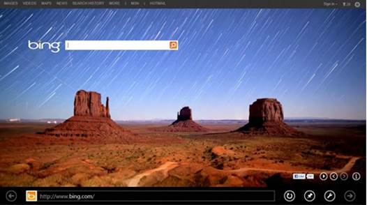
In Windows 8, you have not one but 2
versions of IE 10 browser: one for the desktop and a more touch-friendly one
locates on the Start Screen. Both two versions have a Chrome-like setup, with a
single bar for URLs and web search. Both are also in sync with each other,
which wasn’t the case in earlier builds of the OS.

Internet
Explorer for the Start Screen
As you can imagine, there are some UI
differences. However, in the desktop version, adding a tab is as easy as clicking
a plus sign. In the more touch-friendly version, you swipe from the top of the
screen to expose open tabs, or open a new one. IE 10 also has a feature which
allows you to either swipe or clicks an arrow button on the screen to the next
page, whether that's the next page of search results or the next page in a news
story divided into 9 parts.

Internet
Explorer for the Desktop
As far as content goes, IE 10 is HTML5-based,
although the desktop version also supports Flash and Silverlight. In THE touch-friendly
version of the browser, only specific sites on the Compatibility View list
support Flash. Therefore, we can’t promise that you'll be able to run the
website you want, but that Flash exceptions list at least includes popular
websites such as YouTube and Vimeo. In addition, with HTML5 being as ubiquitous
as it is, you really shouldn’t have any problems.
From a privacy perspective, Do Not Track
comes enabled by default, which means that websites can only monitor and
collect your private data if you go out of your way to turn off "Do Not
Track".
Camera
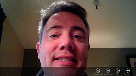
Windows’ built-in camera app is quite simple:
a full-screen frame (if you select at 16:9 resolution), with few options always
visible at the bottom. These consist of a timer, video mode and a “change
camera” toggle (supposing there are front and rear cameras). There’s also a "camera
options" icon, but from there you can just switch the resolution or select
another audio recording option, if available.

Windows
8 camera
Now, at least, there are no image filters,
such as sepia, and nothing in the way of HDR or panorama mode. The camera app
is also lacking tap-to-focus, which can be a small nuisance or an unfortunate
issue, depending on the tablet you’re using. However, as we saw on the Asus
VivoTab RT, PC manufacturers have the option of adding secondary camera apps
that mimic the look and feel of the built-in camera app, but add some special
effects. Without any of these additional features that we’ve expected, the
native camera app feels like a late thought.