The Xperia T is almost remarkable in
how unremarkable it is.
Design and build
If smartphone design has become stuck in a
rut over the last year or so, the Sony Xperia T is almost a parody of that rut.
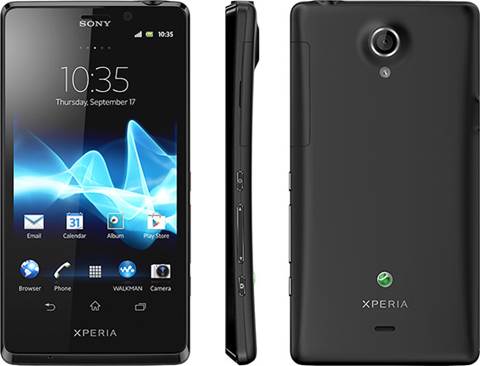
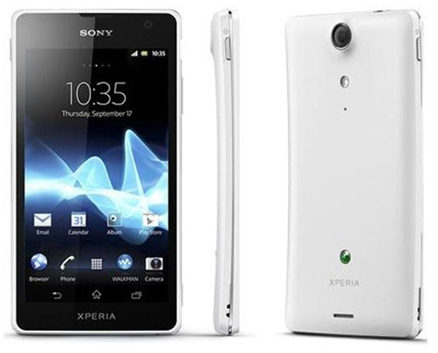
It is, for want of a better description, a black rectangle. The front is almost
featureless, save a couple of logos and the speaker at the top. The corners are
less square than previous Xperia devices this year but still only subtly
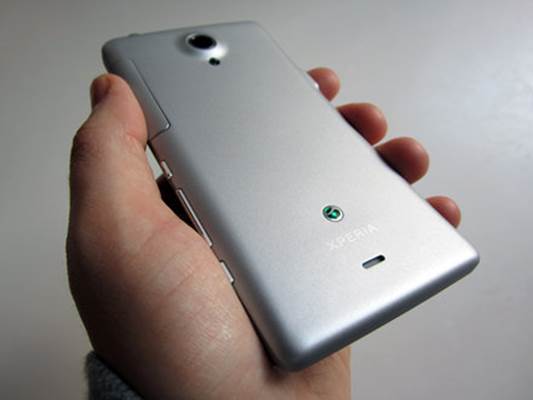
rounded. The back is a plain, soft touch black plastic sporting yet another
logo, the camera lens, recessed inside a slight bulge and the small LED flash.
Tap on the back and it sounds strangely hollow as if there is space to spare
inside. We don’t know if there is because the backplate is not removable, and
so neither is the battery.

The
Xperia T is almost remarkable in how unremarkable it is.
From the side you can see that the device
curves in towards the middle, borrowing the design from 2Olrs Arc series. But
while those devices used the design trait to achieve great thinness the Xperia
T never matches that. It’s not especially thin or svelte, and despite the
presence of curved edges down the sides, doesn’t quite sit in the hand as
comfortably as other phones.
There’s a small array of buttons and ports
around the edges. On the left is the micro IJSB slot which also supports MHL
for video out; on the top the headphone port; and on the bottom nothing at all.
Down the right-hand edge is a cover for the full-sized SIM and micro SD cards,
a power button that was located just a little too low down to be entirely
convenient, the volume rocker and, most welcome of all, a dedicated camera
button.
Overall the Xperia T is almost remarkable
in how unremarkable it is. The design touches, where present, are extremely
understated, and it doesn’t feel like an especially premium device.
Screen
What the stripped back aesthetics do is
give the display a chance to shine, and unsurprisingly it does exactly that. It
has been a while since we’ve had cause to complain about Sony displays and even
though it is not the best on the market we’re not about to start with the
Xperia T. The 4.5-inch display packs in 720 x 1,280 pixels, the same as that
seen in the HTC One X and Samsung Galaxy S Ill among others, although since the
Xperia uses virtual on-screen buttons you do lose 48 pixels at the bottom of
the screen in most apps. Some button-less devices add extra pixels for the
buttons, but not here. Where it really matters though, such as when watching
videos, the button bar disappears so you do get the full screen.

Some
button-less devices add extra pixels for the buttons, but not here.
The size and resolution of the screen
amounts to a pixel density of about 323 pixels per inch which is excellent. It
is exceptionally sharp and clear and Sony’s Bravia engine gives added punch to
the display. Viewing angles are less wide than we’ve seen elsewhere, however,
so you need to look face on to get the full effect of the display’s Vibrance.
The blacks are also not as deep as we’ve seen on other displays, and as always
it’s not so great when used in sunlight.
Hardware and performance
Sony has so far resisted the temptation to
join the spec wars as being fought by companies like Samsung, HTC and 1G, which
might go some way to explain why it has also failed to produce a single real
standout Android handset. We’re not necessarily fans of the
‘spec-for-spec-sake’ approach to making phones, but we do like to see
manufacturers pushing the limits of what can be done. The Xperia T, in line
with the rest of the Xperia range, offers nothing of the sort. It’s not the
fastest, the most powerful or anything else. It is Sony’s new flagship handset,
but on the balance of the spec sheet alone it does nothing that we haven’t been
seeing on a regular basis throughout the whole of 2012. In fact it is not even
a massive leap forward from the excellent Xperia S that Sony put out in
January.

The
Xperia T, in line with the rest of the Xperia range, offers nothing of the
sort.
But just because the phone doesn’t deliver
headline specs doesn’t mean it doesn’t do its job well regardless, and it is by
no means underpowered. The phone is powered by the dual-core Snapdragon S4
processor similar to that in the HTC One S, and is clocked at 1.5GHz. Despite
the lack of the extra cores, that you might expect to see in a top-end device,
the T flies along, the S4 proving its worth yet again. There’s 1GB of RAM as
well, which is more than enough for the moment, although double that amount is
likely to become the norm as we move into 2013. There is 16GB of storage on
board, along with the memory card slot.