Interface
You’ve got the package, now how easy
is it to get around?
AfterShot Pro
If you’ve used a RAW editor in the last
decade or so, the layout of AfterShot Pro will be instantly familiar to your
eyes. On the left, you have the browsing controls – a file manager, a library
viewer and some settings for filtering and searching for shots. In the middle
is a digital light table that shows thumbnails or zooms to individual pics for
editing.
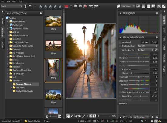
If
you’ve used a RAW editor in the last decade or so, the layout of AfterShot Pro
will be instantly familiar to your eyes
Over on the right, meanwhile, are the
editing tools. Laid out in a fashion not designed for efficient use of screen
space, but names and ordered in an intuitive fashion such that most photos can
be edited from the default tab, with advanced options for harder work cascading
behind.
It’s not the prettiest or most modern photo
editor, but neither does it look dated or make the user work to find essential
tools. Top marks.
DigiKam
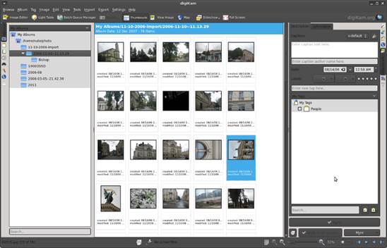
It’s
perfect for someone who handles a lot of images and wants to stay within
digiKam for everything
Few things are more than a click away. It
opens up onto a library manager, and you can rearrange the view according to
title, date taken, meta tags, ratings and more, or switch to a fully-fledged
RAW importer and photo editor. This is also a problem, as by default there are
icons running down both sides of the main frame, and lots of controls to
remember. It’s perfect for someone who handles a lot of images and wants to
stay within digiKam for everything, but if you aren’t going to use the
extra controls, it’s cluttered. Plus some of the cooler features – like the
spinning globe for GPS tagging photos are slightly buggy. The date sorting
panel looks great, but is less usable than Shotwells dull folder tree.
Being a native KDE app, though, it is eminently tweak able.
Shotwell
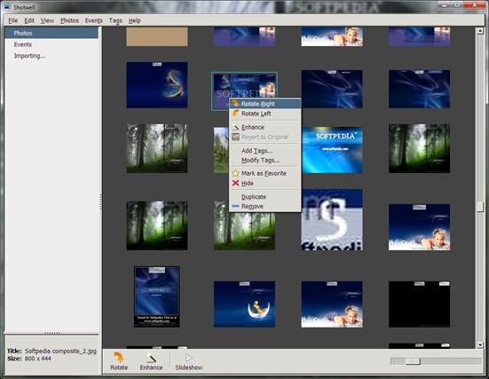
Shotwell
is the next best thing to a dedicated library manager that focuses on helping
you find a photo fast
Now Google’s Picasa is no longer
maintained for Linux, Shotwell is the next best thing to a dedicated
library manager that focuses on helping you find a photo fast. By default, it
sorts images by time taken using a timeline on the right that looks
rudimentary, but is easier to get around than the one in digiKam. You
can also view by tag or EXIF information – although these options aren’t
obvious and require going through the View menu. There’s a one-click photo fix
button, and it uploads shots and albums directly to a vast number of photo
sharing sites. Shotwell is simple, but not yet elegant. The rounded
icons used for folder and album views look slightly out of place, and the
functional sorting column on the left could do with a little love.
Color management
The most important aspect of photo
editing is now commonplace
All of these applications except Fotoxx
can handle full color management. That may not sound important, but is a huge
leap forward for Linux photo editors.
It means they can use a custom gamut, as
laid down according to ICC standards, to alter the way they display colors
according to the monitor’s unique characteristics, the tested color space of
the camera and that of the image which will usually be one of the standard RGB
profiles, such as sRGB or Adobe RGB. This is vital for professional image
editing, as it means the color you see on screen are an accurate representation
of what will be printed. The real credit goes to the Gnome developers for
including simple color calibration controls based on Argylla as a
default control panel setting. It’s easier to fully calibrate a monitor using a
device like a ColorVision Spyder 2 in Gnome now than it is in Windows. The same
applies to Canonical’s Unity environment, which uses the same tool.
KDE is catching up – Oyranos and KCM
are almost on a par with Gnome’s default tools, but require a manual build and
install, while XFCE’s only real option is the CLI-based xcalib tool. Without
setting these up correctly, there’s no point having a color managed editor, as
your monitor won’t be correctly calibrated. Photographers who don’t want Gnome
or Unity do have one other choice, though – Kubuntu includes color calibration
by default, based on the same packages as Unity.
Darktable
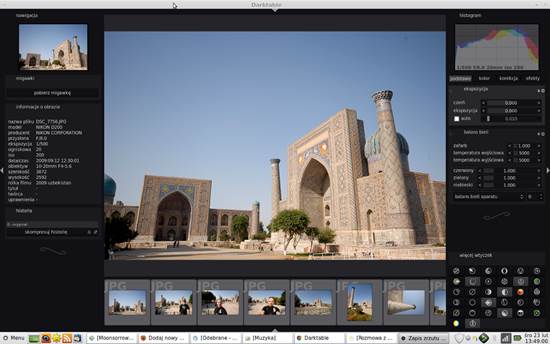
The
library view is simple and straightforward, and the editing tools seem
initially straightforward too
The guiding principle for Darktable
seems to be to take the established design of a traditional RAW editor and
simplify it. To this extent, it is a massive success. The library view is
simple and straightforward, and the editing tools seem initially
straightforward too. Then there’s the little flourishes, the swirls that are
reminiscent of a silent movie panel that decorate the black background.
But while it looks simple, Darktable
is a challenge to use. Editing menus are labeled with icons rather than words,
and named unintuitively. Controls are divided into Basic Group, Tone Group and
Explicitly Specified by User. Some of the more commonly used controls aren’t
available, but have to be added from the hidden Plugins menu. Set it up right,
and Darktable is an efficient tool laid out to your way of working. But
for most, the learning curve is staggeringly high.
Fotoxx

It’s
a library management tool that hides its core function
There’s something a little Windows 98-ish
about the interface of Fotoxx that will put most users off trying it.
Not to give it a go, however, is to miss out on some of the wonderful lunacy
that’s gone into the design.
It’s a library management tool that hides
its core function. You get a grey screen that does, apparently, nothing. Only
if you’re very observant will you tap the tiny letter G in a corner that fires
up a file manager with a folder and thumbnail structure that works, so long as
you never need to go up a level. There’s a row of buttons for file functions
and navigation. It’s only when you start going through the file menu options
that the full range of capabilities is revealed. In any other software this
willful obfuscation and confusion of the user would be a sin. But there’s
something joyously quirky about Fotoxx, and it’s hard not to be charmed.
Gimp
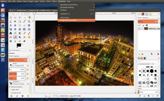
Most
of the improvements in the 2.8 version are in the editing engine and the GEGL
framework for plugins
Ah, what hasn’t been written about Gimp
that we can add here? Most of the improvements in the 2.8 version are in the
editing engine and the GEGL framework for plugins that will lead to hardware
acceleration and floating point color control. The basic interface is as
hardcore as ever, feeling as if it’s designed to intimidate newcomers into
submission.
There are some grudging compromises for
those who’ve complained about ease of use. The single window option which locks
dockable toolbars into place is a good start, and you can turn off dialogs that
you don’t need. But Gimp is a place you can do anything from simple exposure
adjustments to masking and cutting out sections of an image to paste elsewhere.
Our only real gripe about the interface is that it still seems to roll a D3
every time it boots up before deciding what docks it will have open. Will there
be layers and histograms? Who knows?