The original eye-candy window manager
finally gets a stable release. If you stick to
the big-name distros, you could be forgiven for not knowing that Enlightenment
exists, let alone that version E17 has just been released. None of the top ten
on DistroWatch have an Enlightenment version (although most have it in the
repositories if you wish to install it yourself). In fact, at the time of
writing, you had to go down to number 15 before coming across an Enlightenment
distro: Bodhi.

Enlightenment
E17
This shouldn’t be taken as a sign that
Enlightenment is somehow not ready or not suitable for the big time – although
the Enlightenment team’s obsession with alpha and beta versions may have put
some people off. This particular version was in development for 12 years before
finally being released as stable. Of course, the developer versions have been
used widely for years with few problems.
To get a feel for the system, we tried both
with Bodhi, and on top of an Ubuntu 12.04 install. The former gave a better
introduction to the window manager for curios users because it has a number of
different preset layouts for you to try.

Enlightenment
E17 ubuntu 12.04
The first thing you’ll notice on starting
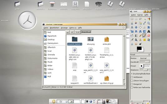
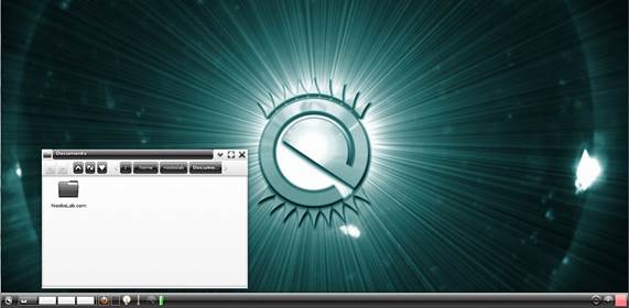
E17 is that it looks gorgeous. This isn’t something new in this release, but a
long-running feature of Enlightenment. The graphical effects, such as menus
fading in and out, feel as if they’ve got a bit more care than in other window
managers. What’s more, they seem to run well on older hardware that has other
desktop environments coking on their widgets. Speaking of widgets,
Enlightenment has a range of them known as gadgets that can be added to the
desktop. As you would expect of Enlightenment, they’re well drawn and integrate
well with the rest of the environment.
Waste of time
The default menu configuration is a bit
unintuitive. The most common thing this reviewer uses menus for is opening applications.
This shouldn’t be hidden in a submenu. An extra few seconds every time you want
to launch an app builds up. If it takes two extra seconds every time you open
an application, and you open applications a hundred times a day, that’s 20
hours a year spent fiddling about with menus that you could spend… well, not
fiddling about with menus.

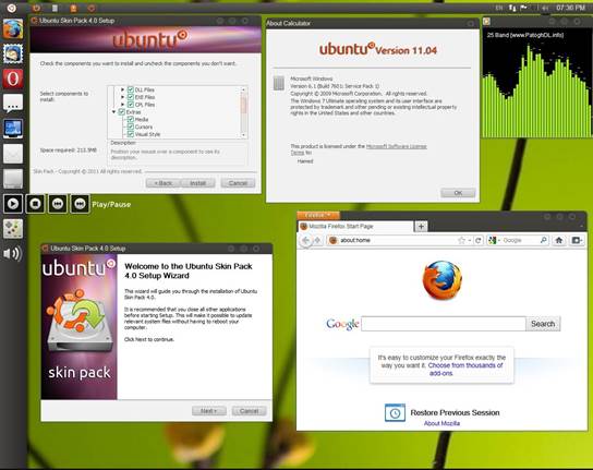
The
style mismatch with GTK means Enlightenment loses its slick feel as soon as
programs are started
The raison d’etre for Enlightenment is that
it looks good. Really, really good. However, unlike Gnome, KDE and others,
Enlightenment is just a window manager rather than a desktop environment. This
means that it doesn’t have its own applications. You can use applications for
any of the other desktop environments, and they work fine, but none of them
looks quite right, and herein lies Enlightenment’s fatal flaw. It looks great
when there’s nothing on the desktop, but as soon as you open windows and start
doing things, you end up with a mismatched mess. It’s a shame, because it looks
very good as long as you don’t try to do anything with it. Because of this, we
feel we can recommend it only to people who want eye-candy on their desktop,
but don’t have the processing grunt to get it from other sources.
Verdict
·
Developer: Enlightenment Dev Team
·
Web: www.enlightenment.org
·
Price: Free under BSD-like license
·
Ratings: 7/10