Bring in new business with a better website
Imagine a consumer looking for a local
repairman. Before calling anyone, he’s likely to search the Web to find out
what options are available, and then he’ll probably visit the prospective
companies’ websites to see what type of products and services are offered. If
you’re a businessperson, this is the sort of situation in which the quality of
your website can have a big impact on bringing in new business. Fairly or not,
accurately or not, many people believe that the quality of your website
reflects the quality of your work. If your website is hard to navigate or lacks
coherent examples of your work, customers may opt for a competitor - and
remember that these days, your competitor is only a click away. Here are some
ways to modernize your business website and attract new customers.

A
website’s landing page should clearly demonstrate what you offer
Landing page
This is the first page customers see when
visiting your website, and it gives them an overall impression of your company.
There are several small tweaks you can perform to grab a customer’s attention.
First, examine your website’s headline. Does it clearly state what services you
offer? Second, does the headline make an impression on the reader? When
creating the headline, consider what you want your readers to do now that
they’re on your website. For example, do you have something you’d like them to
know? Use a headline that entices them to learn more about your products. Or
maybe you’d prefer a headline that enlightens them about your guiding business
principle, because you feel that’s even more important than the actual product
or service.

Try
to limit the amount of content on the page that would distract from what you want
visitors to learn about your business
Next, take a look at the landing page and
analyze whether the visuals effectively demonstrate what you offer and evoke a
compelling response. Let’s say that you have a landscaping business with a
single image of a pristine backyard. It’s a good visual, but doesn’t exactly
tell the customer about all the services you provide. A scrolling banner or
image carousel that quickly displays employees performing different landscaping
services—creating that impressive backyard—tells the visitor what to
expect, while also displaying the quality of your work. Whatever your business,
ensure that the graphics show potential clients what you can do for them and
makes your value proposition clear.

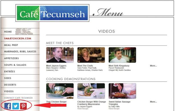
Buttons
on your website make it easy for visitors to “like” and “follow” your business
Finally, try breaking the text on the
landing page into small chunks (or use bullet points) to quickly convey what
you want to say. If a large chunk of text is blocked together, customers may
not read through the entire paragraph. Breaking the information down into
smaller chunks allows them to scan the page and quickly digest what you want
them to know about your company. Remember to work in calls to action, brief
testimonials, and other snippets that will create interest and result in a
dialog with the prospective customer.
Many website creation services provide
hundreds of templates from which you can select to match the look and feel
you’d like to convey. Examine the choices offered by your provider and see if
there are different options that may better tell your company’s story. Once
you’ve selected the template you feel is best, take some time to tailor the
text, graphics, and/or video to draw people into the rest of your website.
Feeling lost?
If the website navigation isn’t intuitive,
people may go looking for another option. One typical source of confusion is a
poorly designed navigation bar, such as one that offers too few—or too
many—page links. Most websites offer between five and seven categories in the
navigation bar area. If you’ve got other pages you’d like to highlight, place
the links in a drop-down menu under the category. Perhaps most importantly,
keep the navigation bar consistent throughout all of the pages, so visitors can
reach other pages on the site with minimal effort.

Most
navigation bars feature between five and seven categories of drop-down menus
Secondly, make certain that any links in
drop-down menu are located in a logical category. For instance, you wouldn’t
put the link to an Events page under a Support section. If you want to
highlight a specific aspect of your company, make the text or graphics larger
to draw the eye. You could also make the important text or graphic part of a
headline that appears at the top of every page. Find a way to easily and
consistently impart the key benefits of your business.

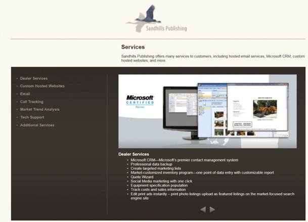
You
can use bulleted lists to quickly inform visitors about the variety of services
you offer
If you have a large variety of products and
services, you may also want to create a different theme or color for each
category. For example, our hypothetical landscaping business could use green
for tree planting, red for paver installation, brown for block walls, and blue
for irrigation. The colors will help visually distinguish the sections of the
website from one another.
Make it social
Does your company have a blog, a Facebook
page, a Twitter account, a Google + network, and/ or a Pinterest pinboard?
Social networks are now becoming an important part of your business identity,
and your website should help link customers with your company’s social media
efforts. Most website service providers make it easy for you to add buttons
that let visitors “like” your company on Facebook, “follow” you on Twitter, add
your feed to Google +, or “Pin It” for a business pinboard. The buttons allow
customers to quickly link with your company, so they won’t need to search to
find you in the appropriate social network. These social media buttons should
be placed on any page with a product or service that your business offers, so
that friends of the people who “like” or “follow” the product will be able to
see it on their feed.
Simplify
Is your current website cluttered with
icons, links, or text? Try streamlining the content to deliver a single message.
Many new websites feature a large photo or graphic as a background—and a single
large object in the foreground with a headline. Links on the left or right of
the screen can allow visitors to learn more about the product if it piques
their interest. A simplified design is visually appealing and lets visitors
quickly discover the product or service that is right for them.