Motorola’s new mid-range device
combines a stylish design, excellent UI skin and a few eye-catching upgrades.
Motorola’s RAZRi brings with it two new
features of note. One is Intel’s new mobile processor, first seen on the
somewhat obscure Orange San Diego, and now appearing in a mainstream device for
the first time; the other a near edge-to-edge display. Both have a major impact
on the device.

Motorola’s
new mid-range device combines a stylish design, excellent UI skin and a few
eye-catching upgrades.
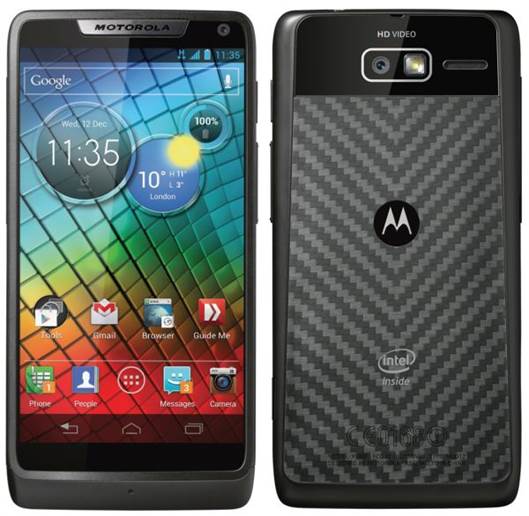
The processor first, It’s single-core,
clocked at a hearty 2G Hz, although Intel says that its design makes it as
efficient at handling multiple tasks as a multi-core processor. It certainly is
fast, and it helped deliver decent battery life as well, but there’s no
practical benefit to choosing an Intel-powered Android phone. In fact, branding
on the rear and boot screen apart, the only time you’ll even know it’s there is
when you download an app and find it isn’t compatible with the processor. At
present the compatibility rate is around the three-quarter mark and will almost
certainly never reach loo per cent. It’s completely hit and miss what works and
what doesn’t so you really will need to research your favourite apps before you
buy.

At
present the compatibility rate is around the three-quarter mark and will almost
certainly never reach loo per cent.
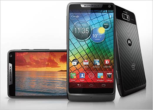
The RAZRi‘s other key feature is far more
impressive. Two things mark out progress in each generation of devices - a
thinner body and a smaller bezel. The handset measures a very svelte 8.3mm and
introduces an edge-to-edge display for the first time. Okay, it’s not properly
edge to edge, there’s still a small amount of bezel down the sides of the
screen. But it is less than we’ve seen before, and it looks stunning, helping
reduce the overall footprint of the device without compromising on screen size.
The display is 540 x 960 pixels, or 256ppi, so is not class leading, but it was
bright and crisp with vibrant colors. Display aficionados will find fault with
it, but we enjoyed using it very much.
This screen is what makes the phone, which
is a lot smaller than other 4.3-inch devices like the HTC One S. It’s
surprisingly pretty, with the fiercely angular styling of some of its
predecessors being smoothed out in favor of something altogether friendlier.
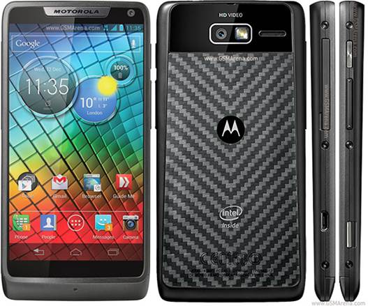
The bottomless face complements the tiny bezel to create a very minimalist
front-on view. The sides, by contrast, are very busy. With no removable back
cover the SIM and SD slots are accessed down one edge, while among the assorted
other elements there is a most welcome camera shutter button. The appearance of
a few screws gives the device a tastefully industrial appearance, suiting a
device that is slim and delicate, yet sturdy and well built.
There are more pleasant surprises when you
turn the phone on. Motorola, for so long the biggest sinner when it comes to
customizing and bloating their Android software, has now limited its
customizations to a few genuinely useful tweaks that are in perfect harmony
with the Ice Cream Sandwich OS.
The home screen has been completely
rethought. There’s just one main screen, with a quick settings screen
permanently placed to the left. You can add more home screens for your widgets
as and when you need them, but the main focus here is on keeping things simple,
and it works really well. Similarly Motorola has redesigned some superficial
elements of the UI, such as the icons, but all the changes are totally
consistent with the Holo theme in Android 4. It’s really well done. Extra
software is kept to a minimum as well. Best of the bunch is the Smart Actions
app that enables you to program the phone to perform tasks at certain times or
at certain locations. Want to switch data oft at night, or connect to Wi-Fi
when you get home? These are the kinds of things you’ll be doing with Smart
Actions.

Similarly
Motorola has redesigned some superficial elements of the UI, such as the icons,
but all the changes are totally consistent with the Holo theme in Android 4.
The Camera app has also been tweaked, and
puts some key controls under your fingers when you most need them. The eight
megapixel camera shoots reasonable photos; good in the day, grainy at night.
There is a small amount of lag when shooting, not enough to really impact its
performance, but it’s noticeably slower than what we’ve seen in devices like
HTC’s One range or the Galaxy S Ill. The front-facing camera has only a
0.3-megapixel sensor so is only barely useable for video chat and nothing more.
Connectivity features include NFC and DLNA.
The RAZR i is in some ways one of the more
impressive Android devices we’ve seen. It manages to innovate while avoiding
the ludicrous spec wars that other manufacturers are obsessed with. It is
stylish yet sturdy, the customizations are all intelligent and well thought
through and it delivers on performance. We do have a few concerns about the
patchy app compatibility with the Intel processor, but for the most part this
is a powerful, classy handset. Motorola’s best yet.