Desktop
How do the interface shape up?
Inarguably, the most talked about feature
of the new Windows 8 release is its interface. Historically, it’s the one thing
that’s been consistent in Windows releases since the last century. So much so
that a cryogenically frozen Windows 95 user could shake off his slumber and get
started on Windows 7 without missing a beat.
But it all changes with Windows 8. If you
aren’t bamboozled by the new Start screen, you will be by the time you get to
the traditional-looking Desktop, which lacks the iconic Start menu. After a
couple of times of switching between the Start screen and the Desktop, the
cryogenic chamber will look really appealing.

Windows
8 looks and feels like a tablet OS slapped over Windows 7 with a few tweaks
Radical interface changes are something
Linux users are well aware of. At some point, we’ve all been a victim of style
over substance, be it KDE 4, Gnome 3 or Unity. But the Windows 8 interface is a
much more radical departure from its predecessor.
For starters, our workspaces still adhere
to the WIMP (Windows, Icons, Menus, Pointers) style of interface design. The
buttons might be on the wrong side of the window, but at least we don’t have to
learn new tricks to close them. And our icon-only task bars are way better than
the Windows 8 idea of replacing icons with tiles.
The biggest faux pas in Windows 8 seems to
be its dual-interface. We can appreciate Microsoft’s intentions in doing this.
It would be the go-to environment for users while they get used to the newer,
tile-laden interface. But it took us only a few minutes to realize that the
dual-interface strategy was a recipe for usability disaster. The two Windows 8
environments behave differently, making for an inconsistent user experience. On
top of that, users can’t ignore one environment and use the other exclusively.
They have to juggle between the two, because there are some things users can do
in only one interface, while some others are exclusively to the other
interface.
Also, applications launched from Windows
8’s new interface run in full screen mode, which is fine for tablets with
limited real estate. But a widescreen full HD monitor has the real estate to
accommodate multiple apps and window side by side, and the forced full screen
behavior seems rather abusive. Then there’s the fact that since they run full screen
and don’t display the controls to minimize or even close them, you’ll have to
learn new skills and gestures to manage windows.

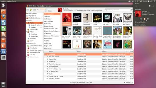
You
can preview tracks before buying music from Ubuntu’s music store
Contrast this with the first version of
Unity in Ubuntu 11.04. Initially developed for a netbook, the interface tried
its best to use the limited real estate by hiding the Launcher when an app was
launched. There was outrage despite the fact that you could still resize
windows and fit multiple ones in your screen, and this default behavior was
overwritten in the next release.
Broken tiles
Another Windows 8 feature that seems to be
poor is tiles. At first glance, they look like application shortcuts, until you
realize that some apps can also have live tiles that update themselves with the
latest information for the app, such as a list of recent emails.
A tile could also be a folder, a library
link or a network resource. But if they sound to you like the perfect shortcut,
you have another thing coming. You can’t create tiles for files, such as
important PDFs that you refer to occasionally and would want pinned to the
Start screen.
Also, while organizing tiles is easy their
limited customization is annoying. You can only adjust a tile to one of the two
preset sizes. It’s also easy to miss out features such as the one to name
columns of tiles. And this seemingly simple task involves complex mouse
gymnastics, which is true for most tasks if you’re using Windows 8 with a
mouse. Windows 8 will automatically create tiles for any new apps you install,
whereas in Ubuntu you can choose if you want to pin an app to the Launcher
after it’s installed.
Unity to the rescue
Ubuntu’s Unity doesn’t resemble a
traditional OS either. But I surely isn’t as outlandish as the Windows 8 Start
screen. The two most prominent components on the Ubuntu Desktop are the
Launcher and the Dash. Think of the Launcher as an icon-only taskbar. You can
pin icons for the apps you use most frequently to the Launcher for quick
access.
Furthermore, the Launcher icons of some
apps have a customized right-click context menu to let you access some of the
app’s interesting features. For example, the Chromium browser’s Launcher
icon can launch a new window in Incognito mode, or one with a temporary
profile.

Ubuntu
gets new icons in the file system lens to add file systems such as USB sticks
Unity offers a very usable environment for
both touch and traditional interfaces.so, for example, you can rearrange icons
on the Launcher by grabbing them, with the mouse or finger, and moving them to
a new position.
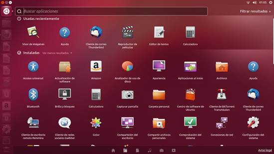
Then there’s the Dash, which enables you to
search for applications, file, music and videos. Several applications, such as Gwibber,
install their own lenses and extend the usability of the Dash. The new Ubuntu
release also features the Unity Shopping Lens, which shows you content you can
buy online from Ubuntu One and Amazon.
It really doesn’t take much time to figure
out that Windows 8 is designed for hand-held devices with touchscreens. All
menus are positioned on the edges of the screen, within the reach of thumbs and
fingers.
The usability experience is also designed
for touch, then mapped on to traditional devices, such as the mouse and
keyboard. You can close apps and access menus with a simple swipe, while the
same tasks require multiple mouse-clicks and key combinations.
On the other hand, while unity doesn’t
quite match up to Windows 8’s touch friendliness, it does a far better job of
managing both the traditional and newer interaction devices. The icon-laced
Launcher is wonderful for launching apps with touch, but at the same time you
can navigate the entire Unity desktop with a keyboard. Then there’s the
innovative HUD interface, using which you can avoid trawling through menus,
especially in apps with nested menus, such as office suites.

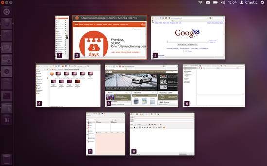
If
you’ve got multiple windows open, switch to Spread mode (Super + W) to see them
all
When you begin comparing the new Windows 8
interface to Ubuntu’s Unity, the latter has everything going for it. It’s been
the main Ubuntu desktop for about two years, and has steadily improved through
the growing pains of rejection and revisions. It still has critics, but they
are arguably outnumbered by active users.
In fact, in our experiment back when
Microsoft was previewing Windows 8, our Windows testers were more comfortable
with Unity than they were with the new Windows 8 interface. Since then, Windows
8 has gone through additional preview releases without much change to its user
interface. On the other hand, Unity in Ubuntu 12.10 has ironed out more
usability issues, and is better than ever before.
Sneek preview
The best thing about Unity in Ubuntu 12.10
is the various Dash previews. In some sense, they are the next logical
evolution of the right-click context menu. When you search in any of the lenses
in the Dash, Unity will give you an interactive preview of the results. The
information displayed, along with the preview and things you can do with it,
depends on the lens. For instance, if you’re in the Files lens, you can preview
images and listen to audio files without opening them. You’ll also get options
to email certain types of files if you’ve set up Thunderbird with your
email account, and you can open the containing folder, as well as the file
itself.
If you’re looking for applications, the
previewer will show a brief description of the app, including its version
number, rating and number of reviews. The previewer is designed to save you a
trip to the Software Centre. So if the app is installed, you can uninstall it
from here, and if it isn’t you get the option to install the app.